Graphs
Igor graphs are simultaneously:
-
Publication quality presentations of data and
-
Dynamic windows for exploratory data analysis
This topic describes how to create and modify graphs, how to adjust graph features to your liking, and how to use graphs for data exploration. It deals mostly with general graph window properties and with waveform and XY plots.
These other sections discuss material related to graphs:
Category Plots, Contour Plots, Image Plots, 3D Graphics
Drawing, Annotations, Exporting Graphics (Windows)
A single graph window can contain one or more of the following:
| Waveform plots | Wave data versus X values (scaled point number) | |
| XY plots | Y wave data versus X wave data | |
| Category plots | Numeric wave data versus text wave data | |
| Image plots | Display of a matrix of data | |
| Contour plots | Contour of a matrix or an XYZ triple | |
| Axes | Any number of axes positioned anywhere | |
| Annotations | Textboxes, legends, color scales, and dynamic tags | |
| Cursors | To read out XY coordinates | |
| Drawing elements | Arrows, lines, boxes, polygons, pictures . . . | |
| Controls | Buttons, pop-up menus, readouts . . . | |
The various kinds of plots can be overlaid in the same plot area or displayed in separate regions of the graph. Igor also provides extensive control over stylistic factors such as font, color, line thickness, dash pattern, etc.
Graph Features
Igor graphs are smart. If you expand a graph to fill a large screen, Igor will adjust all aspects of the graph to optimize the presentation for the available screen real estate. The font sizes will be scaled to sizes that look good for the large format and the graph margins will be optimized to maximize the data area without fouling up the axis labeling. If you shrink a graph down to a small size Igor will automatically adjust axis ticking to prevent tick mark labels from running into one another. If Igor's automatic adjustment of parameters does not give the desired effect, you can override the default behavior by providing explicit parameters.
Igor graphs are dynamic. When you zoom in on a detail in your data, or when your data changes, perhaps due to data transformation operations, Igor will automatically adjust both the tick mark labels and the axis labels. For example, before zooming in, an axis might be labeled in milli-Hertz and after in micro-Hertz. No matter what the axis range you select, Igor always maintains intelligent tick mark and axis labels.
If you change the values in a wave, any and all graphs containing that wave will automatically change to reflect the new values.
You can zoom in on a region of interest (see Manual Scaling), expand or shrink horizontally or vertically, and you can pan through your data with a hand tool (see Panning). You can offset graph traces by simply dragging them around on the screen (see Trace Offsets). You can attach cursors to your traces and view data readouts as you glide the cursors through your data (see Info Panel and Cursors). You can edit your data graphically (see Drawing and Editing Waves).
Igor graphs are fast. They are updated almost instantly when you make a change to your data or to the graph. In fact, Igor graphs can be made to update in a nearly continuous fashion to provide a real-time oscilloscope-like display during data acquisition (see Live Graphs and Oscilloscope Displays).
You can also control virtually all details in the style of presentation of a graph. When you have the graph just the way you like it, you can create a template called a "style macro" to make it easy to create more graphs of the same style in the future (see Graph Style Macros). You can also set preferences from an ideal graph so that new graphs will automatically be created with the settings you prefer (see Graph Preferences).
You can print or export graphs directly, or you can combine several graphs in a page layout window prior to printing or exporting. You can export graphs and page layotus in a wide variety of graphics formats.
A graph can exist as a standalone window or as a subwindow of another graph, a page layout, or a control panel (see Embedding and Subwindows).
The Graph Menu
The Graph menu contains items that apply only to graph windows. The menu appears in the menu bar only when the active or target window is a graph.
When you choose an item from the Graph menu it affects the top-most graph.
Typing in Graphs
If you type on the keyboard while a graph is the top window, Igor brings the command window to the front and your typing goes into the command line. The only exception to this is when a graph contains a selected SetVariable control.
Graph Names
Every graph that you create has a window name which you can use to manipulate the graph from the command line or from a procedure. When you create a new graph, Igor assigns it a name of the form "Graph0", "Graph1" and so on. When you close a graph, Igor offers to create a window recreation macro which you can invoke later to recreate the graph. The name of the window recreation macro is the same as the name of the graph.
The graph name is not the same as the graph title which is the text that appears in the graph's window frame. The name is for use in procedures but the title is for display purposes only. You can change a graph's name and title using the Window Control dialog which you can access by choosing Windows→Control→Window Control.
Creating Graphs
You create a graph by choosing New Graph from the Windows menu.
You can also create a graph by choosing New Category Plot, New Contour Plot or New Image Plot from the New submenu in the Windows menu.
You select the waves to be displayed in the graph from the Y Waves list. The wave is displayed as a trace in the graph. A trace is a visual representation of a wave or an XY pair. By default a trace is drawn as a series of lines joining the points of the wave or XY pair.
Each trace has a name so you can refer to it from a procedure. By default, the trace name is the same as the wave name or Y wave in the case of an XY pair. However, there are exceptions. If you display the same wave multiple times in a given graph, the traces will have names like wave0, wave0#1, and wave0#2. wave0 is equivalent to wave0#0. Such names are called trace instance names.
You can also programmatically specify a trace's name using the Display or AppendToGraph operations. This is something an Igor programmer would do, typically to better distinguish multiple traces associated with the same Y wave.
Often the data values of the waves that you select in the Y Waves list are plotted versus their calculated X values. This is a waveform trace. The calculated X values are derived from the wave's X scaling; see The Waveform Model of Data.
If you want to plot the data values of the Y waves versus the data values of another wave, select the other wave in the X Wave list. This is an XY plotting trace. In this case, X scaling is ignored; see The XY Model of Data.
If the lengths of the X and Y waves are not equal, then the number of points plotted is determined by the shorter of the waves.
The New Graph dialog has a simple mode an an advanced mode. In the simple mode, you can select multiple Y waves but just one X wave. If you have multiple XY pairs with distinct X waves, click the More Choices button to use the advanced mode. This allows you to select a different X wave for each Y wave.
You can specify a title for the new window. The title is not used by Igor except to form the title bar of the window. It is not used to identify windows and does not appear in the graph. If you specify no title, Igor will choose an appropriate title based on the traces in the graph and the graph name. Igor automatically assigns graph names of the form "Graph0". The name of a window is important because it is used to identify windows in commands. The title is for display purposes only and not used in commands.
If you have created style macros for the current experiment they will appear in the Style pop-up menu. See Graph Style Macros for details.
Normally, the new graph is created using left and bottom axes. You can select other axes using the pop-up menus under the X and Y wave lists. Picking L=VertCrossing automatically selects B=HorizCrossing and vice versa. These free axes are used when you want to create a Cartesian type plot where the axes cross at (0,0).
You can create additional free axes by choosing New from the pop-up menu. This displays the New Free Axis dialog
Axes created this way are called "free axes" because they can be freely positioned nearly anywhere in the graph window. The standard left, bottom, right, and top axes always remain at the edge of the plot area.
You should give the new axis a name that describes its intended use. The name must be unique within the current graph and can't contain spaces or other nonalphanumeric characters. The Left and Right radio buttons determine the side of the axis on which tick mark labels will be placed. They also define the edge of the graph from which axis positioning is based.
You can create a blank graph window containing no traces or axes by clicking the Do It button without selecting any Y waves to plot. Blank graph windows are mostly used in programmer when traces are appended later using AppendToGraph.
Using the advanced mode of the New Graph dialog, you can create complex graphs in one step. You select a wave or an XY pair using the Y Waves and X Wave lists, and then click the Add button. This moves your selection to the trace specification list below. You can then add more trace specifications using the Add button. When you click Do It, your graph is created with all of the specified traces.
The advanced version of the dialog includes two-dimensional waves in the Y Waves and X Wave lists. You can edit the range values for waves in the trace specification list to specify individual rows or columns of a matrix or to specify other subsets of data. See Subrange Display for details.
Waves and Axes
Axes are dependent upon waves for their existence. If you remove from a graph the last wave that uses a particular axis then that axis will also be removed.
In addition, the first wave plotted against a given axis is called the controlling wave for the axis. There is only one thing special about the controlling wave: its units define the units that will be used in creating the axis label and occasionally the tick mark labels. This is normally not a problem since all waves plotted against a given axis will likely have the same units. You can determine which wave controls an axis with the AxisInfo function.
Types of Axes
The four axes named left, right, bottom and top are termed standard axes. They are the only axes that many people will ever need.
Each of the four standard axes is always attached to the corresponding edge of the plot area. The plot area is the central rectangle in a graph window where traces are plotted. Axis and tick mark labels are plotted outside of this rectangle.
You can also add unlimited numbers of additional user-named axes termed free axes. Free axes are so named because you can position them nearly anywhere within the graph window. In particular, vertical free axes can be positioned anywhere in the horizontal dimension while horizontal axes can be positioned anywhere in the vertical dimension.
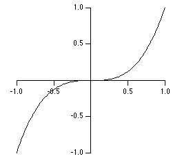
The Axis pop-up menu entries L=VertCrossing and B=HorizCrossing in the New Graph dialog create free axes that are each preset to cross at the numerical zero location of the other. They are also set to suppress the tick mark and label at zero. For example, create this data:
Make yWave; SetScale/I x,-1,1,yWave; yWave= x^3
Now, using the New Graph dialog, select yWave from the Y list and then L=VertCrossing from the Y axis pop-up menu. This generates the following command and the resulting graph:
Display/L=VertCrossing/B=HorizCrossing yWave
You could remove the tick mark and label at -0.5 by double-clicking the X axis to reach the Modify Axis dialog, choosing the Tick Options tab, and finally typing -0.5 in one of the unused Inhibit Ticks boxes.
The free axis types described above all require that there be at least one trace that uses the free axis. For special purposes Igor programmers can also create a free axis that does not rely on any traces by using the NewFreeAxis operation. Such an axis will not use any scaling or units information from any associated waves if they exist. You can specify the properties of a free axis using the SetAxis operation or the ModifyFreeAxis operation, and you can remove them using the KillFreeAxis operation.
Appending Traces
You can append waves to a graph as a waveform or XY plot by choosing Append Traces to Graph from the Graph menu. This presents a dialog identical to the New Graph dialog except that the title and style macro items are not present. Like the New Graph dialog, this dialog provides a way to create new axes and pairs of XY data. The Append to Graph submenu in the Graph menu allows you to append category plots, contour plots and image plots.
Appending Traces by Drag and Drop
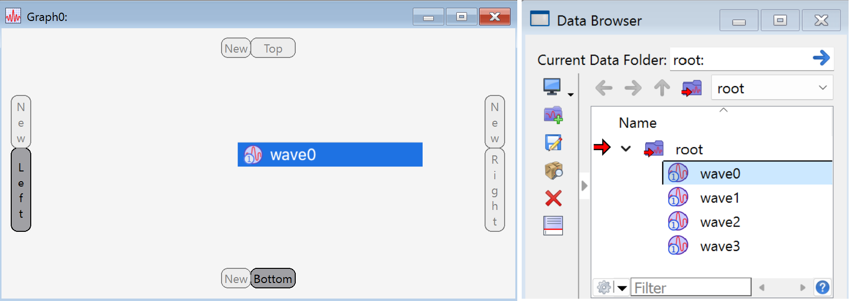
You can append waves to a graph by dragging them from the Data Browser or from the Waves in Window list of the Window Browser.
The following sections present a guided tour showing how to use drag and drop. You can execute the example commands by selecting the line or lines and pressing Ctrl+Enter.
Drag and Drop Tour
-
Choose File→New Experiment.
-
Execute this command to create waves used in the tour:
Make/O wave0=sin(x/8), wave1=cos(x/8), wave2=wave0*wave1, xwave=x/8 -
Choose Data→Data Browser.
We will drag icons from the Data Browser into a graph window.
-
Execute this command to create an empty graph:
Display
Appending Traces to Standard Axes by Drag and Drop
You can append a trace using any of the four standard axes by dragging and hovering over the Left, Top, Right, or Bottom drop targets shown below. Dropping a wave in the middle of the graph appends a trace using the left and bottom axes.
-
Select wave0 in the Data Browser and drag it to the middle of the graph.
When the mouse enters the graph, a number of drop targets appear.
-
Release the mouse to drop the wave in the middle of the graph window.
Dropping the wave in the middle of the graph adds a trace to the left and bottom axes. An AppendToGraph command appears in the history area of the command window.
-
Remove the trace from the graph by executing:
RemoveFromGraph wave0When you remove the last trace plotted against a given axis, Igor removes that axis from the graph.
Next we will show how to append a trace using any of the four standard axes.
-
Select wave0 in the Data Browser, drag it to the Top drop target and pause until Top turns blue. Then drag the wave to the Right drop target and release the mouse.
A trace is appended to the graph using the standard right and top axes.
-
Remove the trace from the graph by executing:
RemoveFromGraph wave0
You can cancel a drag and drop operation that you have not yet completed by dragging the wave out of the graph or by pressing the escape key.
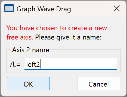
Creating Free Axes by Drag and Drop
You can append a trace to a new free axis by dragging and hovering over one of the New drop targets. In this section, we will append a trace to a new free left axis versus the standard bottom axis. For background information on free axes, see Types of Axes.
-
Select wave0 in the Data Browser, drag it to the New drop target on the left side of the graph, and pause until New turns blue. Then drag the wave to the Bottom drop target and release the mouse.
A dialog appears asking for a name for the new free axis:
-
Enter left2 as the name for the new free axis and click OK.
The trace is appended versus the left2 and bottom axes.
In the history area of the command window you can see AppendToGraph and ModifyGraph commands that were executed to create the new free axis and set its position.
-
Select wave1 in the Data Browser, drag it to the New drop target on the left side of the graph, and pause until New turns blue. Then drag the wave to the Bottom drop target and release the mouse.
A dialog appears asking for a name for the new free axis. Enter left3.
A wave1 trace is appended versus the left3 and bottom axes. The left2 and left3 axes are identical at this point so you can see only one of them. In the next step we will make them distinct.
-
Stack the left2 and left3 axes by executing:
ModifyGraph axisEnab(left2)={0,0.45}, axisEnab(left3)={0.55,1.0}You now have a stacked graph.
You can also use the Draw Between settings of the Axis tab of the Modify Graph dialog to generate the axisEnab commands.
Dragging to Existing Axes
Axes that already exist in the graph, whether standard or free, act as drop targets. To append a new trace to an existing axis, you drag onto the existing axis and pause until it turns blue, then drag onto another drop target.
-
Select wave2 in the Data Browser, drag it to the left3 axis (the upper left axis) in the graph, and pause until the narrow gray rectangle turns blue. Then drag the wave to the Bottom drop target and release the mouse.
Wave2 is appended versus the left3 and bottom axes.
-
Remove the traces from the graph by executing:
RemoveFromGraph wave0, wave1, wave2
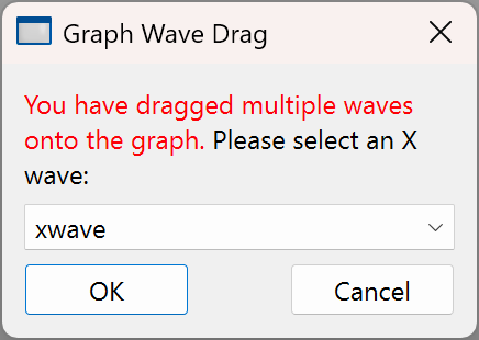
Appending XY Traces by Drag and Drop
To append an XY pair to a graph, you select the X and Y waves in the browser and drag to the graph as described above. When you release the mouse, Igor displays a dialog that allows you to identify one of the waves as the X wave.
-
Select wave0, wave1, and xwave in the Data Browser, and drag and drop them in the middle of the graph.
Igor displays a dialog asking you to select an X wave:
-
Select xwave from the pop-up menu and click OK.
Igor displays wave0 and wave1 versus xwave using the left and bottom axes.
If you wanted to plot all dragged waves as waveforms rather than as XY pairs, you would choose _calculated_ from the popup menu and click OK.
-
Remove the traces from the graph by executing:
RemoveFromGraph wave0, wave1
It is not supported to create multiple XY traces with one drag. For example, if you have waves named wave0 and xwave0 and wave1 and xwave1, you have to do two drags to create two XY pairs. If you have many such XY pairs, use the command line or the advanced mode of the New Graph or Append Traces dialog; see Creating Graphs for details.
Trace Names
Each trace in a graph has a name. Trace names are displayed in graph dialogs and popup menus and used in graphing operations. Some of the operations that take trace names as parameters are ModifyGraph, RemoveFromGraph, ReorderTraces, ErrorBars and Tag.
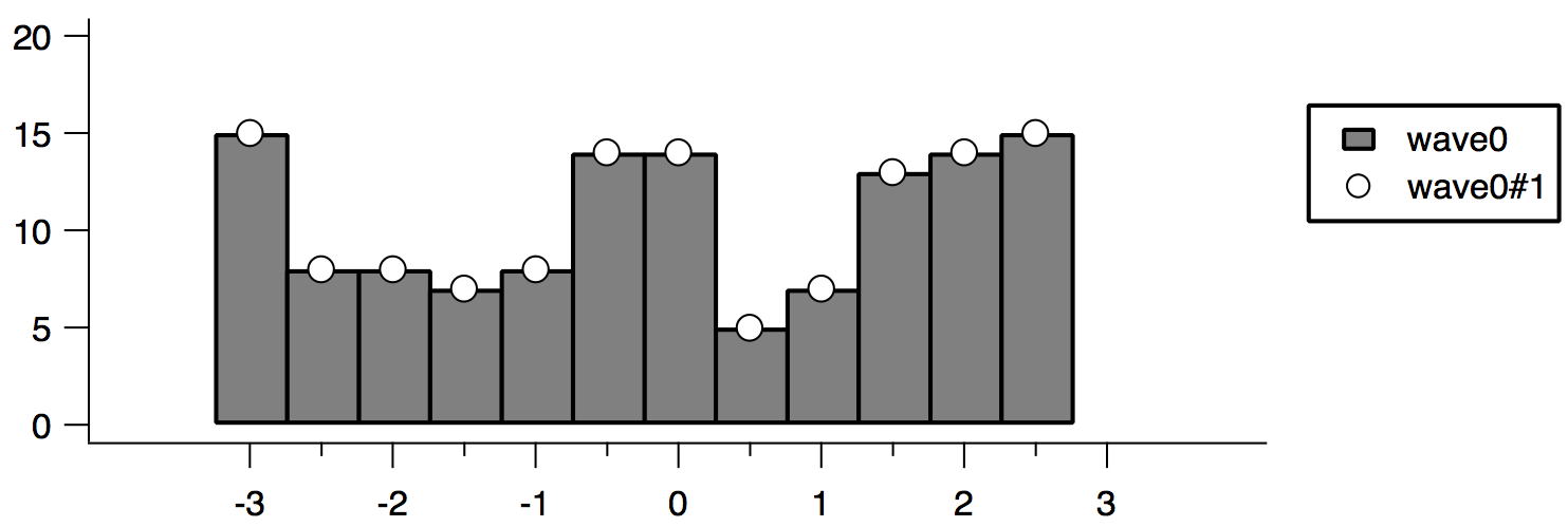
The name of the trace is usually the same as the name of the wave displayed in the trace, but not always. If two traces display the same wave, or waves with the same name from different data folders, Instance Notation such as #1and #2, is used to distinguish between the traces. For example:
Make/O wave0 = sin(x/8)

// Create first trace displaying wave0. The trace name is wave0 (equivalent to wave0#0).
Display wave0

// Create second trace displaying of wave0. The trace name is wave0#1.
AppendToGraph wave0
Trace names like wave0#1 are automatically generated by Igor based on the name of the wave and the position of the trace in the graph.
It is also possible to assign a user-defined name to a trace that is not derived from the name of the wave being displayed:
// Create third instance of wave0. The trace name is thirdInstance.
AppendToGraph wave0/TN=thirdInstance
This creates a graph with three traces named wave0, wave0#1 and thirdInstance. The trace name wave0 is equivalent to wave0#0.
As of Igor Pro 9.00, you can change the name of an existing trace using ModifyGraph with the traceName keyword.
User-defined trace names are helpful in graphs that display same-named waves from different data folders. They are also useful for assigning names to be used programmatically which indicate the purpose of the trace rather than the wave supplying the data for it. User-defined trace names can be set only via the Display and AppendToGraph operations.
User-defined trace names are particularly useful for box plots and violin plots, as these plot types often take a list of waves instead of just one wave. Unless you specify a user-defined trace name, the name is taken from the first wave in the list.
See also User-defined Trace Names.
Automatically-generated trace names can create surprises. Imagine that three waves from different data folders all having the name "wave0" are added to a graph:
Make :df1:wave0
Make :df2:wave0
Make :df3:wave0
Display :df1:wave0,:df2:wave0,:df3:wave0
Now the list of traces is wave0, wave0#1, and wave0#2. Now remove the first trace:
RemoveFromGraph wave0
This is equivalent to removing wave0#0. Because the automatically-generated instance number is the based on position in the list of traces, the name of trace wave0#1 changes to wave0 and wave0#2 changes to wave0#1.
For information on programming with trace names, see Programming With Trace Names.
Moving Traces
You can move a trace from the left axis to the right axis or vice versa by right-clicking the trace and choosing Move to Opposite Axis. You can do other types of moves using the ReorderTraces operation with the /L or /R flags.
Removing Traces
You can remove traces, as well as image plots and contour plots, from a graph by choosing Remove from Graph from the Graph menu. Select the type of item that you want to remove from the pop-up menu above the list.
A contour plot has traces that you can remove, but they will come back when the contour plot is updated. Rather than removing the contour traces, use the pop-up to select Contours, and remove the contour plot itself, which automatically removes all of the contour-related traces. See Removing Contour Traces from a Graph.
If you remove the last item associated with a given axis then that axis will also be removed.
Replacing Traces
You can "replace" a trace in the sense of changing the wave that the trace is displaying in a graph. All the other characteristics of the trace, such as mode, line size, color, and style, remain unchanged. You can use this to update a graph with data from a wave other than the one originally used to create the trace.
To replace a trace, use the Replace Wave item in the Graph menu to display the Replace Wave in Graph dialog.
A special mode allows you to browse through groups of data sets composed of identically-named waves residing in different data folders. For instance, you might take the same type of data during multiple runs on different experimental subjects. If you store the data for each run in a separate data folder, and you give the same names to the waves that result from each run, you can select the Replace All in Data Folder checkbox and then select one of the data folders containing data from a single run. All the waves in the chosen data folder whose names match the names of waves displayed in the graph will replace the same-named waves in the graph.
You can also replace waves one at a time with any other wave. With the Replace All in Data Folder checkbox unchecked, choose a trace from the list below the menu. To replace the Y wave used by the trace, check the Y checkbox; to replace the X wave check the X checkbox. You can replace both if you wish. Select the waves to use as replacements from the menus to the right of the checkboxes. You can select _calculated_ from the X wave menu to remove the X wave of an XY pair, converting it to a waveform display.
The menus allow you to select waves having lengths that don't match the length of the corresponding X or Y wave. In that case, use the edit boxes to the right to select a sub-range of the wave's points. You can also use these boxes to select a single row or column from a two-dimensional wave.
The dialog creates command lines using the ReplaceWave operation.
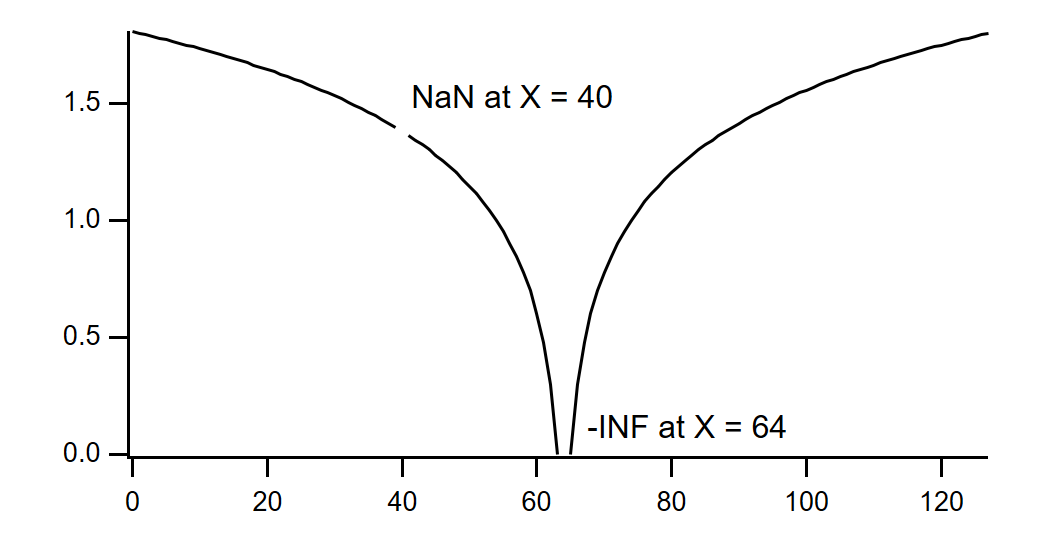
Plotting NaNs and INFs
The data value of a wave is normally a finite number but can also be a NaN or an INF. NaN means "Not a Number", and INF means "infinity". An expression returns the value NaN when it makes no sense mathematically. For example, log(-1) returns the value NaN. You can also set a point to NaN, using a table or a wave assignment, to represent a missing value. An expression returns the value INF when it makes sense mathematically but has no finite value. log(0) returns the value -INF.
Igor ignores NaNs and INFs when scaling a graph. If a wave in a graph is set to lines between points mode then Igor draws lines toward an INF. By default, it draws no line to or from a NaN so a NaN acts like a missing value. You can override the default, instructing Igor to draw lines through NaNs using the Gaps checkbox in the Modify Trace Appearance dialog.
The following graph illustrate these points. It was created with these commands:
Make/O wave1 = log(abs(x-64)); wave1(40) = log(-1)
Display wave1
You can override the default, instructing Igor to draw lines through NaNs. See Gaps for details.
Scaling Graphs
Igor provides several ways of scaling waves in graphs. All of them allow you to control what sections of your waves are displayed by setting the range of the graph's axes. Each axis is either autoscaled or manually scaled.
Autoscaling
When you first create a graph all of its axes are in autoscaling mode. This means that Igor automatically adjusts the extent of the axes of the graph so that all of each wave in the graph is fully in view. If the data in the waves changes, the axes are automatically rescaled so that all waves remain fully in view.
If you manually scale any axis, that axis changes to manual scaling mode. The methods of manual scaling are described in the next section. Axes in manual scaling mode are never automatically scaled by Igor.
If you choose Autoscale Axes from the Graph menu all of the axes in the graph are autoscaled and returned to autoscaling mode. You can set individual axes to autoscaling mode and can control properties of autoscaling mode using the Axis Range tab of the Modify Axis dialog described in Setting the Range of an Axis.
Manual Scaling
To manually scale one or more axes of a graph with the mouse, start by selecting the region of the graph that you want to examine. Then select the scaling operation that you want from a pop-up menu that appears when you click inside the region.
You can manually scale one or more axes of a graph using the mouse. Start by clicking the mouse and dragging it diagonally to frame the region of interest. Igor displays a dashed outline around the region. This outline is called a marquee. A marquee has handles and edges that allow you to refine its size and position.
To refine the size of the marquee move the cursor over one of the handles. The cursor changes to a double arrow which shows you the direction in which the handle moves the edge of the marquee. To move the edge click the mouse and drag.
To refine the position of the marquee move the cursor over one of the edges away from the handles. The cursor changes to a hand. To move the marquee click the mouse and drag.
When you click inside the region of interest Igor presents a pop-up menu from which you can choose the scaling operation.
Choose the operation you want and release the mouse. These operations can be undone and redone; just press Ctrl+Z.
The Expand operation scales all axes so that the region inside the marquee fills the graph (zoom in). It sets the scaling mode for all axes to manual.
The Horiz Expand operation scales only the horizontal axes so that the region inside the marquee fills the graph horizontally. It has no effect on the vertical axes. It sets the scaling mode for the horizontal axes to manual.
The Vert Expand operation scales only the vertical axes so that the region inside the marquee fills the graph vertically. It has no effect on the horizontal axes. It sets the scaling mode for the vertical axes to manual.
The Shrink operation scales all axes so that the waves in the graph appear smaller (zoom out). The factor by which the waves shrink is equal to the ratio of the size of the marquee to the size of the entire graph. For example, if the marquee is one half the size of the graph then the waves shrink to one half their former size. The point at the center of the marquee becomes the new center of the graph. The shrink operation sets the scaling mode for all axes to manual.
The Horiz Shrink operation is like the shrink operation but affects the horizontal axes only. It sets the scaling mode for the horizontal axes to manual.
The Vert Shrink operation is like the shrink operation but affects the vertical axes only. It sets the scaling mode for the vertical axes to manual.
Another way to manually scale axes is to use the Axis Range tab of the Modify Axis dialog (see Manual Axis Ranges), or the SetAxis operation.
Scaling Using the Mouse Wheel
You can manually scale a graph axis using the mouse wheel. The scaling performed is determined by where along the axis you position the mouse. Start by positioning the mouse over the axis until the cursor changes to a double-ended arrow.
If you position the mouse over the middle of the axis and rotate the wheel, both ends of the axis are scaled equally.
If you position the mouse over one end of the axis and rotate the wheel, that end remains fixed and the other end of the axis is scaled.
If you position the mouse between the middle and one end of the axis and rotate the wheel, more of the scaling is applied to the other end.
Panning
After zooming in on a region of interest, you may want to view data that is just off screen. To do this, press Alt and move the mouse to the graph interior where the cursor changes to a hand. Now drag the body of the graph. Pressing Shift will constrain movement to the horizontal or vertical directions.
This operation is undoable.
Fling Mode
If, while panning, you release the mouse button while the mouse is still moving, the panning will automatically continue. While panning, release the Option or Alt key and change the force or direction of the mouse-click gesture to change the panning speed or direction. Click the mouse button once to stop.
Panning Using the Mouse Wheel
You can pan a graph using the mouse wheel. Start by positioning the mouse over the axis until the cursor changes to a double-ended arrow.
Press the shift key and rotate the wheel. The axis range is changed to pan the graph. The axis value over which you position the mouse remains fixed while the axis range is changed.
Panning is triggered by "horizontal scrolling" with the mouse wheel. With most mice, you trigger horizontally scrolling by pressing the shift key and rotating the scroll wheel, but some mice may behave differently.
Setting the Range of an Axis
You can set the range and other scaling parameters for individual axes using the Axis Range tab in the Modify Axis dialog. You can display the dialog with this tab selected by choosing Set Axis Range from the Graph menu or by double-clicking a tick mark label of the axis you wish to modify. Information on the other tabs in this dialog is available in Modifying Axes.
Start by choosing the axis that you want to adjust from the Axis pop-up menu. You can adjust each axis in turn, or a selection of axes, without leaving this dialog.
Manual Axis Ranges
When a graph is first created, it is in autoscaling mode. In this mode, the axis limits automatically adjust to just include all the data. The controls in the Autoscale Settings section provide autoscaling options.
You can set the axis limits to fixed values by editing the minimum and maximum parameters in the Manual Range Settings section. You can return the minimum or maximum axis range to autoscaling mode by unchecking the corresponding checkbox. These settings are independent, so you can fix one end of the axis and autoscale the other end.
There are a number of other ways to set the minimum or maximum parameters. Clicking the Expand 5% button expands the range by 5 percent. This has the effect of shrinking the traces plotted on the axis by 5%.
Clicking the Swap button exchanges the minimum and maximum parameters. This has the effect of reversing the ends of the axis, allowing you to plot waves upside-down or backwards with fixed limits.
An additional way to set the minimum and maximum parameters is to select a wave from the list and use the Quick Set buttons. If you click the X Min/Max quick set button then the minimum and maximum X values of the selected wave are transferred to the parameter boxes. If you click the Y Min/Max quick set button then the minimum and maximum Y values of the selected wave are transferred to the parameter boxes. If you specified the full scale Y values for the wave then you can click the Full Scale quick set button. This transfers the wave's Y full scale values to the parameter boxes. The full scale Y values can be set using the Change Wave Scaling item in the Data menu.
Automatic Axis Ranges
When the manual minimum and maximum checkboxes are unchecked, the axis is in autoscaling mode. In this mode the axis limits are determined by the data values in the waves displayed using the selected axis. The items inside the Autoscale Settings section control the method used to determine the axis range.
The Reverse Axis checkbox swaps the minimum and maximum axis range values, plotting the trace upside-down or backwards.
The top pop-up menu controls adjustments to the minimum and maximum axis range values.
The default mode is "Use data limits". The axis range is set to the minimum and maximum data values of all waves plotted against the axis.
The "Round to nice values" mode extends the axis range to include the next major tick mark.
The "Nice + inset data" mode extends the axis range to include the next major tick mark and also ensures that traces are inset from both ends of the axis.
The bottom pop-up menu controls the treatment of the value zero.
The default mode is "Zero isn't special". The axis range is set to the minimum and maximum data values.
The "Autoscale from zero" mode forces the end of the axis that is closest to zero to be exactly zero.
The "Symmetric about zero" mode forces zero to be in the middle of the axis range.
The "Autoscale from zero if not bipolar" mode behaves like "Autoscale from zero" if the data is unipolar (all positive or all negative) and like "Zero isn't special" if the data is bipolar.
Autoscaling mode usually sets the axis limits using all the data in waves associated with the traces that use the axis. This can be undesirable if the associated horizontal axis is set to display only a portion of the total X range. Select the Autoscale Only Visible Data checkbox to have Igor use only the data included within the horizontal range for autoscaling. This checkbox is available only if the selected axis is a vertical axis.
Overall Graph Properties
You can specify certain overall properties of a graph by choosing Modify Graph from the Graph menu. This displays the Modify Graph dialog. You can also get to this dialog by double-clicking a blank area outside the plot rectangle.
Normally, X axes are plotted horizontally and Y axes vertically. You can reverse this behavior by checking the "Swap X & Y Axes" checkbox. This is commonly used when the independent variable is depth or height. This method swaps X and Y for all traces in the graph. You can cause individual traces to be plotted vertically by checking the "Swap X & Y Axes" checkbox in the New Graph and Append Traces dialogs as you are creating your graph.
Initially, the graph font is determined by the default font which you can set using the Default Font item in the Misc menu. The graph font size is initially automatically calculated by Igor based on the size of the graph. You can override these initial settings using the "Graph font" and "Font size" settings. Igor uses the font and size you specify in annotations and axis labels unless you explicitly set the font or size for an individual annotation or label.
Initially, the graph marker size is automatically calculated by Igor based on the size of the graph. You can override this using the "Marker size" setting. You can set it to "auto" (or 0 which is equivalent) or to a number from -1 to 99. Use -1 to make a graph subwindow get its default font size from its parent. Igor uses the marker size you specify unless you explicitly set the marker size for an individual wave in the graph.
The "Use comma as decimal separator" checkbox determines whether dot or comma is used as the decimal separator in tick mark labels.
Graph Margins
The margin is the distance from an outside edge of the graph to the edge of the plot area of the graph. The plot area, roughly speaking, is the area inside the axes. See Graph Dimensions for a definition. Initially, Igor automatically sets each margin to accommodate axis and tick mark labels and exterior textboxes, if any. You can override the automatic setting of the margin using the Margins settings. You would do this, for example, to force the left margins of two graphs to be identical so that they align properly when stacked vertically in a page layout. The Units pop-up menu determines the units in which you enter the margin values.
You can also set graph margins interactively. If you press Alt and position the cursor over one of the four edges of the plot area rectangle, you will see the cursor change to this shape:  . Use this cursor to drag the margin. You can cause a margin to revert to automatic mode by dragging the margin all the way to the edge of the graph window or beyond. If you drag to within a few pixels of the edge, the margin will be eliminated entirely. If you double click with this cursor showing, Igor displays the Modify Graph dialog with the corresponding margin setting selected.
If you specify a margin for a given axis, the value you specify solely determines where the axis appears. Normally, dragging an axis will adjust its offset relative to the nominal automatic location. If, however, a fixed margin has been specified then dragging the axis will drag the margin.
Graph Dimensions
The Modify Graph dialog provides several ways of controlling the width and height of a graph. Usually you don't need to use these. They are intended for certain specialized applications.
These techniques are powerful but can be confusing unless you understand the algorithms, described below, that Igor uses to determine graph dimensions.
The graph can be in one of five modes with respect to each dimension: auto, absolute, per unit, aspect, or plan. These modes control the width and height of the plot area of the graph. The plot area is the shaded area in the illustration below. The width mode and height mode are independent.
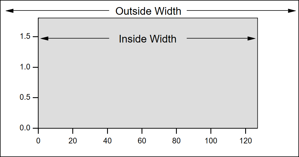
In this graph, the axis standoff feature, described in the Modifying Axes section, is off so the plot area extends to the center of the axis lines. If it were on, the plot area would extend only to the inside edge of the axis lines.
Auto mode tells Igor to automatically determine the width or height of the plot area based on the outside dimensions of the graph and other factors that you specify using Igor's dialogs. This is the normal default mode which is appropriate for most graphing jobs. The remaining modes are useful for special purposes such as matching the axis lengths of two or more graphs or replicating a standard graph or a graph from a journal.
If you select any mode other than auto, you are putting a constraint on the width or height of the plot area which also affects the outside dimensions of the graph. If you adjust the outside size of the graph, by dragging the window's size box, by tiling, by stacking or by using the MoveWindow operation, Igor first determines the outside dimensions as you have specified them and then applies the constraints implied by the width/height mode that you have selected. A graph dimension can be changed by dragging with the mouse only if it is auto mode.
With Absolute mode, you specify the width or height of the plot area in absolute units; in inches, centimeters or points. For example, if you know that you want your plot area to be exactly 5 inches wide and 3.5 inches high, you should use those numbers with an absolute mode for both the width and height.
If you want the outside width and height to be an exact size, you must also specify a fixed value for all four margins. For instance, setting all margins to 0.5 inches in conjunction with an absolute width of 5 inches and a height of 3.5 inches yields a graph whose outside dimensions will be 6 inches wide by 4.5 inches high.
The Aspect mode maintains a constant aspect ratio for the plot area. For example, if you want the width to be 1.5 times longer than the height, you would set the width mode to aspect and specify an aspect ratio of 1.5.
The remaining modes, per unit and plan, are quite powerful and convenient for certain specialized types of graphs, but are more difficult to understand. You should expect that some experimentation will be required to get the desired results.
In Per unit mode, you specify the width or height of the plot area in units of length per axis unit. For example, suppose you want the plot width to be one inch per 20 axis units. You would specify 1/20 = 0.05 inches per unit of the bottom axis. If your axis spanned 60 units, the plot width would be three inches.
Igor allows you to select a horizontal axis to control the vertical dimension or a vertical axis to control the horizontal direction, but it is very unlikely that you would want to do that.
In Plan mode, you specify the length of a unit in the horizontal dimension as a scaling factor times the length of a unit in the vertical dimension, or vice versa. The simplest use of plan scaling is to force a unit in one dimension to be the same as in the other, such as would be appropriate for a map. To do this, you select plan scaling for one dimension and set the scaling factor to 1.
Until you learn how to use the per unit and plan modes, it is easy to create a graph that is ridiculously small or large. Since the size of the graph is tied to the range of the axes, expanding, shrinking or autoscaling the graph makes its size change.
Applying plan or aspect mode to both the X and Y dimensions of a graph is a bad idea. Interactions between the dimensions cause huge or tiny graphs, or other bizarre results. The Modify Graph dialog does not allow both dimensions to be plan or aspect, or a combination of the two. However, the ModifyGraph operation permits it and it is left to you to refrain from doing this.
Sometimes you can end up with a graph whose size makes it difficult to move or resize the window. Use the Graph menu's Modify Graph dialog to reset the size of the graph to something more manageable.
You can change a graph dimension by dragging with the mouse only if it is in auto mode. If you want to resize a graph but can't, use the Modify Graph dialog to check the width and height modes.
If you want to fully understand how Igor arrives at the final size of a graph when the width or height is constrained, you need to understand the algorithm Igor uses:
-
The initial width and height are calculated. When you adjust a window by dragging, the initial width and height are based on the width and height to which you drag the window.
-
If you are exporting graphics, the width and height are as specified in the Export Graphics dialog or in the SavePICT command.
-
If you are printing, the width and height are modified by the effects of the printing mode, as set by the PrintSettings graphMode keyword.
-
The width modes absolute and per unit are applied which may generate a new width.
-
The height mode is applied which may generate a new height.
-
The width modes aspect and plan are applied which may generate a new width.
Because there are many interactions, it is possible to get a graph so big that you can't adjust it manually. If this occurs, use the Modify Graph dialog to set the width and height to a manageable size, using absolute mode.
Modifying Traces
You can specify each trace's appearance in a graph by choosing Modify Trace Appearance from the Graph menu or by double-clicking a trace in the graph.
For image plots, choose Modify Image Appearance from the Graph menu, rather than Modify Trace Appearance.
For contour plots, you normally should choose Modify Contour Appearance. Use this to control the appearance of all of the contour lines in one step. However, if you want to make one contour line stand out, use the Modify Trace Appearance dialog.
Selecting Traces to be Modified
Select the trace or traces whose appearance you want to modify from the Trace list. If you got to this dialog by double-clicking a trace in the graph then that trace will automatically be selected. If you select more than one trace, the items in the dialog will show the settings for the first selected trace.
Once you have made your selection, you can change settings for the selected traces. After doing this, you can then select a different trace or set of traces and make more changes. Igor remembers all of the changes you make, allowing you to do everything in one trip to the dialog.
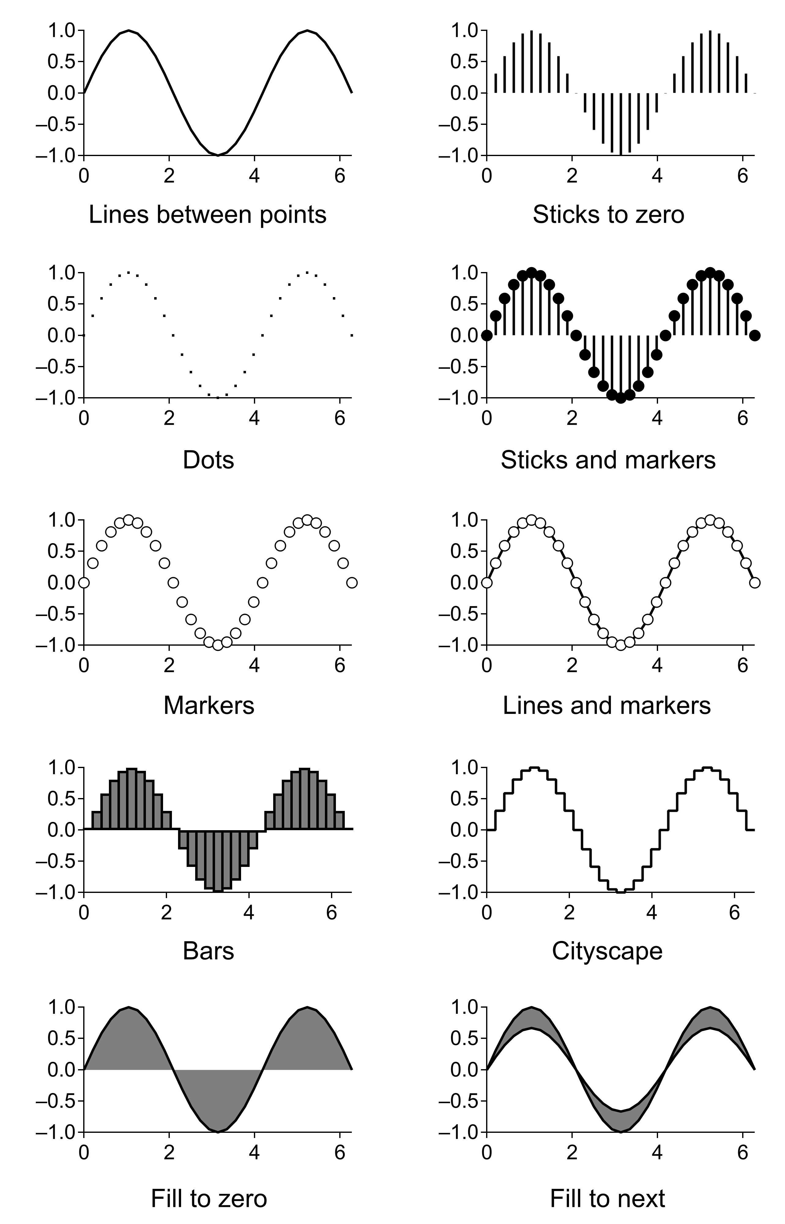
Display Modes
Choose the mode of presentation for the selected trace from the Mode pop-up menu. The commonly-used modes are Lines Between Points, Dots, Markers, Lines and Markers, and Bars. Other modes allow you to draw sticks, bars, and fills to Y=0 or to another trace.
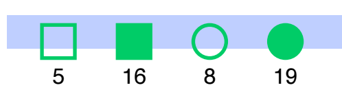
Markers
If you choose the Markers or Lines and Markers mode you also can choose the marker, marker size, marker thickness, and whether the marker is transparent or filled with color. The marker size is a fractional number from 0 to 200. 0 means "auto", which makes Igor choose a marker size appropriate to the size of the graph. The marker thickness is a fractional number from 0 to 50 points. Fractional points may not be evident on screen but can be seen in exported and printed graphics. Setting the marker thickness to 0 makes the markers disappear.
There is an interaction between marker size and marker thickness: Igor will adjust the marker size if this is needed to make the marker symmetrical. The unadjusted width and height of the marker is 2*s+1 points where s is the marker size setting.
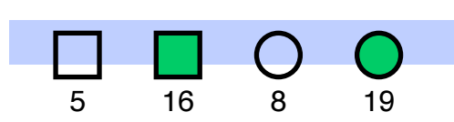
Here is a table of the markers and the corresponding marker numbers (from the ColorsMarkersLinesPatterns example experiment
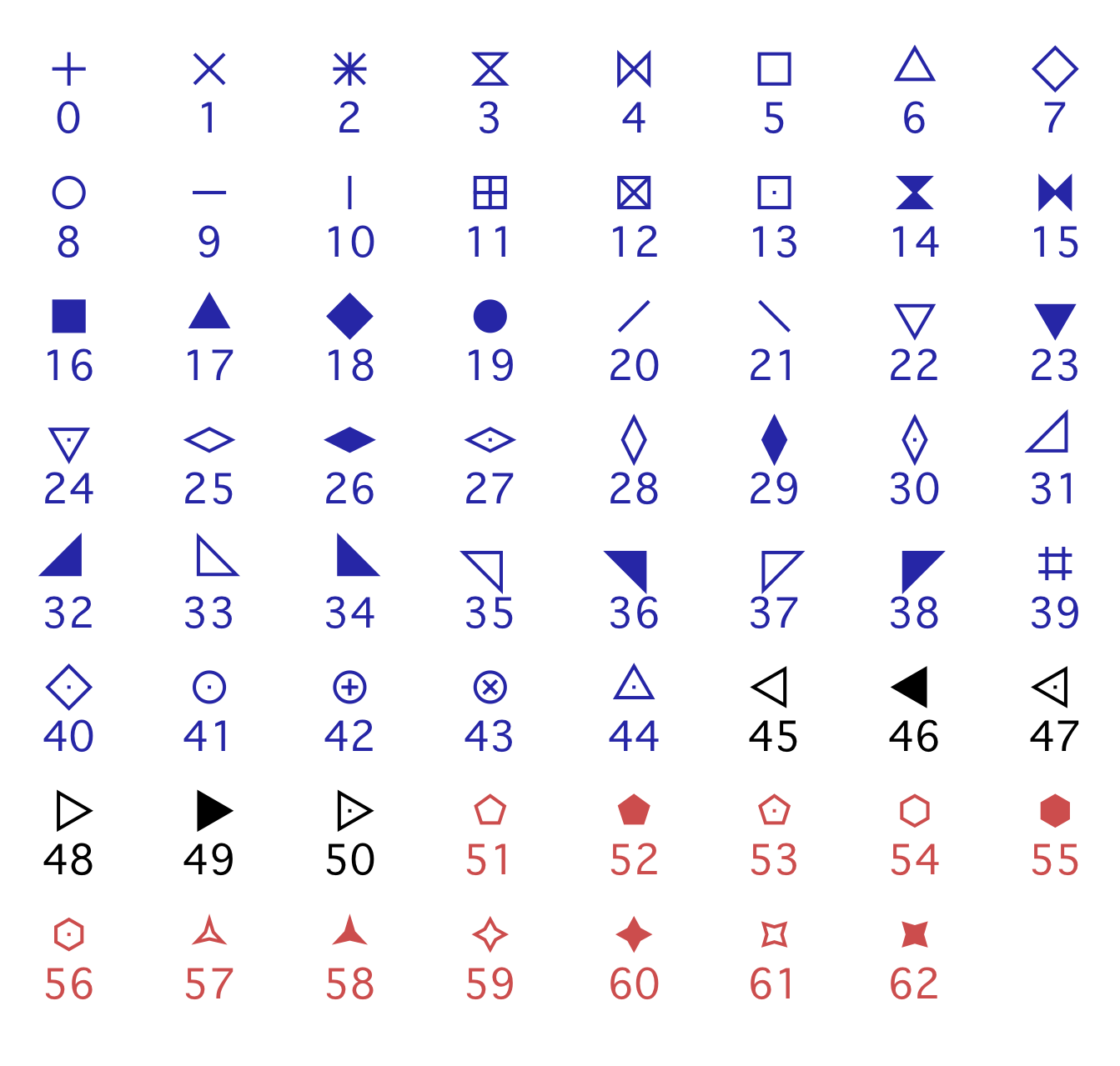
You can also create custom markers. See the SetWindow operation's markerHook keyword.
Marker Colors
Igor provides control of three colors for graph markers: the trace color, the stroke color and the fill color.
The trace color is simply the color selected for the trace overall and is the same for any trace mode.
The stroke color is the color of the lines making the outlines of the markers. By default the stroke color is the same as the trace color.
The fill color is used to fill the background space of hollow markers. By default there is no fill color so that you see background objects through the interiors of hollow markers.
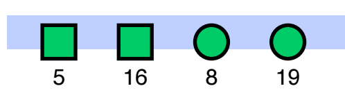
Here is a sample of some of Igor's markers with the trace color set to black, the marker size set to 10 and the marker stroke thickness set to 2 points. A blue rectangle is drawn beneath the markers:
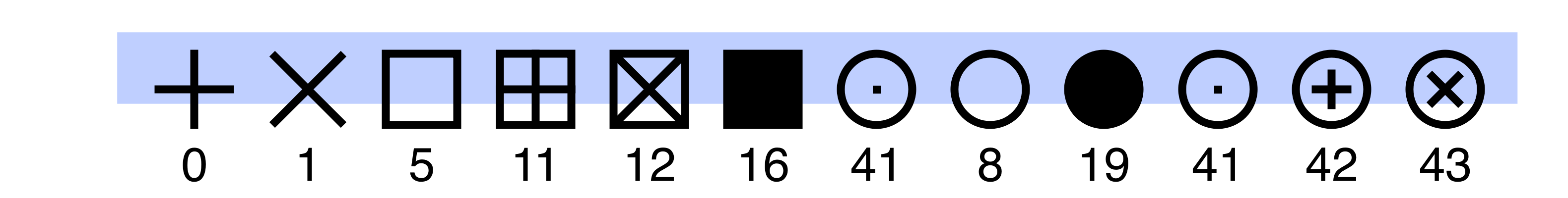
The blue rectangle shows through the interior of the hollow markers (5, 11, 12, 8, 41, 42, 43). The solid markers (16, 19) are solid black because the trace color is black.
You can set the stroke color using the Modify Trace Appearance dialog: turn on the Stroke checkbox and select a color. You can also use the command ModifyGraph mrkStrokeRGB. In the next figure, the stroke color was set to green using the command
ModifyGraph mrkStrokeRGB=(1,52428,26586)
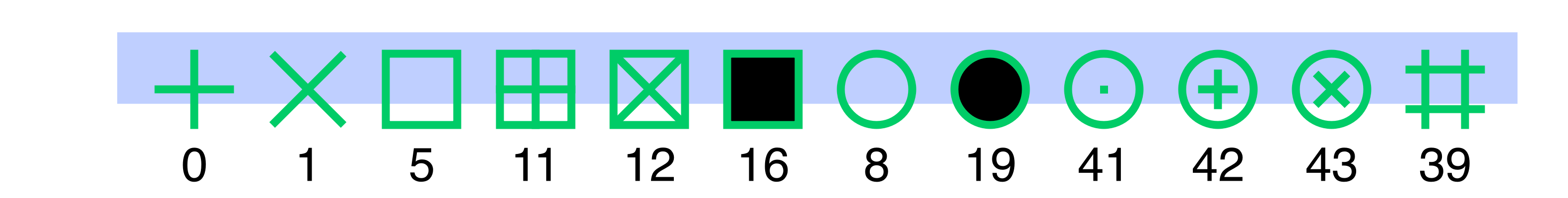
The stroke color overrides the trace color, so the outlines of all the markers are now green. The solid markers are black with green outlines.
You can choose to make the interiors of hollow markers opaque. In the Modify Trace Appearance dialog, turn on the Fill checkbox. The command is
ModifyGraph opaque=1
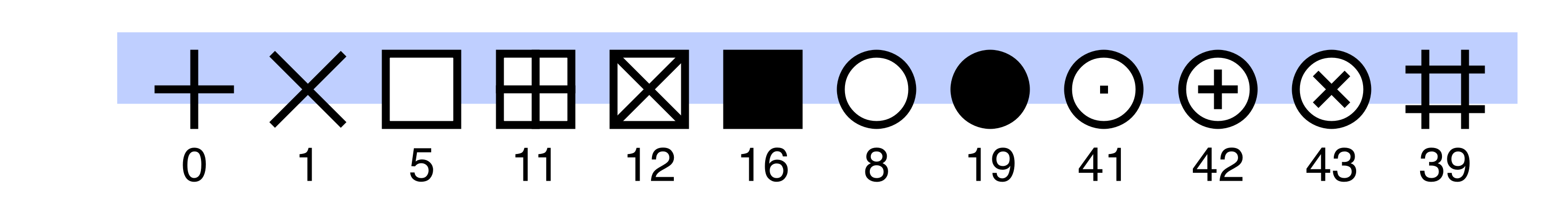
By default, the interior color of opaque hollow markers is white. You can change the interior color by selecting a fill color in the Modify Trace Appearance dialog or with the ModifyGraph mrkFillRGB keyword. Here the fill is set using the command
ModifyGraph mrkFillRGB=(1,52428,26586)
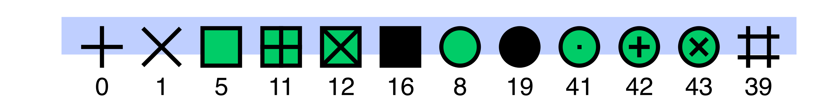
It is possible to achieve identical results by setting the stroke color of a solid marker or the fill color of a hollow marker, as in the following example.
Trace color set to green:
Now set the stroke color set to black, resulting in solid markers having a black outline and green interior:
Finally set the fill color to green resulting in hollow markers being filled with green:
Now the solid and hollow markers look the same. This is a historical oddity - the fill color could not be changed from white before Igor Pro 9.00. Before Igor 9, the hollow markers with interior markings, such as 11 or 42, could not be filled with a color.
Text Markers
In addition to the built-in drawn markers, you can also instruct Igor to use one of the following as text markers:
-
A single character from a font
-
The contents of a text wave
-
The contents of a numeric wave
A single character from a font is mainly of interest if you want to use a special symbol that is available in a font but is not included among Igor's built-in markers. The specified character is used for all data points.
The remaining options provide a way to display a third value in an XY plot. For example, a plot of earthquake magnitude versus date could also show the location of the earthquake using a text wave to supply text markers. Or, a plot of earthquake location versus date could also show the magnitude using a numeric wave to supply text markers. For each data point in the XY plot, the corresponding point of the text or numeric wave supplies the text for the marker. The marker wave must have the same number of points as the X and Y waves.
To create a text marker, choose the Markers or Lines and Markers display mode. Then click the Markers pop-up menu and choose the Text button. This leads to the Text Markers subdialog in which you can specify the source of the text as well as the font, style, rotation and other properties of the markers.
You can offset and rotate all the text markers by the same amount but you cannot set the offset and rotation for individual data points — use tags for that. You may find it necessary to experimentally adjust the X and Y offsets to get character markers exactly centered on the data points. For example, to center the text just above each data point, choose Middle bottom from the Anchor pop-up menu and set the Y offset to 5-10 points. If you need to offset some items differently from others, you will have to use tags (see Tags).
Igor determines the font size to use for text markers from the marker size, which you set in the Modify Trace Appearance dialog. The font size used is 3 times the marker size.
You may want to show a text marker and a regular drawn marker. For this, you will need to display the wave twice in the graph. After creating the graph and setting the trace to use a drawn marker, choose Graph→Append Traces to Graph to append a second copy of the wave. Set this copy to use text markers.
Arrow Markers
Arrow markers can be used to create vector plots illustrating flow and gradient fields, for example. Arrow markers are fairly special purpose and require quite a bit of advance preparation.
Here is a very simple example:
// Make XY data
Make/O xData = {1, 2, 3}, yData = {1, 2, 3}
Display yData vs xData					// Make graph
ModifyGraph mode(yData) = 3			// Marker mode

// Make an arrow data wave to control the length and angle for each point.
Make/O/N=(3,2) arrowData				// Controls arrow length and angle
Edit /W=(439,47,820,240) arrowData

// Put some data in arrowData
arrowData[0][0]= {20,25,30}    				// Column 0: arrow lengths in points
arrowData[0][1]= {0.523599,0.785398,1.0472}	// Column 1: arrow angle in radians

// Set trace to arrow mode to turn arrows on
ModifyGraph arrowMarker(yData) = {arrowData, 1, 10, 1, 1}

// Make an RGB color wave
Make/O/N=(3,3) arrowColor
Edit /W=(440,272,820,439) arrowColor

// Store some colors in the color wave
arrowColor[0][0]= {65535,0,0}			// Red
arrowColor[0][1]= {0,65535,0}			// Green
arrowColor[0][2]= {0,0,65535}			// Blue

// Turn on color as f(z) mode
ModifyGraph zColor(yData)={arrowColor,*,*,directRGB,0}
This demo experiment shows arrow markers in action:
Open the Arrow Plot demo experiment
See the reference for a description of the arrowMarker keyword under the ModifyGraph operation for further details.
Line Styles and Sizes
If you choose the "Lines between points", "Lines and markers", or Cityscape mode you can also choose the line style. You can change the dash patterns using the Dashed Lines item in the Line section.
For any mode except the Markers mode you can set the line size. The line size is in points and can be fractional. If the line size is zero, the line disappears.
For more information see Dashed Lines.
Fills
For traces in the Bars and "Fill to zero" modes, Igor presents a choice of fill type. The fill type can be None, which means the fill is transparent, Erase, which means the fill is white and opaque, Solid, or three patterns of gray. You can also choose a pattern from a palette and can choose the fill types and colors for positive going regions and negative going regions independently.
For more information see Fill Patterns and Gradient Fills.
Bars With Waveforms
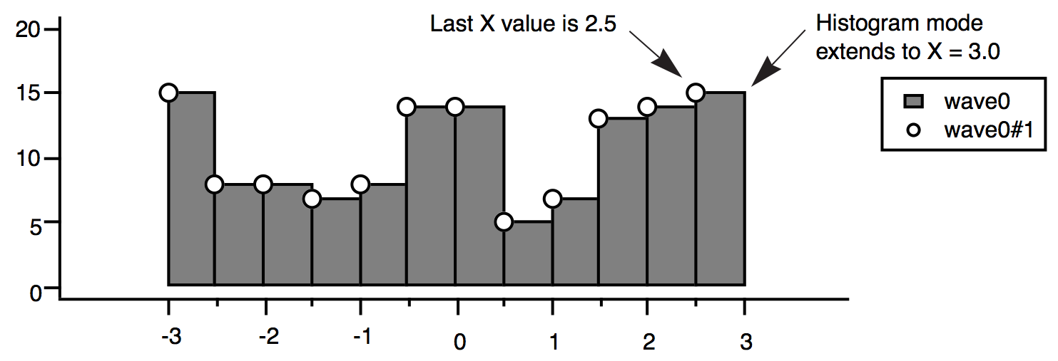
When Bars mode is used for a waveform plotted on a normal continuous X axis (rather than a category axis, see Category Plots), the X values are computed from the wave's X scaling. The bars are drawn from the X value for a given point up to but not including the X value for the next point. Such bars are commonly called "histogram bars" because they are usually used to show the number of counts in a histogram that fall between the two X values.
If you want your bars centered on their X values, then you should create a Category Plot, which is more suited for traditional bar charts (see Category Plots). You can, however, adjust the X values for the wave so that the flat areas appear centered about its original X value as for a traditional bar chart. One way to do this without actually modifying any data is to offset the trace in the graph by one half the bar width. You can just drag it, or use the Modify Trace Appearance dialog to generate a more precise offset command. In our example, the bars are 0.5 X units wide:
ModifyGraph offset(wave0)={-0.25,0}
Bars With XY Pairs
If your X axis is controlled by an XY pair, the width of each bar is determined by two X values. One X value provides the location of the left edge of the bar and the next X value provides the location of the right edge of the bar.
If you imagine a bar plot with one bar, this requires an XY pair with two points - one X value to set the left edge of the bar and the next X value to set the right edge.
Generalizing, for a bar plot with N bars, you need N+1 points in your X and Y waves. Here is an example using 3 XY points to produce two bars:
Make/O barX={0,1,3}, barY = {1,2,2}
Display barY vs barX
ModifyGraph mode=5, hbFill=4
SetAxis left 0,*
Grouping, Stacking and Adding Modes
For the four modes that normally draw to y=0 ("Sticks to zero", "Bars", "Fill to zero", and "Sticks and markers") you can choose variants that draw to the Y values of the next trace. The four variant modes are: "Sticks to next", "Bars to next", "Fill to next" and "Sticks&markers to next". Next in this context refers to the trace listed after (below) the selected trace in the list of traces in the Modify Trace Appearance and the Reorder Traces dialogs.
If you choose one of these four modes, Igor automatically selects "Draw to next" from the Grouping pop-up menu. Also use this menu to choose "Add to next" and "Stack on next" modes.
The Grouping pop-up menu in the Modify Trace Appearance dialog is used to create special effects such as layer graphs and stacked bar charts. The available modes are "None", "Keep with next", "Draw to next", "Add to next", and "Stack on next".
"Keep with next" is used only with category plots and is described in Category Plots.
"Draw to next" modifies the action of those modes that normally draw to y=0 so that they draw to the Y values of the next trace that is plotted against the same pair of axes as the current trace. The X values for the next trace should be the same as the X values for the current trace. If not, the next trace will not line up with the bottom of the current trace.
"Add to next" tells Igor to add the Y values of the current trace to the Y values of the next trace before plotting. If the next trace is also using "Add to next" then that addition is performed first and so on. When used with one of the four modes that normally draw to y=0, this mode also acts like "Draw to next".
"Stack on next" works just like "Add to next" except Y values are not allowed to backtrack. In other words, negative values act like zero when the Y value of the next trace is positive and positive values act like zero with a negative next trace.
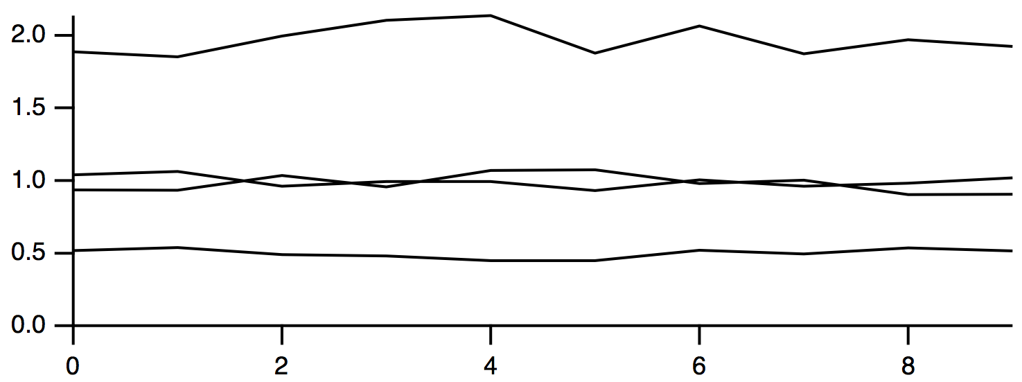
Here is a normal plot of a small sine wave and a bigger sine wave:
In this version, the small sine wave is set to "Add to next" mode:
And here we use "Stack on next":
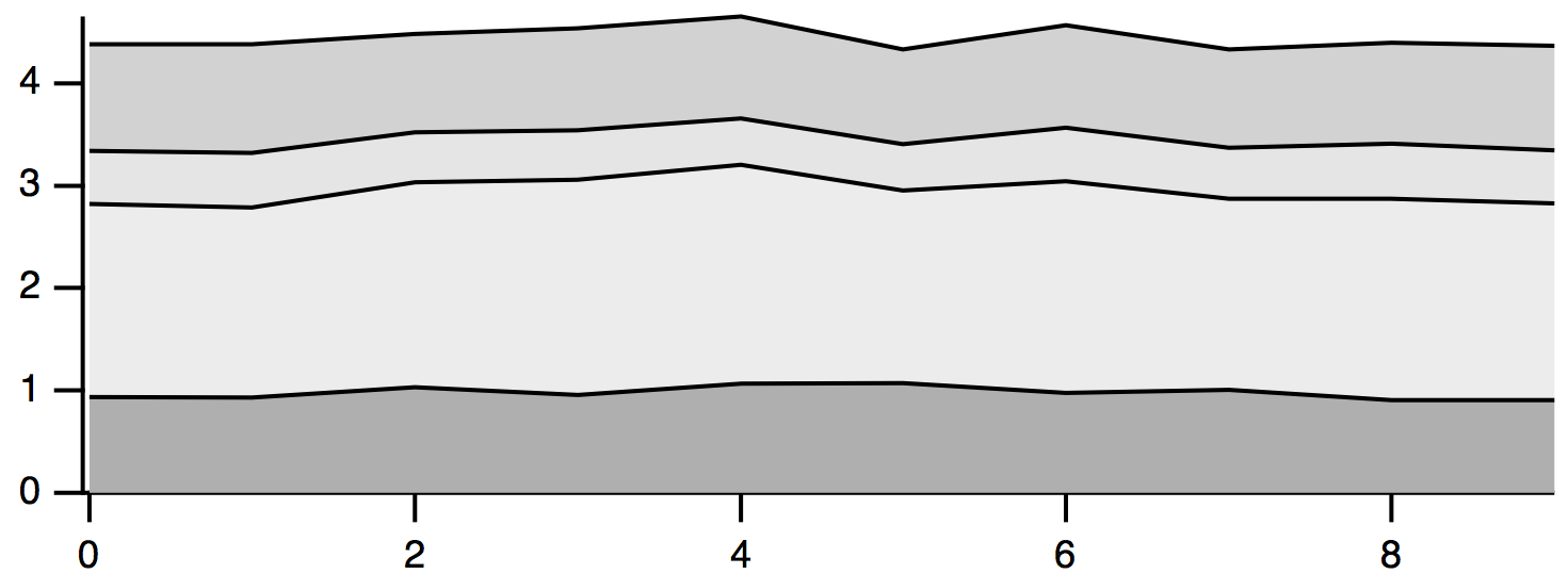
You can create layer graphs by plotting a number of waves in a graph using the fill to next mode. Depending on your data you may also want to use the add to next grouping mode. For example, in the following normal graph, each trace might represent the thickness of a geologic layer:
We can show the layers in a more understandable way by using fill to next and add to next modes:
Because the grouping modes depend on the identity of the next trace, you may need to adjust the order of traces in the graph. You can do this using the Reorder Traces dialog. Choose Graph→Reorder Traces. Select the traces you want to move. Adjust the order by dragging the selected traces up and down in the list, dropping them in the appropriate spot.
All of the waves you use for the various grouping, adding, and stacking modes should have the same numbers of points, X scaling, and should all be displayed using the same axes.
Trace Color
You can choose a color for the selected trace from the color pop-up palette of colors.
In addition to color, you can specify opacity using the color pop-up via the "alpha" property. An alpha of 1.0 makes the trace fully opaque. An alpha of 0.0 makes it fully transparent.
Setting Trace Properties from an Auxiliary (Z) Wave
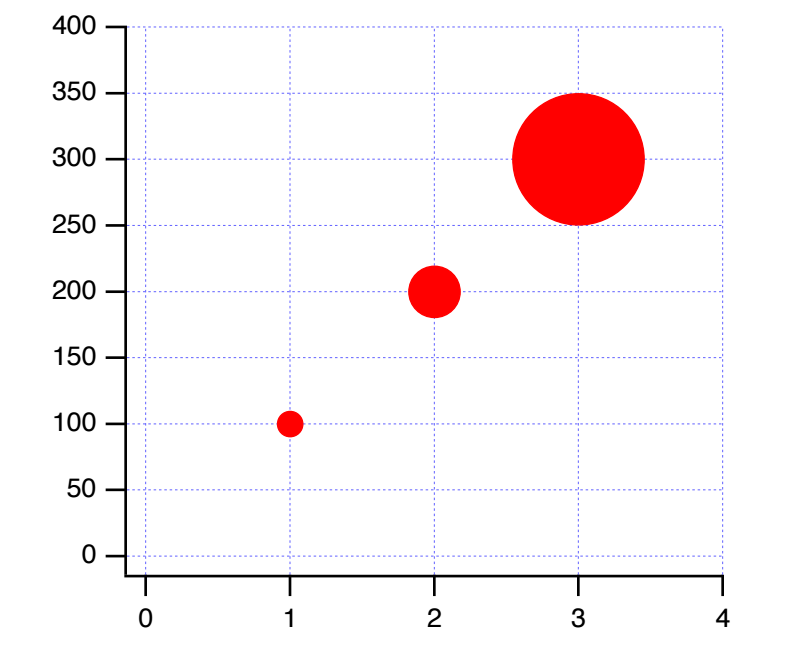
You can set the color, marker number, marker size, and pattern number of a trace on a point-by-point basis based on the values of an auxiliary wave. The auxiliary wave is called the "Z wave" because other waves control the X and Y position of each point on the trace while the Z wave controls a third property.
For example, you could position markers at the location of earthquakes and vary their size to show the magnitude of each quake. You could show the depth of the quake using marker color and show different types of quakes as different marker shapes.
To set a trace property to be a function of a Z wave, click the "Set as f(z)" button in the Modify Trace Appearance dialog to display the "Set as f(z)" subdialog.
Color as f(z)
Color as f(z) has four modes: Color Table, Color Table Wave, Color Index Wave, and Three or Four Column Color Wave. You select the mode from the Color Mode menu.
In Color Table mode, the color of each data point on the trace is determined by mapping the corresponding Z wave value into a built-in color table. The mapping is logarithmic if the Log Colors checkbox is checked and linear otherwise. The Log Colors option is useful when the zWave spans many decades and you want to show more detailed changes of the smaller values.
The zMin and zMax settings define the range of values in your Z wave to map onto the color table. Values outside the range take on the color at the end of the range. If you choose Auto for zMin or zMax, Igor uses the smallest or largest value it finds in your Z wave. If any of your Z values are NaN, Igor treats those data points in the same way it does if your X or Y data is NaN. This depends on the Gaps setting in the main dialog.
Color Table Wave mode is the same as Color Table mode except that the colors are determined by a color table wave that you provide instead of a built-in color table. See Color Table Waves for details.
In Color Index Wave mode, the color of data points on the trace is derived from the Z wave you choose by mapping its values into the X scaling of the selected 3-column color index wave, either linearly or logarithmically. This is similar to the way ModifyImage cindex maps image values (in place of the Z wave values) to a color in a 3-column color index matrix. See Indexed Color Details.
In Three or Four Column Color Wave mode, data points are colored according to Red, Green and Blue values in the first three columns of the selected wave. Each row of the three column wave controls the color of a data point on the trace. Use this mode for absolute control over the colors of each data point on a trace. If the wave has a fourth column, it controls opacity. See Direct Color Details for further information.
Color as f(z) Example
These commands use Color Table mode to color the points of a trace based on a Z wave.
Make/N=5 yWave = {1,2,3,2,1}
Display yWave
ModifyGraph mode=3, marker=19, msize=5
Make/N=5 zWave = {1,2,3,4,5}
ModifyGraph zColor(yWave)={zWave,*,*,YellowHot}
The commands generate this graph:
_Example_0.png)
If instead you create a three column wave and edit it to enter RGB values:
Make/N=(5,3) directColorWave
_Example_2.png)
You can use this wave to directly control the marker colors:
ModifyGraph zColor(yWave)={directColorWave,*,*,directRGB}
_Example_4.png)
Marker Size as f(z)
"Marker size as f(z)" works just like "Color as f(z)" in Color Table mode except the Z values map into the range of marker sizes that you define using the min and max marker settings.
This example presents a third value as a function of marker size:
Make/N=100 xData,yData,zData
xData=enoise(2); yData=enoise(2); zData=exp(-(xData^2+yData^2))
Display yData vs xData; ModifyGraph mode=3,marker=8
ModifyGraph zmrkSize(yData)={zData,*,*,1,10}
_1.png)
Marker Number as f(z)
In "Marker Number as f(z)" mode, you must create a Z wave that contains the actual marker numbers for each data point. See Markers for the marker number codes.
Marker Size as f(z) in Axis Units
In Igor Pro 9.00 or later, you can specify the marker size in units of an axis. For example:
Make/O xData2 = {1,2,3}
Make/O yData2 = {100,200,300}
Make/O zData2 = {10, 20, 50}
Display/W=(400,50,700,300) yData2 vs xData2
ModifyGraph mode=3, marker=19, msize=6		// Markers mode, filled circle marker
ModifyGraph grid=1
ModifyGraph nticks(left)=10
SetAxis left,0,400
SetAxis bottom,0,4
ModifyGraph zmrkSize(yData2)={zData2,*,*,6,10,left}
The last command sets the marker size to be controlled by the wave zData2 whose values are scaled to the left axis. For example, zData2[2] is 50 and sets the radius of the marker for point 2 of yData2 to be 50 units on the left axis. This produces this graph:
The axis specified can be any axis on the graph. If that axis is later removed, the marker size, the marker size goes back to the "no axis" state as if you never specified an axis.
When scaling marker sizes in axis units, the values that you specify for the zMin, zMax, mrkMin, and mrkMax parameters of the zmrkSize keyword have no impact on the marker size unless you remove the specified axis in which case those parameters control the trace's marker sizes.
If the marker size scale is independent of the scales of the axes against which the trace is plotted, you can use a free axis to show the scale. You do this by creating a free axis with the desired range and setting it as the axis for the zmrkSize keyword. See Types of Axes for a discussion of free axes.
If the axis that you specify is a log axis, the interpretation of Z values changes. Think of a conceptual axis of the same length in points as the log axis. Conceptually set the min and max of the conceptual axis to the log of the min and log of the max of the log axis. The marker size for a given Z value is the length of Z units on the conceptual axis. To help visualize this, you can create a free axis representing this conceptual axis.
Open the Marker Size in Axis Units demo experiment
Pattern Number as f(z)
In "Pattern Number as f(z)" mode, you must create a Z wave that contains the actual pattern numbers for each data point. See Fill Patterns for a list of pattern numbers.
Color as f(z) Legend Example
If you have a graph that uses the color as f(z) mode, you may want to create a legend that identifies what the colors correspond to. This section demonstrates using the features of the Legend operation for this purpose.
Execute these commands, one-at-a-time:
// Make test data
Make /O testData = {1, 2, 3}

// Display in a graph in markers mode
Display testData
ModifyGraph mode=3,marker=8,msize=5

// Create a normal legend where the symbol comes from the trace
Legend/C/N=legend0/J/A=LT "\\s(testData) First\r\\s(testData) Second\r\\s(testData) Third"

// Make a color index wave to control the marker color
Make /O testColorIndex = {0, 127, 225}

// Change the graph trace to use color as f(z) mode.
// Rainbow256 is the name of a built-in color table.
// The numbers 0 and 255 set the color index values that correspond to the
// first and last entries in the color table.
ModifyGraph zColor(testData)={testColorIndex,0,255,Rainbow256,0}

// Change the legend so that it shows the colors
Legend/C/N=legend0/J/A=LT "\\k(65535,0,0)\\W608 Red\r\\k(0,65535,0)\\W608 Green\r\\k(0,0,65535)\\W608 Blue"
The result is this graph:
_Legend_Exam_0.png)
The last command used the \W escape sequence to specify which marker to use in the legend (08 for the circle marker in this case) and the marker thickness (6 means 1.0 points).
The \k escape sequence specifies the color to use for stroking the marker specified by \W. You would use \K to specify the marker fill color. Colors are specified in RGB format where each component falls in the range 0 to 65535.
This example uses double-backslashes because a single backslash is an escape character in Igor literal strings. Since we want a backslash in the final text, because that is what Igor requires for \k and \W, we need to use a double-backslash in the literal strings.
If you were to enter the legend text in the Add Annotation dialog, you would use just a single backslash and the dialog would generate the requires command, with double-backslashes.
Trace Offsets
You can offset a trace in a graph in the horizontal or vertical direction without changing the data in the associated wave. This is primarily of use for comparing the shapes of traces or for spreading overlapping traces out for better viewing.
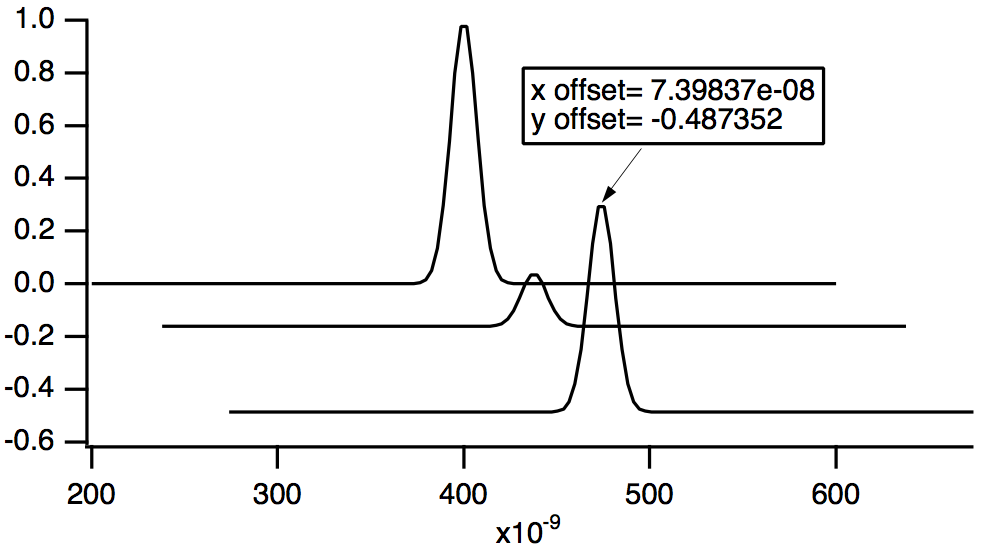
Each trace has an X and a Y offset, both of which are initially zero. If you check the Offset checkbox in the Modify Trace Appearance dialog, you can enter an X and Y offset for the trace.
You can also set the offsets by clicking and dragging in the graph. To do this, click the trace you want to offset. Hold the mouse down for about a second. You will see a readout box appear in the lower left corner of the graph. The readout shows the X and Y offsets as you drag the trace. If it doesn't take too long to display the given trace, you will be able to view the trace as you drag it around on the screen.
If you press Shift while offsetting a wave, Igor constrains the offset to the horizontal or vertical dimension.
You can disable trace dragging by pressing Caps Lock, which may be useful for trackball users.
Offsetting is undoable, so if you accidently drag a trace where you don't want it, choose Undo from the Edit menu.
It is possible to attach a tag to a trace that will show its current offset values. See Dynamic Escape Codes for Tags, for details.
If autoscaling is in effect for the graph, Igor tries to take trace offsets into account. If you want to set a trace's offset without affecting axis scaling, use the Set Axis Range item in the Graphs menu to disable autoscaling.
When offsetting a trace that uses log axes, Igor moves the trace by the same distance it does when the axis is not log. The shape of the trace is not changed — it is simply moved. If you were to try to offset a trace by adding a constant to the wave's data, it would distort the trace.
Trace Multipliers
In addition to offsetting a trace, you can also provide a multiplier to scale a trace. The effective value used for plotting is then multiplier * data + offset. The default value of zero means that no multiplier is provided, not that the data should be multiplied by zero.
With normal (not log) axes, you can interactively scale a trace using the same click and hold technique described for trace offsets. First you must place Cursor A somewhere on the trace to act as a reference point. Then, after entering offset mode by clicking the trace and holding, press Alt to adjust the multiplier instead of the offset. You can press and release the key as desired to alternate between scaling and offsetting.
With log axes, the trace multiplier provides an alternative method of offsetting a trace on a log axis (remember: log(a *b )=log(a )+log(b )). For compatibility reasons and because the trace offset method better handles switching between log and linear axis modes, Igor uses the multiplier method when you drag a trace only if the offset is zero and the multiplier is not zero (the default meaning "not set"). Consequently, to use the multiplier technique, you must use the command line or the Offset controls in the Modify Trace Appearance dialog to set a nonzero multiplier.1 is a good setting for this purpose.
Hiding Traces
You can hide a trace in a graph by checking the Hide Trace checkbox in the Modify Trace Appearance dialog. When you hide a trace, you can use the Include in Autoscale checkbox to control whether or not the data of the hidden trace should be used when autoscaling the graph.
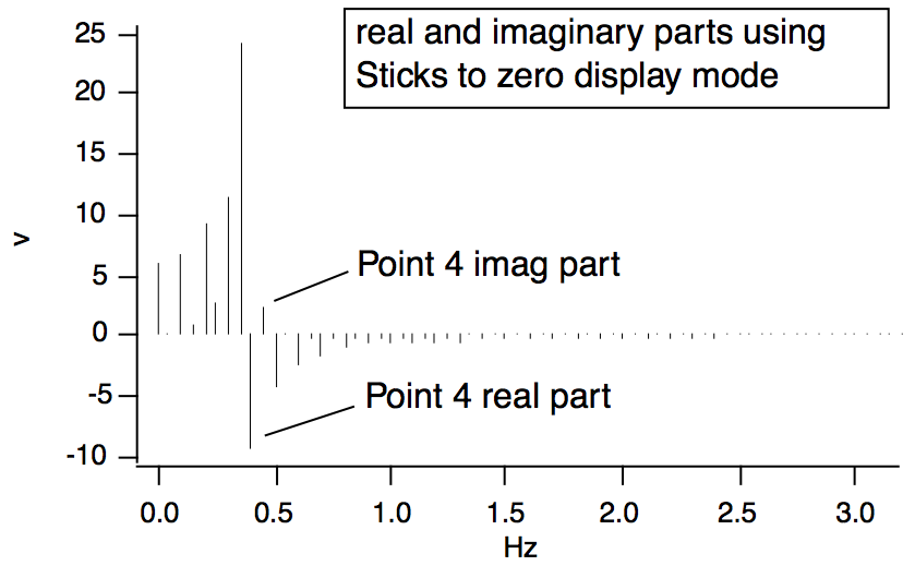
Complex Display Modes
When displaying traces for complex data you can use the Complex Mode pop-up menu in the Modify Trace Appearance dialog to control how the data are displayed. You can display the complex and real components together or individually, and you can also display the magnitude or phase.
The default display mode is Lines between points. To display a wave's real and imaginary parts side-by-side on a point-for-point basis, use the Sticks to zero mode.
Gaps
In Igor, a missing or undefined value in a wave is stored as the floating point value NaN ("Not a Number"). Normally, Igor shows a NaN in a graph as a gap, indicating that there is no data at that point. In some circumstances, it is preferable to treat a missing value by connecting the points on either side of it.
You can control this using the Gaps checkbox in the Modify Trace Appearance dialog. If this checkbox is checked (the default), Igor shows missing values as gaps in the data. If you uncheck the checkbox, Igor ignores missing values, connecting the available data points on either side of the missing value.
Error Bars
The Error Bars checkbox in the Modify Trace Appearance dialog adds error bars to the selected trace. When you select this checkbox or click the Options button, Igor presents the Error Bars subdialog.
Error bars are a style that you can add to a trace in a graph. Error values can be a constant number, a fixed percent of the value of the wave at the given point, the square root of the value of the wave at the given point, or they can be arbitrary values taken from other waves. In this last case, the error values can be set independently for the up, down, left and right directions.
Choose the desired mode from the Y Error Bars and X Error Bars pop-up menus.
The dialog changes depending on the selected mode. For the "% of base" mode, you enter the percent of the base wave. For the "sqrt of base" mode, you don't need to enter any further values. This mode is meaningful only when your data is in counts. For the "constant" mode, you enter the constant error value for the X or Y direction. For the "+/- wave" mode, you select the waves to supply the positive and negative error values.
If you select "+/- wave", pop-up menus appear from which you can choose the waves to supply the upper and lower or left and right error values. These waves are called error waves. The values in error waves should normally all be positive since they specify the length of the line from each point to its error bar. This is the only mode that supports single-sided error bars. Error waves do not have to have the same numeric type and length as the base wave. If the value of a point in an error wave is NaN then the error bar corresponding to that point is not drawn.
The Cap Width setting sets the width of the cap on the end of an error bar as an integral number of points. You can also set the cap width to "auto" (or to zero) in which case Igor picks a cap width appropriate for the size of the graph. In this case the cap width is set to twice the size of the marker plus one. For best results the cap width should be an odd number.
You can set the thickness of the cap and the thickness of the error bar. The units for these settings are points. These can be fractional numbers. Nonintegral thicknesses are properly produced when exporting or printing. If you set Cap Thickness to zero no caps are drawn. If you set Bar Thickness to zero no error bars are drawn.
If you enable the "XY Error box" checkbox then a box is drawn rather than an error bar to indicate the region of uncertainty. No box is drawn for points for which one or more of the error values is NaN.
Here is a simple example of a graph with error bars.
The top trace used the "+/- Wave" mode with only a +wave. The last value of the error wave was made negative to reverse the direction of the error bar.
Error Shading
In Igor Pro 7 or later, you can use shading in place of error bars. In the Error Bars subdialog, check the "Use shading instead of bars" checkbox to enable shading.
Shading mode fills between either the +error to -error levels or from +error to data and data to -error depending on the parameters used with the shade keyword.
These commands illustrate multiple and overlapping error shading with transparency:
Make/O/N=200 jack=sin(x/8), sam=cos(x/9) + (100-x)/30
Display /W=(64,181,499,520) jack,jack,sam
ModifyGraph lsize(jack)=0,rgb(sam)=(0,0,65535)
ErrorBars jack shade={0,0,(0,65535,0,10000),(0,0,0)},const=2
ErrorBars jack#1 shade={0,0,(0,65535,0,10000),(0,0,0)},const=1
ErrorBars sam shade={0,0,(65535,0,0,10000),(0,0,0)},const=1
Shading does not work with the old GDI graphics technology. See Graphics Technology for details.
These commands illustrate different +error and -error shading as well as the use of pattern:
Make/O jack=sin(x/8)
Display /W=(64,181,499,520) jack
ErrorBars jack shade={0,73,(0,65535,0),(0,0,65535),11,(65535,0,0),(0,65535,0)},const=0.5
See the shade keyword for the ErrorBars operation for details.
Error Ellipses
In Igor Pro 9.00 and later, you can specify error ellipses instead of bars or boxes. Error ellipses show both X and Y errors along with correlation between X and Y.
You must provide the data for error ellipses via a three-column wave with a row for each data point. This wave is labelled Ellipse Wave in the Error Bars dialog. It is identified by ewave=ew in the ErrorBars operation.
Each row of ew contains information for the error ellipse for one data point. The interpretation of the columns of ew depends on the mode, labelled Data Type in the ErrorBars dialog and identified by the mode parameter of the ELLIPSE keyword in the ErrorBars operation.
| mode = 0: | ew contains the standard deviation in X, the standard deviation in Y, and the correlation between X and Y. | |
| mode = 1: | ew contains the variance in X, the variance in Y, and the covariance of X and Y. | |
When specified via the ErrorBars operation ew, may include a subrange specification so long as it results in effectively a 2D wave with three columns and a row for each trace data point. See Subrange Display Syntax.
Error Ellipse Color
The color of each error ellipse is taken from the color of the data point to which the ellipse is attached. Usually that is simply the trace color. You can change the color of individual data points and their corresponding ellipses using the trace Color as f(z), or by point customization (see Customize at Point).
You can specify the opacity of all error ellipses for a given trace using the Fill Alpha setting in the Error Bars dialog which ranges from 0 (fully transparent) to 1.0 (fully opaque). This specifies the fill color alpha for all error ellipses, overriding the data points' alpha. In the ErrorBars operation, you specify alpha as a value from 0 (fully transparent) to 65535 (fully opaque) using the ELLIPSE keyword. For background information on alpha, see RGBA Values.
Error Ellipse Example
This example illustrates the use of error ellipses:
Function ErrorEllipseDemo()
	Make/O/N=5 data = 5*sin(x)
	Display data
	ModifyGraph mode=3, marker=19	// Markers mode, solid circle marker

	Make/O/N=(5,3) ellipseData		// Error ellipse parameters

	// Column 0: Standard deviation in X
	ellipseData[0][0]={0.944527,1.19611,0.32858,1.64494,1.71742}

	// Column 1: Standard deviation in Y
	ellipseData[0][1]={0.357613,0.680198,0.665561,0.581878,0.948245}

	// Column 2: Correlation in X and Y. Must be in the range [-1, 1].
	ellipseData[0][2]={0.562396,0.707809,0.396551,-0.516456,0.554322}

	ErrorBars data, ELLIPSE={0, .95, .3*65535}, ewave=ellipseData

	// Make point 2 blue
	ModifyGraph rgb(data[2])=(0,0,65535)
End
Customize at Point
You can customize the appearance of individual points on a trace in a graph displayed in bar, marker, dot and lines to zero modes. To do this interactively, right-click the desired point on a trace and choose Customize at Point→Customize at Point from the contextual menu. The Modify Trace dialog appears with an entry in the trace list shown with the point number in square brackets. When such an entry is selected, only those properties that can be customized are shown in the dialog.
You can remove customizations for a single point by right-clicking on the point and selecting Customize at Point→Remove Customization Here. You can remove all customizations from a trace by right-clicking on the trace and choosing Customize at Point→Remove Customizations from Trace.
Modifying Axes
You can modify the style of presentation of each axis in a graph by choosing Graph→Modify Axis or by double-clicking an axis. This displays the Modify Axis dialog.
The dialog has tabs for various aspects of axis appearance, plus a few controls outside the tabs. These global controls include the standard Igor dialog controls: Do It, To Cmd Line, To Clip, Help and Cancel buttons, plus a box to display the commands generated by the dialog. At the top are the Axis pop-up menu and the Live Update checkbox.
The Axis pop-up menu shows all axes that are in use in the top graph. Select the axis that you want to change from the Axis menu, or select Multiple Selection if you want to affect more than one axis. Below the Multiple Selection item are items that provide shortcuts for selecting certain classes of axes.
You select the appropriate tab for the types of changes you want to make. The dialog provides these tabs:
| Axis Tab | Auto/Man Ticks Tab | Ticks and Grids Tab | ||
| Tick Options Tab | Axis Label Tab | Label Options Tab | ||
| Axis Range Tab | ||||
Axis Tab
You can set the axis mode for the selected axis to linear, log base 10, log base 2, or Date/Time.
The Date/Time mode is special. When drawing an axis, Igor looks at the controlling wave's units to decide if it should be a date/time axis. Consequently, if you select Date/Time axis, the dialog immediately changes the units of the controlling wave. See Date/Time Axes for details on how date/time axes work.
The Standoff checkbox controls offsetting of axes. When standoff is on, Igor offsets axes so that traces do not cover them:
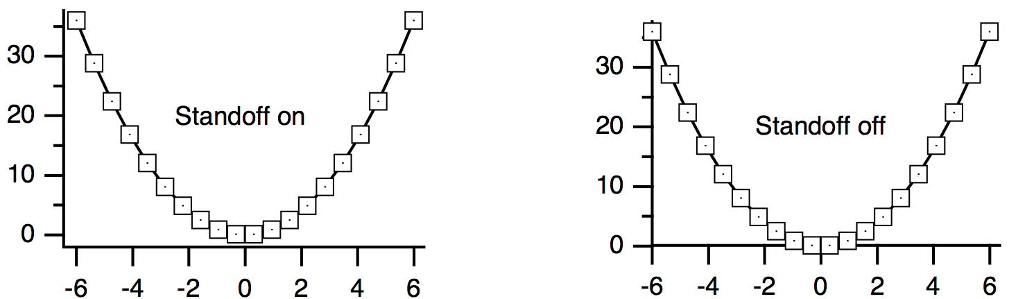
If a free axis is attached to the same edge of the plot rectangle as a normal axis then the standoff setting for the normal axis is ignored. This is to make it easy to create stacked plots.
Use the Mirror Axis pop-up menu to enable the mirror axis feature. A mirror axis is an axis that is the mirror image of the opposite axis. You can mirror the left axis to the right or the bottom axis to the top. The normal state is Off in which case there is no mirror axis. If you select On from the pop-up menu, you get a mirror axis with tick marks but no tick mark labels. If you select No Ticks, you get a mirror axis with no tick marks. If you select Labels you get a mirror axis with tick marks and tick mark labels. Mirror axes may not do exactly what you want when using free axes, or when you shorten an axis using Draw Between. An embedded graph may be a better solution if free axes don't do what you need; see Embedding and Subwindows.
Free axes can also have mirror axes. Unlike the free axis itself, the mirror for a given free axis cannot be moved — it is always attached to the opposite side of the plot area. This feature is provided for the creation of stacked plots; see Creating Stacked Plots.
The "Draw between" items are used to create stacked graphs. You will usually leave these at 0 and 100%, which tells Igor to draw the axis along the entire length or width of the plot area. You could use 50% and 100% to draw the left axis over only the top half of the plot area (mirror axes are on in this example to indicate the plot area):
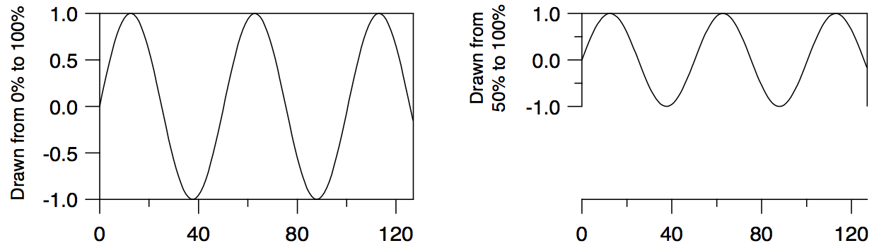
For additional examples using "Draw between", see Creating Stacked Plots and Creating Split Axes.
The Offset setting provides a way to control the distance between the edge of the graph and the axis. It specifies the distance from the default axis position to the actual axis position. This setting is in units of the size of a zero character in a tick mark label. Because of this, the axis offset adjusts reasonably well when you change the size of a graph window. The default axis offset is zero. You can restore the axis offset to zero by dragging the axis to or beyond the edge of the graph. If you enter a graph margin (see Overall Graph Properties), the margin overrides the axis offset.
Normally you will adjust the axis offset by dragging the axis in the graph. If the mouse is over an axis, the cursor changes to a double-ended arrow indicating that you can drag the axis. If the axis is a mirror axis you will not be able to drag it and the cursor will not change to the double-ended arrow.
The Offset setting does not affect a free axis. To adjust the position of a free axis, use the settings in the Free Position section.
The Thickness setting sets the thickness of an axis and associated tick marks in points. The thickness can be fractional and if you set it to zero the axis and ticks disappear.
The free position can be adjusted by dragging the axis interactively. This is the recommended way to adjust the position when using the absolute distance mode but it is not recommended when using the "crossing at" mode. This is because the crossing value as set interactively will not be exact. You should use the Free Position controls to specify an exact crossing value.
The Font section of the Axis tab specifies the font, font size, and typeface to be used for the tick labels and the axis label. You should leave this setting at "default" unless you want this particular axis to use a font different from the rest of the graph. You can set the default font for all graphs using the Default Font item in the Misc menu. You can set the default font for a particular graph using the Modify Graph item in the Graph menu. The axis label font can be controlled by escape codes within the axis label text. See Axis Labels.
Colors of axis components are controlled by items in the Color area.
Auto/Man Ticks Tab
The items in the Auto/Man Ticks tab control the placement of tick marks along the axis. You can choose one of three methods for controlling tick mark placement from the pop-up menu at the top of the tab.
Choose Auto Ticks to have Igor compute nice tick mark intervals using some hints from you.
Choose Computed Manual Ticks to take complete control over the origin and interval for placing tick marks. See Computed Manual Ticks for details.
Choose User Ticks from Waves to take complete control over tick mark placement and labelling. The information for placing and labelling tick marks is taken from waves. See User Ticks from Waves for details.
In Auto Ticks mode, you can specify a suggested number of major ticks for the selected axis by entering that number in the Approximately parameter box. The actual number of ticks on the axis may vary from the suggested number because Igor juggles several factors to get round number tick labels with reasonable spacing in a common numeric sequence (e.g., 1, 2, 5). In most cases, this automatically produces a correct and attractive graph. The Approximately parameter is not available if the selected axis is a log axis.
You can turn minor ticks on or off for the selected axis using the Minor Ticks checkbox.
The Minimum Sep setting controls the display of minor ticks if minor ticks are enabled. If the distance between minor ticks would be less than the specified minimum tick separation, measured in points, then Igor picks a less dense ticking scheme. For log axes Minor Ticks and Tick Separation affect the drawing of subminor ticks.
Ticks and Grids Tab
The Ticks and Grids tab provides control over tick marks, tick mark labels, and grid lines.
Exponential Labels
When numbers that would be used to label tick marks become very large or very small, Igor switches to exponential notation, displaying small numbers in the tick mark labels and a power of 10 in the axis label. The use of the power of 10 in the axis label is covered under Axis Labels. In the case of log axes, the tick marks include the power.
With the Low Trip and High Trip settings, you can control the point at which tick mark labels switch from normal notation to exponential notation. If the absolute value of the larger end of the axis is between the low trip and the high trip, then normal notation is used. Otherwise, exponential is used. However, if the exponent would be zero, normal notation is always used.
There are actually two independent sets of low trip and high trip parameters: one for normal axes and one for log axes. The low trip point can be from 1e-38 to 1 and defaults to 0.1 for normal axes and to 1e-4 for log axes. The high trip point can be from 1 to 1e38 and defaults to 1e4.
Under some circumstances, Igor may not honor your setting of these trip points. If there is no room for normal tick mark labels, Igor will use exponential notation, even if you have requested normal notation.
The Engineering and Scientific radio buttons allow you to specify whether tick mark labels should use engineering or scientific notation when exponential notation is used. It does not affect log axes. Engineering notation is just exponential notation where the exponent is always a multiple of three.
With the Exponent Prescale setting, you can force the tick and axis label scaling to values different from what Igor would pick. For example, if you have data whose X scaling ranges from, say, 9pA to 120pA and you display this on a log axis, Igor will label the tick marks with 10pA and 100pA. But if you really want the tick marks labeled 10 and 100 with pA in the axis label, you can set Exponent Prescale to 12. For details, see Axis Labels.
Date/Time Tick Labels
The Date/Time Tick Labels area of the Ticks and Grids tab is explained under Date/Time Axes.
Tick Dimensions
You can control the length and thickness of each type of tick mark and the location of tick marks relative to the axis line using items in the Tick Dimensions area. Igor distinguishes four types of tick marks: major, minor, "fifth", and subminor:
The tick mark thicknesses normally follow the axis thickness. You can override the thickness of individual tick types by replacing the word "Auto" with your desired thickness specified in fractional points. A value of zero is equivalent to "Auto".
The tick length is normally calculated based on the font and font size that will be used to label the tick marks. You can enter your own values in fractional points. For example you might enter a value of 6 for the major tick mark, 3 for the minor tick mark and 4.5 for the 5th or emphasized minor tick marks. The subminor tick mark only applies to log axes.
The Location pop-up menu specifies that tick marks for the selected axis be outside the axis, crossing the axis or inside the axis or you can specify no tick marks for the axis at all.
Grid
Choose Off from the Grid pop-up menu if you do not want grid lines. Choose On for grid lines on major and minor tick marks. Choose Major Only for grid lines on major tick marks only.
Igor provides five grid styles identified with numbers 1 through 5. Different grid styles have major and minor grid lines that are light, heavy, dotted or solid. If the style is set to zero (the default) and the graph background is white then grid style 2 is used. If the graph background is not white then grid style 5 is used.
Use the Grid Color palette to set the color of the grid lines. They are by default light blue.
The examples here show graphs with thicker than normal axis lines and the thickest grid lines:
Using the settings "Draw from" and "to" you can restrict the length of the grid lines. This is useful if you have used the similar settings on the Axis tab to shorten one of your axes, and you want grid lines to match.
Zero Line
You can control the zero line for the selected axis using the Zero Line checkbox.
The zero line is a line perpendicular to the axis extending across the graph at the point where the value of the axis is zero. The Zero Line checkbox is not available for log axes.
If you turn the zero line on then you will be able to select the line style from the Style pop-up menu. The thickness of the line can be set in fractional points from 0 to 5. The zero line has the same color as the axis.
Tick Options Tab
The Tick Options tab provides fine control over tick marks and tick mark labels.
The Enable/Inhibit section allows you to limit tick marks to a specific range and to suppress specific tick marks.
The Log Ticks section provides control over minor tick marks and labels on log axes.
The Tick Label Tweaks section provides the following settings:
| Checkbox | Result |
|---|---|
| Thousands separator | Draws tick labels like 10000 as 10,000. |
| Zero is 0 | Select this to force the zero tick mark to be drawn as 0 where it would ordinarily be drawn as 0.0 or 0.00. |
| No trailing zeroes | Tick labels that would normally be drawn as 1.50 or 2.00 are drawn as 1.5 or 2. |
| No leading zero | Select if you want tick labels such as 0.5 to be drawn as .5 |
| Tick Unit Prefix is Exponent | If tick mark would have prefix and units (mTorr), force to exponential notation (10-6 Torr). |
| No Units in Tick Labels | If tick mark would have units, suppress them. |
| Units in Every Tick Label | If normal axis, force exponent or prefix and units into each label. |
Axis Label Tab
See Axis Labels.
Label Options Tab
The Label Options tab provides control of the placement and orientation of axis and tick mark labels. You can also hide these labels completely.
Normally, you will adjust the position of the axis label by simply dragging it around on the graph. The "Axis label position" or "Axis label margin" and the "Axis label lateral offset" settings are useful when you want precise numeric control over the position.
The calculations used to position the axis label depend on the setting in the Label Position Mode menu. By default this is set to Compatibility, which will work with older versions of Igor. The other modes may allow you to line up labels on multiple axes more accurately. The choice of positioning mode affects the meaning of the three settings below the menu.
In Compatibility mode, the method Igor uses to position the axis label depends on whether or not a free axis is attached to the given plot rectangle edge. If no free axis is attached then the label position is measured from the corresponding window edge. We call this the axis label margin. Thus if you reposition an axis the axis label will not move. On the other hand, if a free axis is attached to the given plot rectangle edge then the label position is measured from the axis and when you move the axis, the label will move with it.
Because the method used to set the axis label varies depending on circumstances, one or the other of the "Axis label margin" or "Axis label position" settings may be unavailable. If you have selected an axis on the same edge as a free axis, the "Axis label position" setting is made available. If you have selected an axis that does not share an edge with a free axis, the "Axis label margin" setting is made available. If you have selected multiple axes it is possible for both settings to be available.
The axis label position is the distance from the axis to the label and is measured in points.
The axis label margin is the distance from the edge of the graph to the label and is measured in points. The default label margin is zero which butts the axis label up against the edge of the graph.
The margin modes measure relative to an edge of the graph while the axis modes measure relative to the position of the axis. Using an axis mode causes the label to follow a free axis when you move the axis. The margin modes are useful for aligning labels on stacked graphs. The "Axis label margin" setting applies to margin modes while the "Axis label position" setting applies to axis modes.
The absolute modes measure distance in points. Scaled modes have similar numerical values but are scaled to respond to changes in the font size.
The Labels pop-up menu controls which labels are drawn. On gives normal axis labeling. Axis Only leaves the axis label in place but removes the tick mark labels. Off removes the axis labels and tick mark labels.
Axis and Tick label rotations can be set to any value between -360 and 360 degrees.
Axis Range Tab
See Scaling Graphs.
Manual Ticks
If Igor's automatic selection of ticks does not suit you, and you can't find any adjustments that make the tick marks just the way you want them, Igor provides two methods for specifying the tick marks yourself. On the Auto/Man Ticks tab of the Modify Axis dialog, you can select either Computed Manual Ticks, or User Ticks from Waves.
Computed Manual Ticks
Use Computed Manual Ticks to enter a numeric specification of the increment between tick marks and the starting point for calculating where the tick marks fall. This style of manual ticking is available for normal axes and for date/time axes. It is not available for normal log axes but is available in LogLin mode.
When you choose Computed Manual Ticks, the corresponding settings in the Auto/Man Ticks tab become available.
If you click the "Set to auto values" button, Igor sets all of the items in the Compute Manual Ticks section to the values they would have if you let Igor automatically determine the ticking. This is usually a good starting point.
Using the "Canonic tick" setting, you specify the value of any major tick mark on the axis. Using the "Tick increment" setting, you specify the number of axis units per major tick mark. Both of these numbers are specified as a mantissa and an exponent. The canonic tick is not necessarily the first major tick on the axis. Rather, it is a major tick on an infinitely long axis of which the axis in the graph is a subset. That is, it can be any major tick whether it shows on the graph or not.
When you use computed manual ticks on a large range logarithmic axis in LogLin mode, the settings in the dialog refer to the exponent of the tick value.
Imagine that you want to show the temperature of an object as it cools off. You want to show time in seconds but you want it to be clear where the integral minutes fall on the axis. You would turn on manual ticking for the bottom axis and set the canonic tick to zero and the tick increment to 60. You could show the half and quarter minute points by specifying three minor ticks per major tick ("Number per major tick" in the Minor Ticks section) with every second minor tick emphasized ("Emphasize every" setting). This produces the following graph:
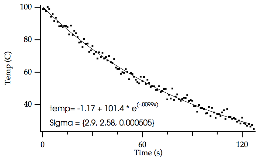
Now, imagine that you want to zoom in on t = 60 seconds.
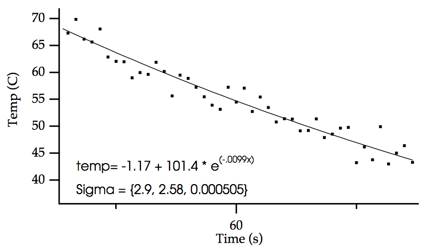
The canonic tick, at t = 0, does not appear on the graph but it still controls where major ticks appear.
User Ticks from Waves
With Computed Manual Ticks you have complete control over ticking as long as you want equally-spaced ticks. If you want to specify your own ticking on a normal log axis, or you want ticks that are not equally spaced, you need User Ticks from Waves.
The first step in setting up User Ticks from Waves is to create two waves: a 1D numeric wave and a text wave. Numbers entered in the numeric wave specify the positions of the tick marks in axis units. The corresponding rows of the text wave give the labels for the tick marks.
Perhaps you want to plot data as a function of Tm/T (melting temperature over temperature, but you want the tick labels to be at nice values of temperature. Starting with this data:
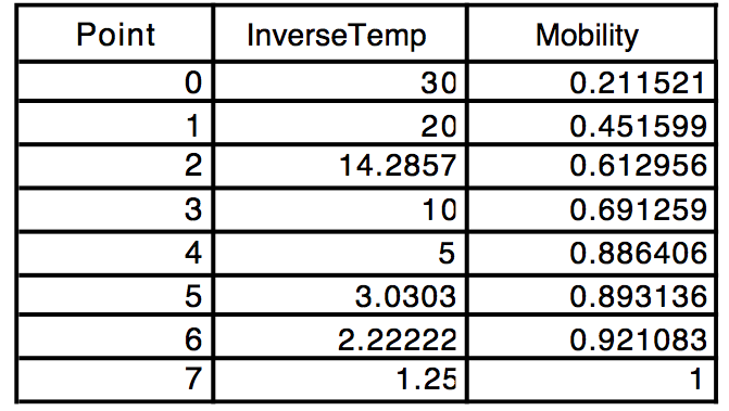
you might have this graph:
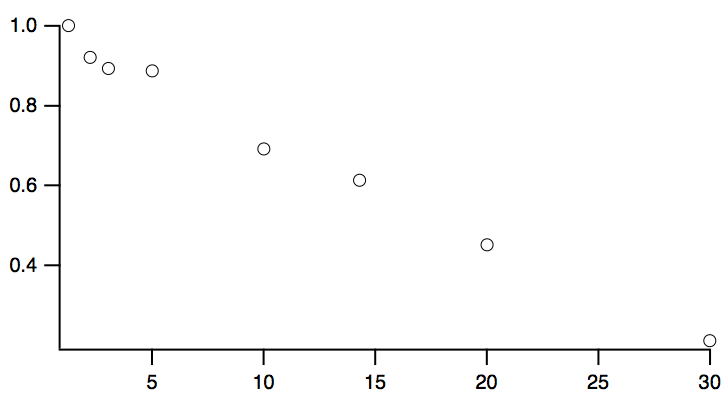
Create the waves for labelling the axes:
Make/N=5 TickPositions
Make/N=5/T TickLabels
Assuming that Tm is 450 degrees and that you have determined that tick marks at 20, 30, 50, 100, and 400 degrees would look good, you would enter these numbers in the text wave, TickLabels. At this point, a convenient way to enter the tick positions in the TickPositions wave is a wave assignment that embodies the relationship you think is appropriate:
TickPositions = 450/str2num(TickLabels)
Note that the str2num function was used to interpret the text in the label wave as numeric data. This only works, of course, if the text includes only numbers.
Finally, double-click the bottom axis to bring up the Modify Axis dialog, select the Auto/Man Ticks tab and select User Ticks from Waves. Select the TickPositions and TickLabels waves.
The result is this graph:
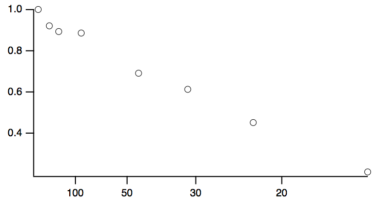
You can add other text to the labels, including special marks. For instance:
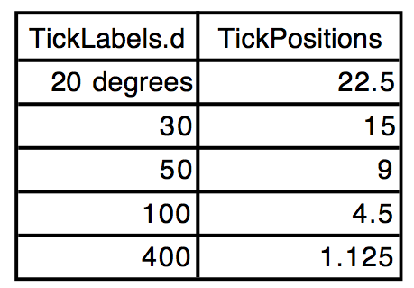
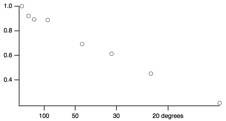
Finally, you can add a column to the text wave and add minor, subminor and emphasized ticks by entering appropriate keywords in the other column. To add a column to a wave, select Redimension Waves from the Data menu, select your text wave in the list and click the arrow. Then change the number of columns from 0 to 2.
This extra column must have the column label 'Tick Type'. For instance:
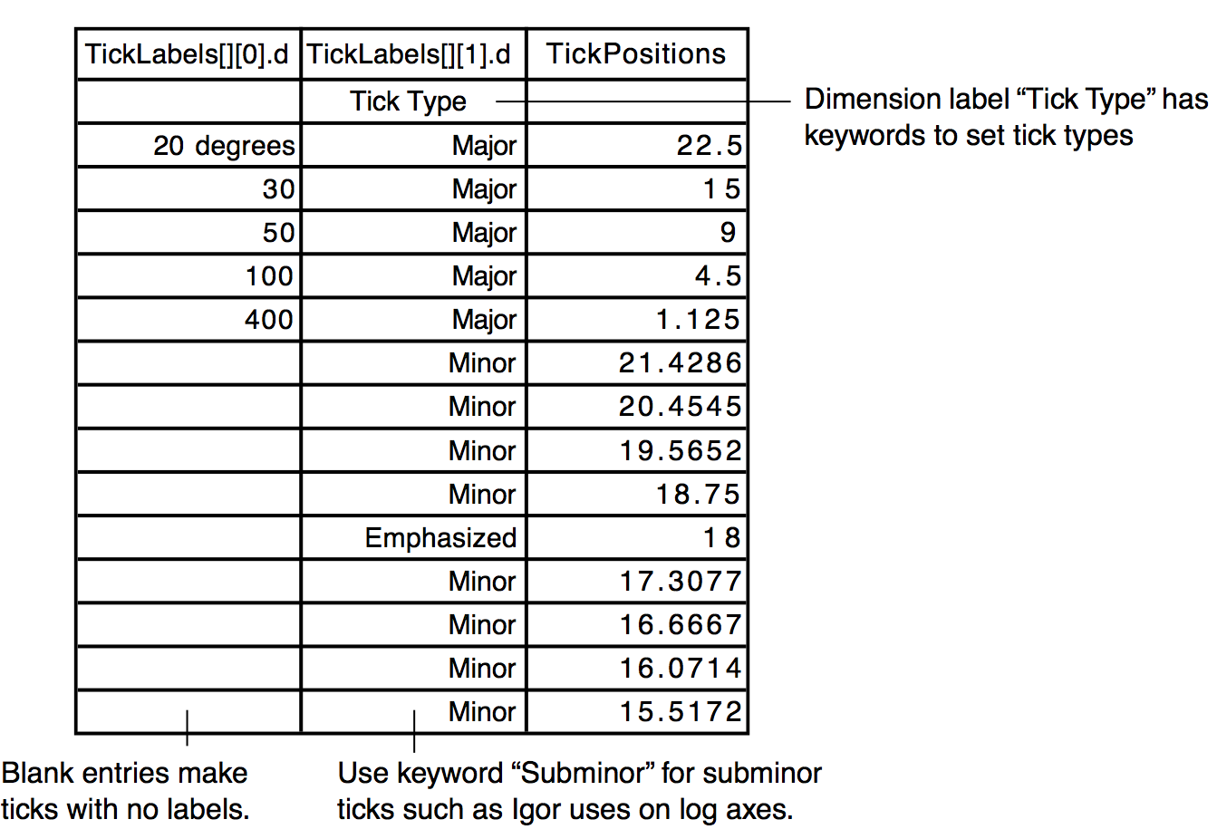
Dimension labels allow you (or Igor) to refer to a row or column of a wave using a name rather than a number. Thus, the Tick Type column doesn't have to be the second column (that is, column 1). For instructions on showing dimension labels in a table, see Showing Dimension Labels.
An easy way to get started is to let the Modify Axis dialog generate waves for you. Double-click the axis for which you want user ticks. Click the Auto/Man Ticks tab and select User Ticks from Waves from the pop-up menu. Click the New from Auto Ticks button. Igor immediately generates waves with names of the form <graphname>_<axisname>_labels and <graphname>_<axisname>_values and selects them in the Labels and Locations pop-up menus. Click Do It. If you now edit the generated waves, the ticks in the graph will change. You can achieve the same thing programmatically using the TickWavesFromAxis operation.
Log Axes
To create a logarithmic axis, set the axis mode to Log in the Axis tab of the Modify Axis dialog.
Computed manual ticks and zero lines are not supported for normal log axes.
Igor has three ways of ticking a log axis that are used depending on the range (number of decades) of the axis: normal, small range and large range. The normal mode is used when the number of decades lies between about one third to about ten. The exact upper limit depends on the physical size of the axis and the font size.
If the number of decades of range is less than two or greater than five, you can force Igor to use the small/large range methods by checking the LogLin checkbox. When you do this, all of the settings of a linear axis are enabled including manual ticking.
Here is a normal log axis with a range of 0.5 to 30:
If we zoom into a range of 1.5 to 4.5 we get this:

But if we then check the LogLin checkbox, we get better results:

Selecting a log axis makes the Log Ticks box in the Tick Options tab available.
The "Max log cycles with minor ticks" setting controls whether minor ticks appear on a log axis. This setting can range from 0 to 20 and defaults to 0. If it is 0 or "auto", Igor automatically determines if minor ticks are appropriate. Otherwise, if the axis has more decades than this number, then the minor ticks are not displayed. Minor ticks are also not displayed if there is not enough room for them.
Similarly, you can control when Igor puts labels on the minor ticks of a log axis using the "Max log cycles with minor tick labels" item. This is a number from 0 to 8. 0 disables the minor tick labels. As long as the axis has fewer decades than this setting, minor ticks are labeled.
Date/Time Axes
In addition to numeric axes, Igor supports axes labeled with dates, times or dates and times.
Dates and date/times are represented in Igor as the number of seconds since midnight, January 1, 1904.
In Igor, a date cannot be accurately represented in a single precision wave. Make sure you use double precision waves to store dates and date/times. (A single precision wave can provide dates and date/times calculated from its X scaling, but not from its data values.)
For further discussion of how Igor represents dates, see Date/Time Waves.
Times without dates can be thought of in two ways: as time-of-day times and as elapsed times.
Time-of-day times are represented in Igor as the number of seconds since midnight.
Elapsed times are represented as a number of seconds in the range -9999:59:59 to +9999:59:59. For integral numbers of seconds, this range of elapsed times can be precisely represented in a signed 32-bit integer wave. A single-precision floating point wave can precisely represent integral-second elapsed times up to about +/-4600 hours.
Igor displays dates or times on an axis if the appropriate units for the wave controlling the axis is "dat". This is case-sensitive — "Dat" won't work. You can set the wave's units using the Change Wave Scaling item in the Data menu, or the SetScale operation.
To make a horizontal axis a date or time axis for a waveform graph, you must set the X units of the wave controlling the axis to "dat". For an XY graph you must set the data units of the wave supplying the X coordinates for the curve to "dat". To make the vertical axis a date or time axis in either type of graph, you must set the data units of the wave controlling the axis to "dat".
If you choose Date/Time as the axis mode in the Axis tab of the Modify Axis dialog, the dialog sets the appropriate wave units to "dat".
For Igor to display an axis as date or time, the following additional restrictions must be met: the axis must span at least 2 seconds and both ends must be within the legal range for a date/time value. If any of these restrictions is not met, Igor displays a single tick mark.
When an axis is in the date/time mode, the Date/Time Tick Labels box in the Ticks and Grids tab of the Modify Axis dialog is available.
From the Time Format pop-up menu, you can select Normal, Military, or Elapsed. Use Normal or Military for time-of-day times and Elapsed for elapsed times. In normal mode, the minute before midnight is displayed as 11:59:00 PM and midnight is displayed as 12:00:00 AM. In military mode, they are displayed as 23:59:00 and 00:00:00.
Elapsed mode can display times from -9999:59:59 to +9999:59:59. This mode makes sense if the values displayed on the axis are actually elapsed times (e.g., 23:59:00). It makes no sense and will display no tick labels if the values are actually date/times (e.g., 7/28/93 23:59:00).
Custom Date Formats
In the short, long and abbreviated modes, dates are displayed according to system date/time settings. If you select Other from the Date Format pop-up menu, a dialog is displayed giving you almost complete control over the format of the tick labels. The dialog allows you to choose from a variety of built-in formats or to create a fully custom format.
Depending on the extent of the axis, the tick mark labels may show date or date and time. You can suppress the display of the date when both the date and time are showing by checking the Suppress Date checkbox. This checkbox is irrelevant when you choose the elapsed time mode in which dates are never displayed.
Date/Time Example
The following example shows how you can create a date/time graph of a waveform whose Y values are temperature and whose X values, as set via the SetScale operation, are dates:
// Make a wave to contain temperatures for the year
Make /N=365 temperature		// single precision data values

// Set its scaling so X values are dates
Variable t0, t1
t0 = Date2Secs(2000,1,1); t1 = Date2Secs(2001,1,1)
SetScale x t0, t1, "dat", temperature 	 // double-precision X scaling

// Enter the temperature data in the wave's Y values
t0 = Date2Secs(2000,1,1); t1 = Date2Secs(2000,3,31) 		// winter
temperature(t0, t1) = 32					// it's cold
t0 = Date2Secs(2000,4,1); t1 = Date2Secs(2000,6,30) 		// spring
temperature(t0, t1) = 65					// it's nice
t0 = Date2Secs(2000,7,1); t1 = Date2Secs(2000,9,31)		// summer
temperature(t0, t1) = 85					// it's hot
t0 = Date2Secs(2000,10,1); t1 = Date2Secs(2000,12,31)		// fall
temperature(t0, t1) = 45					// cold again

// Smooth the data out
CurveFit sin temperature
temperature= K0+K1*sin(K2*x+K3)

// Graph the wave
Display temperature
SetAxis left, 0, 100;Label left "temp"
Label bottom "2000"
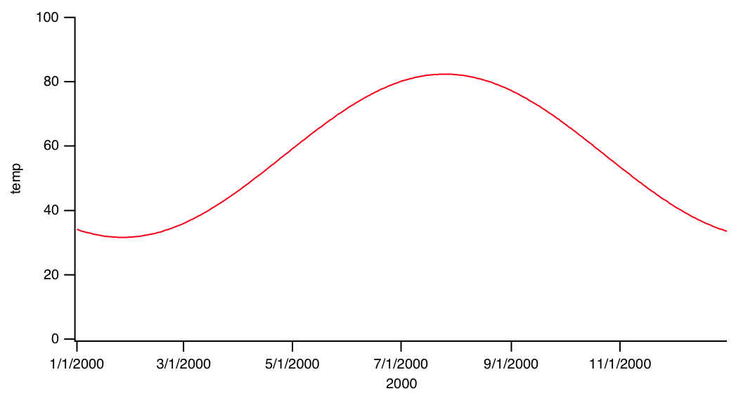
The SetScale operation sets the temperature wave so that its X values span the year 2000. In this example, the date/time information is in the X values of the wave. X values are always double precision. The wave itself is not declared double precision because we are storing temperature information, not date/time information in the Y values.
Manual Ticks for Date/Time Axes
Just as with regular axes, there are times when Igor's automatic choices of ticks for date/time axes simply are not what you want. For these cases, you can use computed manual ticks with date/time axes.
To use computed manual ticks, display the Modify Axis dialog by double-clicking the axis, or by choosing Graph→Modify Axis. Select the Auto/Man Ticks tab, and select Computed Manual Ticks from the menu in that tab.
The first step is to click the Set to Auto Values button. Choose Date, Time, or Date&Time from the pop-up menu below the Canonic Tick setting. Choose the units for the Tick Increment setting and enter an increment value.
Fake Axes
It is sometimes necessary to create an axis that is not related to the data in a simple way. One method uses free axes that are not associated with a wave (see NewFreeAxis). The Transform Axis package uses this technique to make a mirror axis reflecting a different view of the data. An example would be a mirror axis showing wave number to go with a main axis showing wavelength. For an example, choose File→Example Experiments→Graphing Techniques→Transform Axis Demo.
Another technique is to use Igor's drawing tools to create fake axes. For an example, choose File→Example Experiments→Graphing Techniques→New Polar Graph Demo or File→Example Experiments→Graphing Techniques→Ternary Diagram Demo.
Axis Labels
The text for an axis label in a graph can come from one of two places. If you specify units for the wave which controls an axis, using the Change Wave Scaling dialog, Igor uses these units to label the axis. You can override this labeling by explicitly entering axis label text in the Axis Label tab of the Modify Axis dialog.
To display the dialog, choose Graph→Label Axis or double-click an axis label. Select the axis that you want to label from the Axis pop-up menu and then enter the text for the axis label in the Axis Label area. Further label formatting options are available in the Label Options Tab.
There are two parts to an axis label: the text for the label and the special effects such as font, font size, superscript or subscript. You specify the text by typing in the Axis Label area. At any point in entering the text, you can choose a special effect from a pop-up menu in the Insert area.
The Label Preview area shows what the axis label will look like, taking the text and special effects into account. You cannot enter text in the preview. You can also see your label on the graph if you check the Live Update checkbox.
Axis Label Escape Codes
When you choose a special effect, Igor inserts an escape code in the text. An escape code consists of a backslash character followed by one or more characters. It represents the special effect you selected. The escape codes are cryptic but you can see their effects in the Label Preview box.

You can insert special effects at any point in the text by clicking at that point and choosing the special effect from the Insert pop-ups.
Choosing an item from the Font pop-up menu inserts a code that changes the font for subsequent characters in the label. The font pop-up also has a "Recall font" item. This item is used to make elaborate axis labels. See Elaborate Annotations.
Choosing an item from the Font Size pop-up menu inserts a code that changes the font size for subsequent characters in the label. The font size pop-up also has a "Recall size" item used to make elaborate axis labels.
Axis Label Special Effects
The Special pop-up menu includes items for controlling many features including superscript, subscript, justification, and text color as well as items for inserting special characters, markers and pictures.
The Store Info, Recall Info, Recall X Position, and Recall Y Position items are used to create elaborate annotations. See Elaborate Annotations.
The most commonly used items are Superscript, Subscript and Normal. To create a superscript or subscript, use the Special pop-up menu to insert the desired code, type the text of the superscript or subscript and then finish with the Normal code. For example, suppose you want to create an axis label that reads "Phase space density (s3m-6)". To do this, type "Phase space density (s", choose the Superscript item from the Special pop-up menu, type "3", choose Normal, type "m", choose Superscript, type "-6", choose Normal and then type ")". See Annotations for a complete discussion of these items.
The "Wave controlling axis" item inserts a code that prints the name of the first wave plotted on the given axis.
The Trace Symbol submenu inserts a code that draws the symbol used to plot the selected trace.
The Character submenu presents a palette from which you can special characters to add to the axis label.
The Marker submenu inserts a code to draw a marker symbol. These symbols are independent of any traces in the graph.
Axis Label Units
The items in the Units pop-up menu insert escape codes that allow you to create an axis label that automatically changes when the extent of the axis changes.
For example, if you specified units for the controlling wave of an axis, you can make those units appear in the axis label by selecting the Units item from the Units pop-up menu. If appropriate Igor will automatically add a prefix (µ for micro, m for milli, etc.) to the label and will change the prefix appropriately if the extent of the axis changes. The extent of the axis changes when you explicitly set the axis or when it is autoscaled.
If you choose the Scaling or Inverse Scaling items from the Units pop-up menu, Igor automatically adds a power of 10 scaling (x103, x106, etc.) to the axis label if appropriate and changes this scaling if the extent of the axis changes. The Trial Exponent buttons determine what power is used only in the label preview so you can see what your label will look like under varying axis scaling conditions. Both of these techniques can be ambiguous — it is never clear if the axis has been multiplied by the scale factor or if the units contain the scale factor.
A less ambiguous method is to use the Exponential Prefix escape code. This is identical to the Scaling code except the "x" is missing. You can then use it in a context where it is clear that it is a multiplier of units. For example, if your axis range is 0 to 3E9 in units of cm/s, typing "Speed, \ucm/s" would create "Speed, 109cm/s".
It is common to parenthesize scaling information in an axis label. For example the label might say "Joules (x106)". You can do this by simply putting parentheses around the Scaling or Inverse Scaling escape codes. If the scaling for the axis turns out to be x100 Igor omits it and also omits the parentheses so you get "Joules" instead of "Joules (x100)" or "Joules()".
If you do not specify scaling but the range of the axis requires it, Igor labels one of the tick marks on the axis to indicate the axis scaling. This is an emergency measure to prevent the graph from being misleading. You can prevent this from happening by inserting the Manual Override escape code, \u#2, into your label. No scaling or units information will be added at the location of the escape code or on the tick marks.
The situation with log axes is a bit different. By their nature, log axes never have to be scaled and units/scaling escape codes are not used in axis labels. If the controlling wave for a log axis has units then Igor automatically uses the units along with the appropriate prefix for each major tick mark label.
Annotations in Graphs
Annotations include textboxes, legends and tags. A tags is a form of textbox that is attached to a specific data point. You can add text annotation to a graph by selecting the Graph→Add Annotation. This displays the Add Annotation dialog. If text annotation is already on the graph you can modify it by double-clicking on it. This displays the Modify Annotation dialog. See Annotations for details.
Info Panel and Cursors
You can display an information panel ("info panel" for short) for a graph by choosing Graph→Show Info. An info panel displays a precise readout of values for waves in the graph. To remove the info panel from a graph while the graph is the target window choose Graph→Hide Info.
You can use up to five different pairs of cursors (AB through IJ). To control which pairs are available, click the gear icon and select cursor pairs from the Show Cursor Pairs submenu.
Cursors provide a convenient way to specify a range of points on a wave which is of particular interest. For example, if you want to do a curve fit to a particular range of points on a wave you can start by putting cursor A on one end of the range and cursor B on the other. Then you can summon the Curve Fitting dialog from the Analysis menu. In this dialog on the Data Options tab there is a range control. If you click the "cursors" button then the range of the fit will be set to the range from cursor A to cursor B.
Using Cursors
When you first show the info panel, the cursors are at home and not associated with any wave. The slide control is disabled and the readout area shows no values.
To activate a cursor, click it and drag it to the desired point on the wave whose values you want to examine. Now the cursor appears on the graph and the cursor's home icon turns black indicating that the cursor is active. The name of the wave which the cursor is on appears next to the cursor's name. You can drag the cursor to any point on a trace or image plot.
To move the cursor by one element, use the arrow keys on the keyboard. If the cursor is on a trace, you can use the left and right arrow keys. If it is on an image, you can use the left, right, up, and down arrow keys. If you press Shift plus an arrow key, the cursor moves 10 times as far.
If the cursor is on a trace, you can drag the slide control left or right. If it is on an image, you can drag it in any direction.
If you have both cursors of a pair on the graph and both are active, then the slide control moves both cursors at once. If you want to move only one cursor you can use the mouse to drag that cursor to its new location. Another way to move just one cursor is to deactivate the cursor that you don't want to move. You do this by clicking in the cursor's home icon. This makes the home icon change from black to white indicating that the cursor is not active. Then the slide control moves only the active cursor.
You can also move both cursors of a pair at once by dragging. With both cursors on the graph, press the Shift key before clicking and dragging one of the cursors.
When you use the mouse to drag a cursor to a new location, Igor first searches for the trace the cursor is currently attached to. Only if the new location is not near a point on the current trace are all the other traces searched. You can use this preferential treatment of the current trace to make sure the cursor lands on the desired trace when many traces are overlapping in the destination region.
You can attach a cursor to a particular trace by right-clicking the cursor home icon and choosing a trace name from the pop-up menu.
To remove a cursor from the graph, drag it outside the plot area or right-click the cursor home icon and choose Remove Cursor.
Free Cursors
By default, cursors are attached to a particular point on a trace or to a particular element of an image plot. By contrast, you can move a free cursor anywhere within plot area of the graph. To make a cursor free, right-click the cursor home icon in the info panel and choose Style→Free from the resulting pop-up menu.
Cursor Styles
By default, cursors A and B are displayed in the graph using a circular icon for A and a square icon for B. For all other cursors, the default style is a cross. You can change the style for any cursor by right-clicking the cursor home icon in the info panel and using the resulting pop-up menu.
You can create a cursor style function which you can invoke later to apply a given set of cursor style settings. Right-click the cursor home icon in the info panel and, from the resulting pop-up menu, choose Style→Style Function→Save Style Function. Igor creates a cursor style function in the built-in procedure window. You can edit the function to give it a more meaningful name than the default name that Igor uses.
To apply your style function to a cursor, right-click the cursor home icon in the info panel and choose Style→Style Function→<Your style Function>.
Programming With Cursors
These functions and operations are useful for programming with cursors.
The ShowInfo and HideInfo operations show and hide the info panel.
The Cursor operation sets the position of a cursor. It can also be used to change characteristics of the cursor such as the color, hair style, and number of digits used in the Graph Info Panel display.
The CsrInfo function returns information about a cursor.
These functions return the current position of a cursor:
These functions return information about the wave to which a cursor is attached, if any:
CsrWave CsrWaveRef CsrXWave CsrXWaveRef
The CursorStyle keyword marks a user-defined function for inclusion in the Style Function submenu of the cursor pop-up menu.
The section Cursors - Moving Cursor Calls Function explains how to trigger a user-defined function when a cursor is moved.
Identifying a Trace
Igor can display a tooltip that identifies a trace when you hover the mouse over it. To enable this mode, choose Graph→Show Trace Info Tags.
Subrange Display
In addition to displaying an entire wave in a graph, you can specify a subrange of the wave to display. This feature is mainly intended to allow the display of columns of a matrix as if they were extracted into individual 1D waves but can also be used to display other subsets or to skip every nth data point.
To display a subrange of a wave using the New Graph and Append Traces dialogs, you must be in the more complex version of the dialogs which appears when you click the More Choices button. Select your Y wave and optionally an X wave and click the Add button. This adds the trace to the list below. You can then edit the subrange parameters in the list.
Subrange Display Syntax
The Display, AppendToGraph and ReplaceWave operations support the following subrange syntax for a wave list item:
wave [rdspec ][rdspec ][rdspec ][rdspec ]
where rdspec is a range or dimension specification expressed as dimension indices (point numbers for 1D waves). For an n-dimensional wave, enter n specifications and omit the rest.
Only one rdspec can be a range spec. The others must be a single numeric element index or dimension label value.
You can enter [] or [*] to indicate the entire range of a dimension, or [start,stop] for a contiguous subrange, or [start,stop;inc], where start , stop , and inc are dimension indices. Entering * for stop is the same as entering the index of the last element in the dimension.
For example:
Make/N=100 w1D = p
Display w1D[0,*;10]						// Display every tenth point
ModifyGraph mode=3, marker=19
Make/N=(10,8) w2D = p + 10*q
Display w2D[0][0,*;2]					// Display every other column of row 0
ModifyGraph mode=3, marker=19
The subrange syntax rules can be restated as:
-
Only one dimension specifier can contain the range to be displayed.
Legal syntax for range is:
| [] or [*] | Entire dimension | |
| [start,stop] | Subrange | |
| stop may be * | ||
| stop must be >= start | ||
| The range is inclusive | ||
| [start,stop;inc] | Subrange with specified positive increment | |
-
Other dimensions must contain a single numeric index or dimension label using % syntax.
Legal syntax for nonrange specifier is:
| [index] | Element specified by numeric index | |
| [%label] | Element specified by dimension label | |
- Unspecified higher dimensions are treated as if [0] was specified.
For non-XY plots, the X-axis label uses the dimension label (if any) for the active dimension (the one with a range).
When cursors or tags are placed on a subranged trace, the point number used is the virtual point number as if the subrange had been extracted into a 1D wave.
Subrange syntax is also supported for waves used with error bars and with color, marker size and marker number as f(Z). These correspond to the ErrorBars operation with the wave keyword and to the ModifyGraph operation with the zmrkSize, zmrkNum, and zColor keywords.
Subrange Display Limitations
In category plots, the category wave (the text wave) may not be subranged. Waves used to specify text using ModifyGraph textMarker mode may not be subranged.
Subranged traces may not be edited using the draw tools (i.e., option click on the edit poly icon in the tool palette on a graph).
Waterfall plots may not use subranges.
When multiple subranges of the same wave are used in a graph, they are distinguished only using instance notation and not using the subrange syntax. For example, given display
w[][0],w[][1],
you must use
ModifyGraph mode(w#0)=1,mode(w#1)=2
and not
ModifyGraph mode(w[][0])=1,mode(w[][1])=2
as you might expect.
The trace instance and subrange used to plot given trace is included in trace info information. See Identifying a Trace.
Printing Graphs
Before printing a graph you should set the page size and orientation using the Page Setup dialog. Choose Page Setup from the Files menu. Often graphs are wider than they are tall and look better when printed using the horizontal orientation.
When you invoke the Page Setup dialog you must make sure that the graph that you want to print is the top window. Igor stores one page setup in each experiment for all graphs and stores other page setups for other types of windows. You can set the default graph page setup for new experiments using the Capture Graph Preferences dialog.
To print a graph, choose File→Print while the graph is the active window. You can also choose File→Print Preview to display a preview.
Graphs by default print at the same size as the graph window unless they do not fit in which case they are scaled down at the same aspect ratio.
Prior to Igor Pro 7, the Print dialog supported scaling modes such as Fill Page and Same Aspect. These are no longer available in the Print dialog. You can use PrintSettings with the graphMode and graphSize keywords prior to printing to achieve the same effects.
Printing Poster-Sized Graphs
Using the PrintGraphs operation, you can specify a size for a graph that is too big for a single sheet of paper. When you do this, Igor uses multiple sheets of paper to print the graph. Use this to make very large, poster-sized printouts.
To make the multiple sheets into one big poster, you need to trim the edges of the sheets and tape them together. Igor prints tiny alignment marks on the edges so you can line the pages up. You should trim the unneeded borders so that the alignment marks are flush against the edge of the trimmed sheet. Then align the sheets so that the alignment marks butt up against each other. All of the alignment marks should still be visible. Then tape the sheets together.
Other Printing Methods
You can also print graphs by placing them in page layouts. See Page Layouts for details.
You can print graphs directly from macros using the PrintGraphs operation.
Save Graph Copy
You can save the active graph as an Igor packed experiment file by choosing File→Save Graph Copy. The main uses for saving as a packed experiment are to save an archival copy of data or to prepare to merge data from multiple experiments (see Merging Experiments). The resulting experiment file preserves the data folder hierarchy of the waves displayed in the graph starting from the "top" data folder, which is the data folder that encloses all waves displayed in the graph. The top data folder becomes the root data folder of the resulting experiment file. Only the graph, its waves, dashed line settings, and any pictures used in the graph are saved in the packed experiment file, not procedures, variables, strings or any other objects in the experiment.
Save Graph Copy does not work well with graphs containing controls. First, the controls may depend on waves, variables or FIFOs (for chart controls) that Save Graph Copy will not save. Second, controls typically rely on procedures which are not saved by Save Graph Copy.
Save Graph Copy does not know about dependencies. If a graph contains a wave, wave0, that is dependent on another wave, wave1 which is not in the graph, Save Graph Copy will save wave0 but not wave1. When the saved experiment is open, there will be a broken dependency.
The SaveGraphCopy operation provides options that are not available using the Save Graph Copy menu command.
Exporting Graphs
You can export a graph to another application through the clipboard or by creating a file. To export via the clipboard, choose Edit→Export Graphics. To export via a file, choose File→Save Graphics.
The process of exporting graphics from a graph is very similar to exporting graphics from a layout. Because of this, we have put the details in Exporting Graphics (Windows). These sections describe the various export methods you can use and how to choose a method that will give you the best results
Creating Graphs with Multiple Axes
This section describes how to create a graph that has many axes attached to a given plot edge. For example:
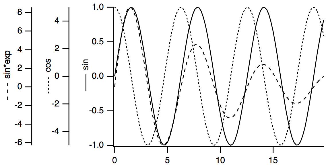
To create this example we first created some data:
Make/N=100 wave1,wave2,wave3; SetScale x,0,20,wave1,wave2,wave3
wave1=sin(x); wave2=5*cos(x); wave3=10*sin(x)*exp(-0.1*x)
We then followed these steps:
-
Use the New Graph dialog to display the following:
wave1 versus the built-in left axis and the built-in bottom axis
wave2 versus a free left axis, L1, and the built-in bottom axis
wave3 versus another free left axis, L2, and the built-in bottom axis
Use the Axis pop-up menu under the Y Waves list to create the L1 and L2 axes.
-
Use the Modify Graph dialog to set the left margin to 1.5 inches.
This moves the built-in left axis to the right, creating room for the free axes.
-
Drag the L1 axis to the left of the left axis.
-
Drag the L2 axis to the left of the L1 axis.
-
Use the Modify Trace Appearance dialog to set the trace dash patterns.
-
Use the Axis Label tab of the Modify Axis dialog to set the axis labels.
In the Axis Label tab, use Wave Symbol from the Special pop-up menu to include the line style.
-
Drag the axis labels into place.
Creating Stacked Plots
Igor's ability to use an unlimited number of axes in a graph combined with the ability to shrink the length of an axis makes it easy to create stacked plots. You can even create a matrix of plots and can also create inset plots.
Another way to make a stacked graph is to use subwindows. See Guides Mode and Guide Tutorial for an example. It is also possible to do make stacked graphs in page layouts, using either graph subwindows or graph layout objects.
In this section we create stacked plot areas in a single graph window using Igor's ability to limit a plot to a portion of the graph. As an example, we will create the following graph:
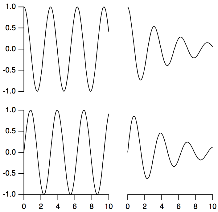
First we created some data:
Make wave1,wave2,wave3,wave4
SetScale/I x 0,10,wave1,wave2,wave3,wave4
wave1=sin(2*x); wave2=cos(2*x)
wave3=cos(2*x)*exp(-0.2*x)
wave4=sin(2*x)*exp(-0.2*x)
We then followed these steps:
-
Use the New Graph dialog to display the following:
wave1 versus the built-in left axis and the built-in bottom axis
wave2 versus a free left axis, L2, and the built-in bottom axis
wave3 versus L2 and a free bottom axis, B2
wave4 versus the built-in left axis and B2
Use the Axis pop-up menu under the Y Waves list to create the L2 axis.
Use the Axis pop-up menu under the X Waves list to create the B2 axis.
This creates a graph consisting of a jumble of axes and traces.
-
Choose Graph→Modify Axis and click the Axis tab.
The next four steps use the "Draw between" settings in the Axis section of the Axis tab.
-
From the Axis pop-up menu, select left and set the left axis to draw between 0% and 45% of normal.
-
From the Axis pop-up menu, select bottom and set the bottom axis to draw between 0% and 45% of normal.
-
From the Axis pop-up menu, select L2 and set the L2 axis to draw between 55% and 100% of normal. Also, in the Free Position section, choose Distance from Margin from the pop-up menu and set the Distance setting 0.
-
From the Axis pop-up menu, select B2 and set the B2 axis to draw between 55% and 100% of normal. Also, in the Free Position section, choose Distance from Margin from the pop-up menu and set the Distance setting 0.
-
Click Do It.
Staggered Stacked Plot
Here is a common variant of the stacked plot:
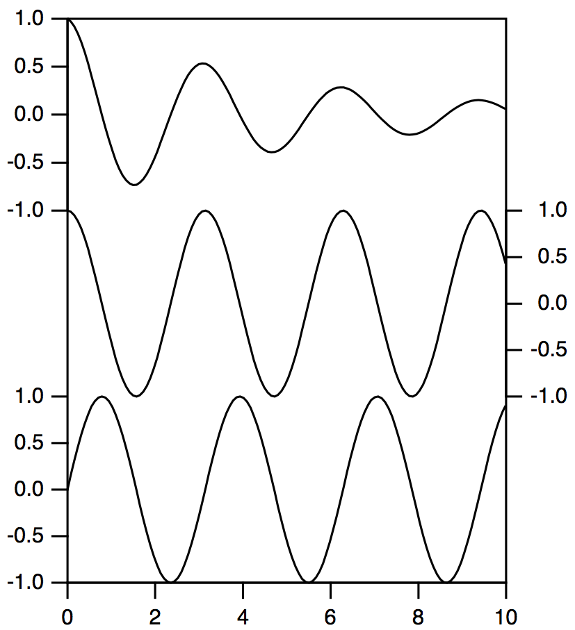
This example was created from three of the waves used in the previous plot. Wave1 was plotted using the left and bottom axes, wave2 used the right and bottom axes and wave3 used L2 and bottom axes. Then the Axis tab of the Modify Axis dialog was used to set the left axis to be drawn from 0% to 33% of normal, the right axis from 33% to 66% and the L2 axis from 66% to 100%. The Axis Standoff checkbox was unchecked for the bottom axis. This was not necessary for the other axes as axis standoff is not used when axes are drawn on a reduced extent.
After returning from the Modify Axis dialog, the graph was resized and the frame around the plot area was drawn using a polygon in plot-relative coordinates.
Waterfall Plots
You can create a graph displaying a sequence of traces in a perspective view. We refer to these types of graphs as waterfall plots, which can be created and modified using the NewWaterfall operation or by choosing Windows→New→Packages→Waterfall Plot.
To display a waterfall plot, you must first create or load a matrix wave. (If your data is in 1D waveform or XY pair format, you may find it easier to create a fake waterfall plot - see Fake Waterfall Plots.) In this 2D matrix, each of the individual matrix columns is displayed as a separate trace in the waterfall plot. Each column from the matrix wave is plotted in, and clipped by, a rectangle defined by the X and Z axes with the plot rectangle displaced along the angled Y axis, which is the right-hand axis, as a function of the Y value.
You can display only one matrix wave per plot.
The traces can be plotted evenly-spaced, in which case their X and Y positions are determined by the X and Y dimension scaling of the matrix. Alternatively they can be plotted unevenly-spaced as determined by separate 1D X and Y waves.
To modify certain properties of a waterfall plot, you must use the ModifyWaterfall operation. For other properties, you will need to use the usual axis and trace dialogs.
Because the traces in the waterfall plot are from a single wave, any changes to the appearance of the waterfall plot using the Modify Trace Appearance dialog or ModifyGraph operation will globally affect all of the waterfall traces. For example, if you change the color in the dialog, then all of the waterfall traces will change to the same color. If you want each of the traces to have a different color, then you will need to use a separate wave to specify (as f(z)) the colors of the traces. See the example in the next section for an illustration of how this can be done.
The X and Z axes of a waterfall are always at the bottom and left while the Y axis runs at a default 45 degrees on the right-hand side. The angle and length of the Y axis can be changed using ModifyWaterfall. Except when hidden lines are active, the traces are drawn in back to front order. Note that hidden lines are active only when the trace mode is lines between points.
Marquee expansion is based only on the bottom and right (waterfall) axes. The marquee is drawn as a box with the bottom face in the ZY plane at zmin and the top face is drawn in the ZY plane at zmax.
Cursors may be used and the readout panel provides X, Y and Z axis information. The hcsr and xcsr functions are unchanged; the vcsr function returns the Y data value (waterfall) and the zcsr returns the data (Z axis) value.
Evenly-Spaced Waterfall Plot Example
In this example we create a waterfall plot with evenly-spaced X and Y values that come from the X and Y scaling of the matrix being plotted.
Function EvenlySpacedWaterfallPlot()
	// Create matrix for waterfall plot
	Make/O/N=(200,30) mat1
	SetScale x,-3,4,mat1
	SetScale y,-2,3,mat1
	mat1=exp(-((x-y)^2+(x+3+y)^2))
	mat1=exp(-60*(x-1*y)^2)+exp(-60*(x-0.5*y)^2)+exp(-60*(x-2*y)^2)
	mat1+=exp(-60*(x+1*y)^2)+exp(-60*(x+2*y)^2)

	// Create waterfall plot
	NewWaterfall /W=(21,118,434,510) mat1
	ModifyWaterfall angle=70, axlen= 0.6, hidden= 3

	// Apply color as a function of Z
	Duplicate mat1,mat1ColorIndex
	mat1ColorIndex=y
	ModifyGraph zColor(mat1)={mat1ColorIndex,*,*,Rainbow}
End
Unevenly-Spaced Waterfall Plot Example
In this example we create a waterfall plot with unevenly-spaced X and Y values that come from separate 1D waves.
Function UnvenlySpacedWaterfallPlot()
	// Create matrix for waterfall plot
	Make/O/N=(200,30) mat2
	SetScale x,-3,4,mat2		// Scaling is needed only to generate
	SetScale y,-2,3,mat2		// the fake data
	mat2=exp(-((x-y)^2+(x+3+y)^2))
	mat2=exp(-60*(x-1*y)^2)+exp(-60*(x-0.5*y)^2)+exp(-60*(x-2*y)^2)
	mat2+=exp(-60*(x+1*y)^2)+exp(-60*(x+2*y)^2)
	SetScale x,0,0,mat2		// Scaling no longer needed because we will
	SetScale y,0,0,mat2		// use X and Y waves in waterfall plot

	// Make X and W waves
	Make/O/N=200 xWave = 10^(p/200)
	Make/O/N=30 yWave = 10^(p/30)

	// Create waterfall plot
	NewWaterfall /W=(21,118,434,510) mat2 vs {xWave,yWave}
	ModifyWaterfall angle=70, axlen= 0.6, hidden= 3

	// Apply color as a function of Z
	Duplicate mat2,mat2ColorIndex
	mat2ColorIndex=y
	ModifyGraph zColor(mat2)={mat2ColorIndex,*,*,Rainbow}
End
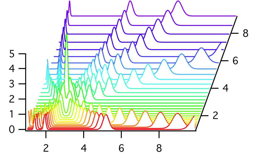
Fake Waterfall Plots
Creating a real waterfall plot requires a 2D wave. If your data is in the form of 1D waveforms or XY pairs, it may be simpler to create a "fake waterfall plot".
In a fake waterfall plot, you plot your waveform or XY data using a regular graph and then create the waterfall effect by offsetting the traces. Since fake waterfall plots use regular Igor traces, you can control their appearance the same as in a regular graph.
The result, with hidden line removal, looks like this:
Because of the offsetting in the X and Y directions, the axis tick mark labels can be misleading.
Igor includes a demo experiment showing how to create a fake waterfall plot:
Open the Fake Waterfall demo experiment
Igor also includes a demo experiment showing how to create a true waterfall plot:
Open a true 3D Waterfall demo experiment
Wind Barb Plots
You can create a wind barb plot by creating an XY plot and telling Igor to use wind barbs for markers. You turn markers into wind barbs using "ModifyGraph arrowMarker", passing to it a wave that specifies the length, angle and number of barbs for each point.
If you want to color-code the wind barbs, you turn on color as f(z) mode using "ModifyGraph zColor", passing to it a wave that specifies the color for each point.
Here is an example. Execute the commands one section at at time to see how it works.
// Make XY data
Make/O xData = {1, 2, 3}, yData = {1, 2, 3}
Display yData vs xData		// Make graph
ModifyGraph mode(yData) = 3		// Marker mode

// Make a barb data wave to control the length, angle and number of barbs for each point.
// To control the number of barbs, column 2 must have a column label of WindBarb.
Make/O/N=(3,3) barbData		// Controls barb length, angle and number of barbs
SetDimLabel 1, 2, WindBarb, barbData		// Set column label to WindBarb
Edit /W=(439,47,820,240) barbData

// Put some data in barbData
barbData[0][0]= {20,25,30}    		// Column 0: Barb lengths in points
barbData[0][1]= {0.523599,0.785398,1.0472}	// Column 1: Barb angle in radians
barbData[0][2]= {10,20,30}		// Column 2: Wind speed from 0 (no barbs) to 40 (4 barbs)

// Set trace to arrow mode to turn barbs on
ModifyGraph arrowMarker(yData) = {barbData, 1, 10, 1, 1}

// Make an RGB color wave
Make/O/N=(3,3) barbColor
Edit /W=(440,272,820,439) barbColor

// Store some colors in the color wave
barbColor[0][0]= {65535,0,0}	// Red
barbColor[0][1]= {0,65535,0}	// Green
barbColor[0][2]= {0,0,65535}	// Blue

// Turn on color as f(z) mode
ModifyGraph zColor(yData)={barbColor,*,*,directRGB,0}
See the arrowMarker keyword of the ModifyGraph operation for details on the construction of the barb data wave.
The various color as f(z) modes are explained under Setting Trace Properties from an Auxiliary (Z) Wave. You can eliminate the barbColor wave by using a color table lookup instead of a color wave.
This experiment further illustrates wind barbs:
Open the Wind Barbs and Arrows demo experiment
Box Plots and Violin Plots
When you have multiple measurements that all represent the same conditions, it is useful to know how those measurements are distributed — tightly or loosely clustered, grouped around a central value or more loosely clustered with outliers, and many other possibilities. It is difficult for the eye to comprehend a simple cluster of dots, so plots that summarize the distribution are helpful. Box plots and violin plots are two ways to summarize a distribution of data points.
In Igor, box plots and violin plots are a special kind of graph trace. Each "point" of the trace represents an entire dataset. The data may be stored in individual waves, one wave for each dataset, in which case the input for the trace is a list of waves. Alternately, each dataset may be a column in a single two-dimensional matrix wave.
A normal XY graph trace is named for the wave containing the Y data. Thus, if the Y data is in a wave called "wave0", the trace is also called "wave0". But a box or violin plot may represent data coming from a number of waves. By default the box or violin plot trace is named for the first wave in the list of waves unless you specify a custom trace name. We recommend choosing a custom trace name that describes the nature of the collection of waves.
Box Plot and Violin Plot Terminology
To illustrate this terminology, consider these commands:
Make/N=10 wave0, wave1, wave2
Make/T labels = {"Run 1", "Run 2", "Run 3"}
Display; AppendBoxPlot/TN=trace0 wave0, wave1, wave2 vs labels
This creates a box plot with one trace named trace0. The trace consists of three datasets named wave0, wave1, and wave2. If we omitted /TN=trace0, the trace would have the default name wave0.
We can achieve the same thing using a three-column 2D wave instead of three 1D waves:
Make/N=(10,3) mat
Make/T labels = {"Run 1", "Run 2", "Run 3"}
Display; AppendBoxPlot/TN=trace0 mat vs labels
This creates a box plot with one trace named trace0. The trace consists of three datasets named mat[0], mat[1], and mat[2]. If we omitted /TN=trace0, the trace would have the default name mat.
Creating Box Plots and Violin Plots
To create a box plot, choose Windows→New→Box Plot. To create a violin plot, choose Windows→New→Violin Plot. This displays a dialog in which you can choose datasets and set other parameters.
You choose datasets to be used for the plot from the list on the left, and transfer them to the list on the right by clicking the arrow button. Initially, the dialog shows only 1D waves and you need to select one wave for each box or violin to be displayed by the trace. If your data is in a 2D wave, turn on the One Multicolumn Wave checkbox below the list on the left.
If you are using 1D waves, after you have transferred the list of waves to the righthand list, you can reorder the waves by dragging them up or down. The order of the waves in the list sets the order of the plots in the trace. If you use a multicolumn wave, the order is set by the columns in the wave.
You may also need to select an X wave. If you select _calculated_, the positions of the plots along the X axis are computed by Igor. For a list of 1D waves, the plots are positioned at 0, 1, 2, .... If your datasets are columns in a multicolumn wave, choosing _calculated_ results in plots positioned according to the Y scaling of the wave, that is, the scaled values of the column dimension indices.
The X Wave menu contains both numeric and text waves. Choosing a numeric wave allows you to position each plot at an arbitrary point on the X axis. Choosing a text wave results in a category X axis (see Category Plots). The waves shown in the X Wave menu are limited to those waves that have one point for each selected dataset.
The New Box Plot or New Violin Plot dialog can also make a new text wave for you. Selecting "_new text wave_" from the X Wave menu causes the dialog to generate commands which make a new text wave of appropriate length, fill it with placeholder text, and display it in a table for editing. The result is a category X axis using the new text wave.
You can give your new trace a custom name by checking the Trace Name checkbox and entering the name in the associated edit box. A custom name is especially useful when you use a list of 1D waves because the default trace name, based on the name of the first data wave, is confusing.
The X Axis, Y Axis and Swap XY Axes controls work the same way as they do in the New Graph dialog (see Creating Graphs).
A graph can hold more than one box plot or violin plot trace and you can mix the two. To add another box plot or violin plot, choose Graph→Append to Graph→Box Plot or Graph→Append to Graph→Violin Plot.
Box Plots
The box plot, or box and whisker plot, was invented by John W. Tukey to present an easy-to-understand display of the distribution of the data points (see Box Plot Reference).
A box plot has several parts:
The bottom and top of the box are at the first and third quartiles of the dataset, with a line drawn across the box to represent the median value. Thus, the box gives an indication of the width of the distribution and the median line an indication of the central location of the distribution. The whiskers represent more information about the width of the data distribution such as the length of tails or the symmetry of the distribution. By default, Igor draws the whiskers to the extreme data points, but there are eight different options for whisker length.
The width of the box is not meaningful, but you can control it to make a pleasing display. The width can be expressed as a fraction, in which case it is the fraction of the width of the plot area. If the width is greater than one, it is taken to be an absolute width in points. By default the width is 1/(2*N), where N is the number of datasets or box plots included in the trace.
It is common to show the actual data points when they are far from the center of the distribution. Tukey defines "outliers" and "far outliers". Igor allows you to show all data points, only outliers and far outliers, or only far outliers. You can also select different markers, sizes and colors for each category of data points.
Box Plot Fences
Some options use Tukey's "fences" to define the length of the whiskers and the boundaries defining outliers and far outliers. Tukey also uses the term "hinge" to refer to the the 25th and 75th percentiles.
Inner fences are defined as
inner fence = upper hinge + 1.5*IQR and lower hinge - 1.5*IQR
Outer fences are defined as
outer fence = upper hinge + 3*IQR and lower hinge - 3*IQR
Box Plot Whisker Length
The following figure shows the options for defining the whisker length. The fences are shown for reference to Tukey's definitions, and the outlier method (see Box Plot Outlier Methods) is option 0:
| Option 0: | Minimum and maximum data points (the default). | |
| Option 1: | Inner fences. | |
| Option 2: | "Adjacent points", which Tukey defines as the most extreme data points inside the inner fences. That is, the most extreme data points that are not outliers, if you define outliers the way Tukey does. | |
| Option 3: | One standard deviation from the mean of the data. The light circle with plus shows the mean value. | |
| Option 4: | The 9th and 91st percentiles. | |
| Option 5: | The 2nd and 98th percentiles. | |
| Option 6: | Arbitrary percentiles. Here the ends are set to the 20th and 80th percentiles in order to make it look different from the other options. | |
| Option 7: | An arbitrary factor times one standard deviation from the mean. In this case, the factor is 3. | |
If the data are normally distributed, the 2nd, 9th, 25th, 50th, 75th, 91st, and 98th percentiles should be equally spaced.
The examples show all the data points but it is common to show only outliers and far outliers. The data points are displayed with "jitter" — data points that would overlap are offset horizontally so that each data point can be seen. You can control the maximum offset by specifying the jitter amount in units of fractions of the box width. If the specified width is insufficient to separate the points, they will overlap as needed. If the width is greater than necessary, only as much offset as necessary is applied.
In usual practice the fences are not shown.
Box Plot Outlier Methods
By default, we follow Tukey in defining outliers and far outliers based on the fences, with "outliers" being points outside the inner fences and "far outliers" being points beyond the outer fences. While not usually shown in practice, you can tell Igor to include the fences on the plot using the command ModifyBoxPlot showFences=1. The outliers are shown as filled circles and the far outliers are large filled squares.
Igor offers four options to control which data points are outliers and far outliers:
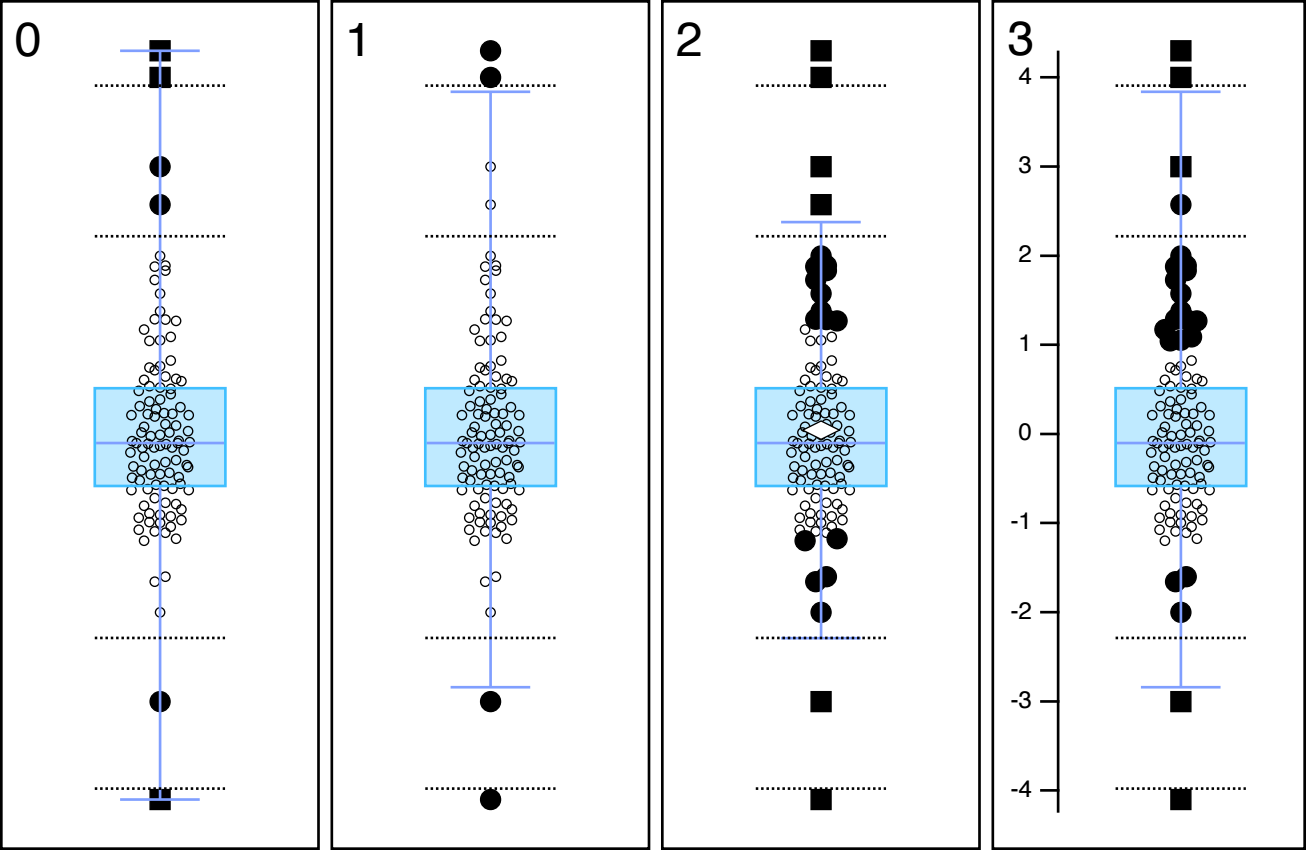
| Option 0: | Tukey's definition. Outliers are any data points beyond the inner fences, far outliers are any data points beyond the outer fences. | |
| Option 1: | Any points beyond the ends of the whiskers are outliers. There are no far outliers. For this option, the whiskers were set to option 6, 2nd and 98th percentiles. | |
| Option 2: | Outliers and far outliers are points beyond an arbitrary factor times the standard deviation of the mean. In this case, those factors are 1 and 2. The whisker lengths are set to option 7, arbitrary factor times the standard deviation of the mean. The factor is set to 2. The white diamond shows the mean value. | |
| Option 3: | Outliers and far outliers are determined by four arbitrary data values. In this case the values are -2, -1.5, 1 and 2.6. | |
Notched Box Plots
A notched box plot shows the 95% confidence interval of the median in addition to the various percentiles usually shown:
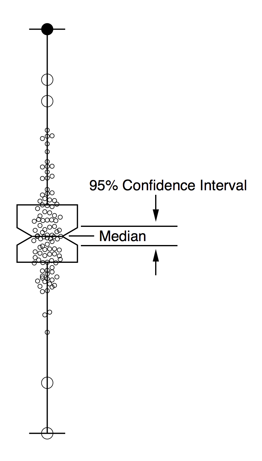
The notches are at median ± 1.57 * IQR/sqrt(n) where n is the number of data points in the dataset represented by the box plot. Two box plots have a high probability of significantly different median values if the notches don't overlap.
You make a notched box plot by right-clicking on the box plot trace and selecting Modify Box Plot. In the Modify Box Plot dialog, General tab, turn on the Notched checkbox.
Appearance Options for Box Plots
To change the appearance of a box plot, select Modify Box Plot from the Graph menu or right-click on a box plot trace and select Modify Box Plot from the contextual menu.
You can change the color, width and dash style for the lines. Those settings can be made individually for each component: the box, the whiskers, the median line and whisker caps.
We regard the fences as an incidental detail. You can show the fences in order to understand the display better, but we have not seen them used for publication purposes. Consequently, the lines for the fences are not modifiable.
You can control the width of the whisker caps — to omit the caps (the default), set the width to zero. A fractional width sets the size of the cap as a fraction of the box width. This is useful to make the cap width consistent when resizing the graph. A width greater than 1 is taken to be an absolute width in points.
The plots that follow are drawn horizontally to save space. You can achieve that effect by choosing Modify Graph from the Graph menu, and then turning on the Swap XY checkbox. Alternately, you can turn on the Swap X Y Axes checkbox in the New Box Plot or the Append Box Plot dialog to apply the swap to just one box plot trace.
The box can be filled with a color. The box fill color is drawn before the markers so that whatever choices you make for the markers will not be overdrawn by the fill color.
You can select a different marker for non-outlier data, outliers and far outliers. In the plot above, regular data points and outliers are drawn with the hollow circle marker, and outliers have been made larger than the regular data points to emphasize them. The far outlier (there is just one) is drawn with a filled circle marker.
You can achieve some special effects by using a hollow marker and selecting a fill color for the marker For instance, in this plot the hollow circle marker is used for the regular data points, and the fill color is enabled and set to white:
The lines making the box, median and whiskers are on top of the markers so that the markers don't obscure the lines. Sometimes you may wish to have the markers on top. With this dataset, that may obscure the lines too much. To achieve this effect, on the Markers tab turn on the Draw Data Points on Top checkbox. You can separately control drawing the mean marker and median marker.
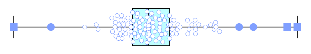
You can choose to show all the raw data, as above, or you can choose to show no raw data points, only outliers and far outliers, or just the far outliers. This plot shows outliers and far outliers:
The plots above apply jitter to the data points; that is, if the markers would overlap a lateral offset is applied so that you can see all of them. You can specify a width for the jitter that sets a maximum lateral offset. If the offset is too small to completely separate the markers, they will overlap to some degree. If an offset is not required for a given marker, it is not offset.
You will sometimes see a box plot in which the data points are shown as a "rug plot", that is, each data point is represented by a thin line. That is another way to allow all the data points to be seen, as long as there aren't too many. To do this, use the line marker and set the jitter to zero. In this plot the marker for normal points, outliers and far outliers is the same vertical line marker (marker 10) with the size set to 8. The caps were set to zero and the extreme data points look like caps.
Large markers with transparency can also give a sense of data density. This plot uses the solid circle marker (number 19) with a blue color with alpha set to 0.1. The fill color for the box is turned off, as the background will show through the transparent markers and affect the color.
Sometimes the number of datasets and data points can be overwhelming. Here is an alternative look that makes a more compact display:
The whisker method is set to Mean ± f*SD, with the factor set to 2, so the whiskers show a span of 2 standard deviations about the mean. The outlier method is set to Whiskers, so only data points beyond the ends of the whiskers are shown. That limits the shear number of data points on the plot.
There are many datasets, so the boxes are quite narrow and filled to make a solid box. Instead of a hard-to-see median line, the median is shown as a white-filled circle marker. To prevent the box outlines from showing on top of the white marker fill, the Draw Median Marker On Top checkbox is turned on in the Markers tab of the Modify Box Plot dialog.
Finally, the mean is shown as a horizontal bar marker. The marker size is set large enough that it shows outside the median circle marker.
Box Plot Reference
Tukey, John W., Exploratory Data Analysis, Addison-Wesley Publishing Company, 1977.
Violin Plots
A violin plot, also called a bean plot, is a way to summarize the distribution of data. A violin plot shows the distribution of a dataset using a kernel density estimate (KDE). The KDE creates a smooth estimate of the underlying data distribution by summing some kernel function, one function per data point. The summed curve is then normalized to an area of 1.0 so that it is an estimate of the probability distribution function for the dataset.
Suppose you have five points drawn from a Gaussian distribution, such as the points represented by the black dots here:
Generate a Gaussian curve for each point (the red curves), then sum the curves and normalize for an area of one (the black curve). In this plot we have arbitrarily selected a standard deviation for the red curves of 0.5; this is referred to as the bandwidth when computing a KDE curve or violin plot.
Now we have a smooth curve that gives a possible representation of the underlying distribution from which the data points were drawn. Quite possibly the kernel bandwidth we used was too small, and unjustified by the small number of points. The choice of kernel function, Gaussian in this example, and the width of the kernel are somewhat arbitrary. The Gaussian kernel is in some sense "smooth" and reflects our bias that most data follow a Gaussian distribution. Others are possible.
You can compute a KDE for your datasets yourself using the StatsKDE operation, but to get from there to a violin plot is quite tedious. Igor does a lot of this work for you when you create a violin plot trace by executing the steps described under Creating Box Plots and Violin Plots.
In a violin plot, the curve is in general plotted vertically and reflected across the midline to give a plot that looks somewhat like a violin or a green bean pod with lumps for each seed. Here is Igor's violin plot of the five points shown above, modified to show the raw data points and to use black coloring:
In this plot, the width of the curves is not meaningful except in a relative way. The centerline indicates zero estimated probability density. Because it is the only dataset included in the trace, and it is not a category plot, it is positioned at zero on the X axis.
For the following illustrations, we made two representative fake datasets:
Make/N=(50,3) run1			// 50 points per dataset, three datasets
Make/N=(50,3) run2			// Another with three datasets with 50 points
run1 = gnoise(q+1)			// Gaussian data with standard deviation based on column number
run2 = gnoise(1) + q			// Gaussian data with constant width and location based on column number
Make/N=3/T categories="dataset "+num2str(p+1)	// Text wave to make a category violin plot
At this point you could select Windows→New Violin Plot, turn on the Multicolumn checkbox, select run1 as the data and categories as the X wave. That would result in these commands:
Display;AppendViolinPlot run1 vs categories
Now select Graph→Append Violin Plot, turn on the Multicolumn checkbox, select run2 as the data and accept categories as the X wave. That would result in this command:
AppendViolinPlot run2
The resulting graph looks like this:
Appearance Options for Violin Plots
To change the appearance of a violin plot, select Graph→Modify Violin Plot or right-click and select Modify Violin Plot.
Igor's violin plot has six kernel shapes to choose from. The default is Gaussian and we don't anticipate that other shapes will be used much.
There are three methods for automatically estimating the best bandwidth to use. If you don't like the results of the automatic bandwidths, you can set your own, with a separate bandwidth for each dataset. The automatic estimate assumes a Gaussian kernel.
Each plot of a violin trace occupies a horizontal space equivalent to the box width of a box plot, and that box width can be set in the same way as a box plot — fractions give a width that is a fraction of the plot area, values larger than one are absolute sizes in points. If the X axis is a category axis, Igor sets the box width, overriding whatever you may have chosen.
When Igor makes a violin trace containing more than one dataset, the curves are all normalized to the largest peak amongst all the KDE curves so only one of the violin plots occupies the full box width. You can see this in the plot above, where the third dataset in the Run1 trace (left plots in each category) represents a dataset with broader distribution, which means that to achieve an area of one it must have a smaller amplitude. Compare it with the short, fat distributions in the other categories.
If you have more than one set of violin plots, as in this example where there are two violin traces — one from run1 and one from run2, by default the widest plot in each trace fills the box. The two traces are normalized separately. If you want all the plots in both traces to use the same normalization, you can set the normalization yourself so that the relative amplitudes of all the curves represent the same relative values. This is done using the Distribution Max setting in the General tab of the Modify Violin Plot dialog. The value computed by Igor is shown next to the edit box.
It is common to show the raw data with markers. By default, the raw data points are shown using hollow circles drawn half the size of the default markers for a normal trace. You can choose a marker for the raw data points, plus one for the mean and the median if desired. Violin plots do not distinguish outliers. Jitter can be applied to the data point markers so that they don't overlap.
To make a rug plot of the raw data, use the appropriate line marker and set the jitter to 0. Most violin plots are plotted vertically, and the horizontal line marker would be appropriate.
The space between the KDE curves can be filled with color. The fill color is drawn behind the markers so that special effects can be achieved with marker color, marker stroke color and marker fill color.
Here is the plot above, re-worked with fill color and hollow round markers with white fill:
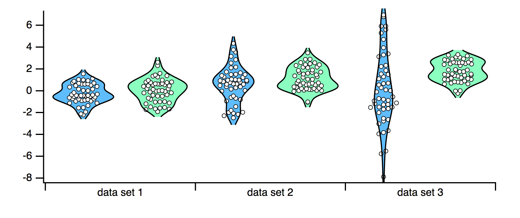
And here it is as a rug plot:
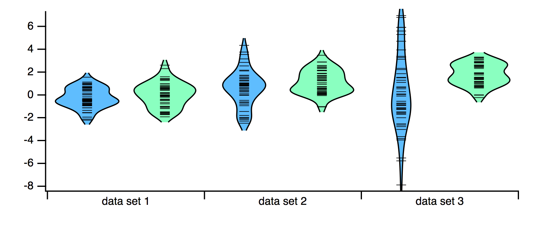
You may notice that some of the curves appear to be a bit truncated. That is particularly true of the dataset 3 plot in the right-hand trace. By default, Igor plots the KDE curves one bandwidth beyond the last data point. In this case, it appears that it might be nice to have the curves extend a bit farther. To achieve that, right-click the trace and select Modify Violin Plot. On the General tab, find the Curve Extension edit box and enter a more pleasing amount of extension. The units are kernel bandwidths. Here we have set 2 for the plot above:
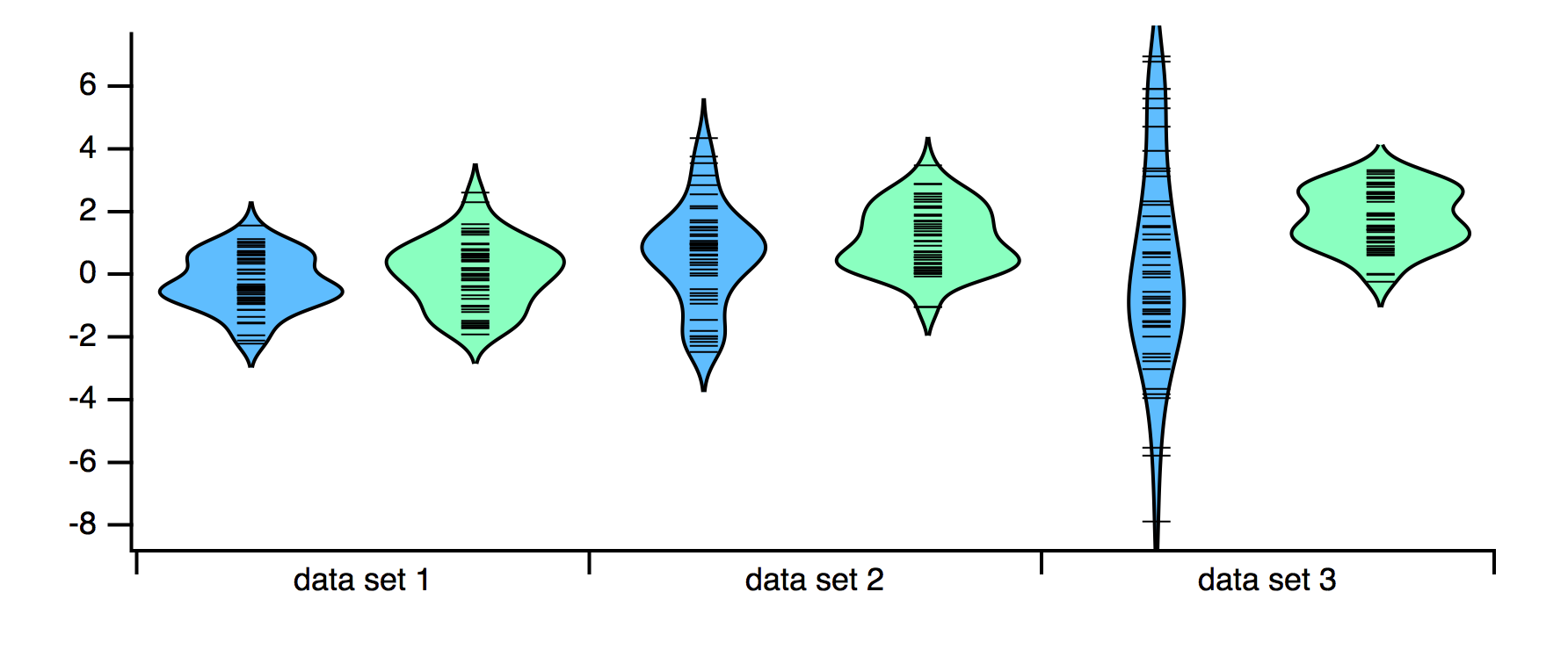
Asymmetric Violin Plots
A common variation on a standard violin plot uses just half the violin. This is usually done to compare two conditions or two runs. One condition provides the left half and the other provides the right half.
Let's make the plot above into an asymmetric plot.
The first step is to right-click one of the traces in the plot and choose Modify Violin Plot from the contextual menu. Select the trace that you want for the left half, say the Run1 trace. On the General tab, find the Plot Side menu and select Left Side. Select Run2 and select Right Side in the Plot Side menu. Click Do It and you now have a plot that looks like this:
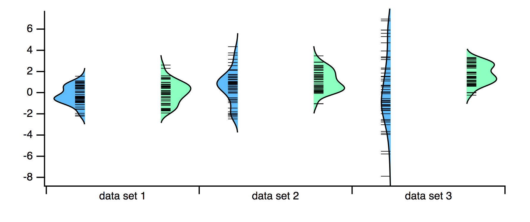
Because the X axis is a category axis, each plot occupies its own slot in the category. To bring them together, double-click the Run1 trace to bring up the Modify Trace Appearance dialog. Make sure the first trace in the trace list is selected. In the Grouping menu, select Keep With Next. We also made the graph window narrower for aesthetic reasons:
If your X axis is a numeric axis, you don't need the last step of setting the Grouping mode. The two violin plot traces draw the plots at the numeric value set by the X wave, or at 0, 1, 2, and so on, if you chose Calculated.
Finally, you may decide that the plot looks better with a line enclosing the entire color-filled area. On the General tab of the Modify Violin Plot dialog, turn on the Close Outline checkbox:
Violin Plot References
Wand M.P. and Jones M.C. (1995) Monographs on Statistics and Applied Probability, London: Chapman and Hall
Bowman, A.W., and Azzalini, A. (1997), Applied Smoothing Techniques for Data Analysis, London: Oxford University Press.
Making Boxes and Violins Look Different
At times you may want one of the boxes or violins in a trace to have a different appearance to distinguish the corresponding dataset from others in the trace. The Modify Box Plot and Modify Violin Plot dialogs support this by allowing you to select a single dataset from a trace.
This graphic shows the Modify Box Plot dialog with a box plot trace made with a list of three waves. The first wave in the list was wave0, so the name of the trace is "wave0". Clicking the triangle icon for the wave0 trace discloses a list of the three datasets, one for each wave.
If the top wave0 item were selected, changes made in the dialog would apply to all datasets in the trace. Here we have selected the second dataset corresponding to wave1 so changes made in the dialog apply only to the dataset and consequently to the second box in the box plot.
These graphs show before and after setting the box fill color for the wave1 dataset only to light blue:
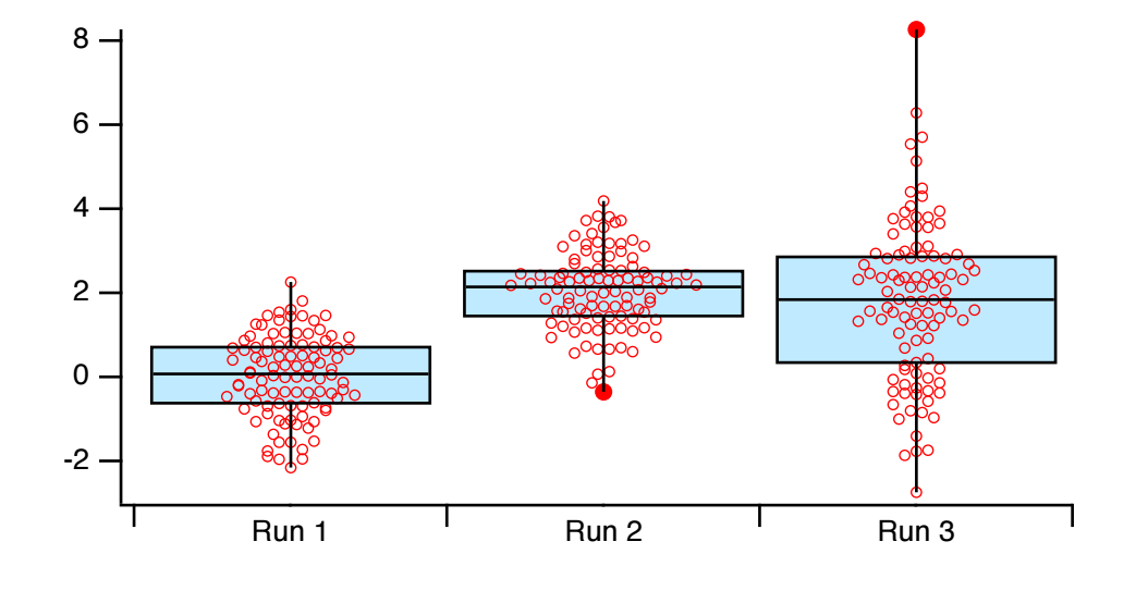
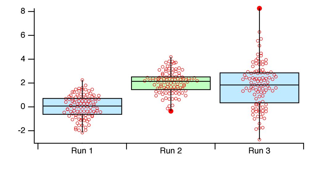
The order in which you make these settings is important. If you change an overall setting, any corresponding values for individual datasets are reset to the overall value. So to make the box plot above with light blue overall, and light green for the second dataset, you need to first set the light blue color for the entire trace followed by setting the light green color for the second dataset only. You do not need to close the dialog between these two changes.
Making Each Data Point Look Different
Sometimes the data points in a single dataset come from different sources, or represent different conditions, and you would like to show that in the graph. Using an auxiliary wave you can set the marker color, marker size or marker style for each data point. Controls for these settings appear in the Markers tab of the Modify Box Plot dialog.
For instance, this table shows a fake dataset in the first column and a corresponding three-column wave to specify the marker color for each data point:
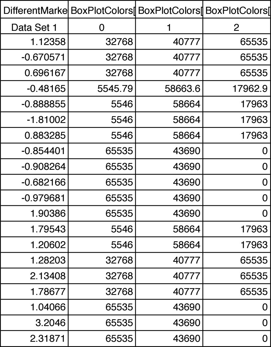
We made a box plot with that dataset and selected the wave BoxPlotColors to set the marker colors for the data points:
The result is this box plot:
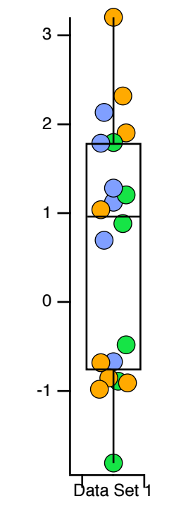
The color wave for this figure was created using the Color Wave Editor package, accessed by choosing Data→Packages→Color Wave Editor.
Similarly, you can set each data point marker to a different size or to a different marker style using a 1D wave with a size or marker number for each data point. For instance:
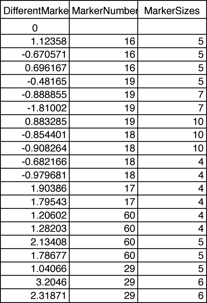
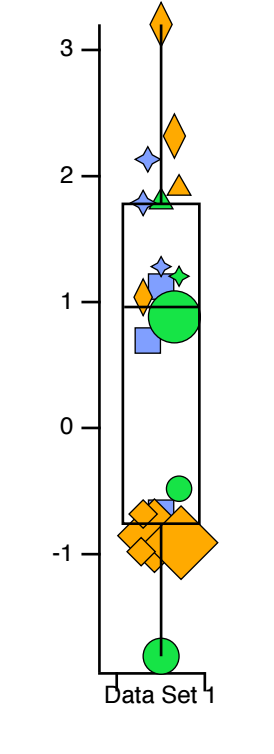
Marker sizes can range from 0 to 200. See Markers for a table of marker styles and the associated marker numbers.
The marker colors, marker sizes and marker styles set by these waves override whatever other settings have been made. So if you have selected a particular marker for box plot outliers, for instance, but an outlier data point has a marker set via a marker wave, the marker is taken from the wave.
The marker color, marker size and marker style waves are not required to have the same number of rows as the dataset wave. If there are extra rows the extras are ignored. If there are too few rows, the extra data points take their color, size, color and style from the normal color, size and style settings.
Combining Box Plots and Violin Plots
One problem with a box plot is that it hides the true distribution of your data. If your data is bimodal, it still shows you only a box with a median line and whiskers. But a violin plot lacks the statistical information contained in a box plot. A common solution is to combine the two — put a box plot in the middle of a violin plot.
To do this in Igor, first create a violin plot using Windows→New→New Violin Plot. We did this with the Run1 dataset from the violin plot example:
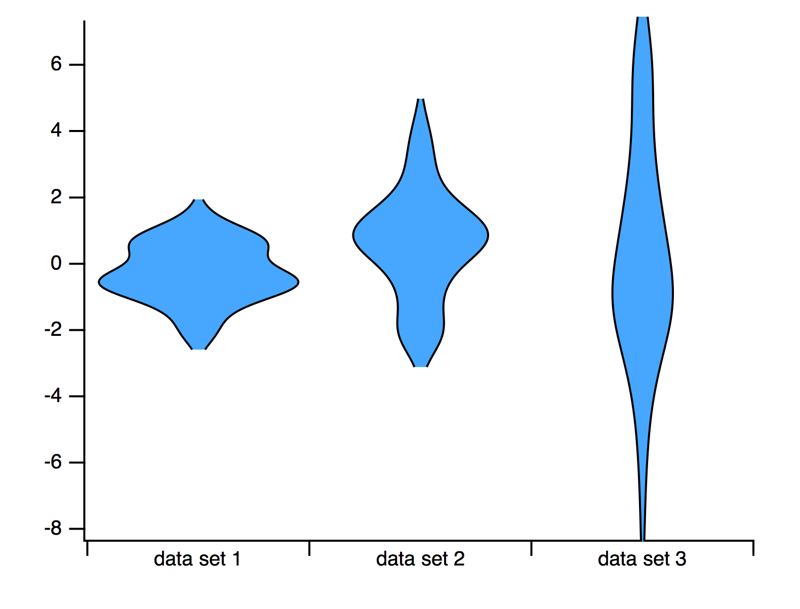
We have chosen a fill color and we are not showing the data points.
Now add a box plot by choosing Graph→Append→Box Plot. Because we are using a category X axis, the plots are side-by-side. Double-click the violin plot trace and select Keep With Next as the grouping mode:
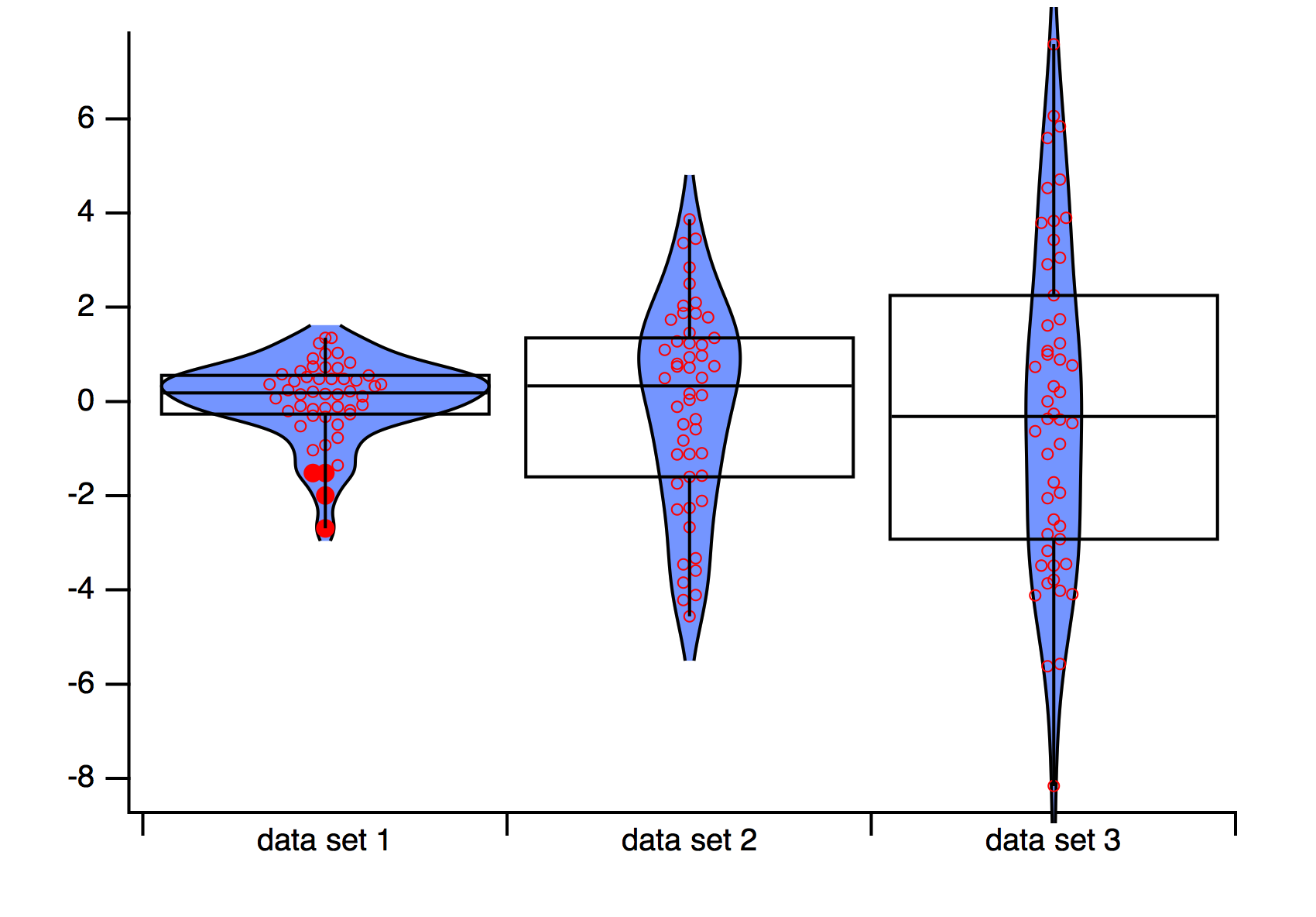
For best appearance, you should make the box plot narrower, and most likely fill the box with contrasting color. Here we set the box width to 0.1 and chose to fill the box with white. We don't show the data points, but if you wish to, it is best to show the data points using the box plot trace so that fills don't obscure the data points.
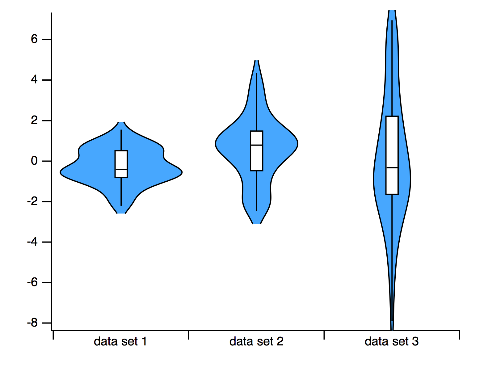
Creating Split Axes
You can create split axes using the same techniques described above for creating stacked plots. Simply plot your data twice using different axes and then adjust the axes so they are stacked. You can then adjust the range of the axes independently. You can use draw tools to add cut marks.
WaveMetrics supplies a procedure package to automate all aspects of creating split axes except setting the range and adjusting the ticking details of the axes. To use the package, choose Graph→Packages→Split Axes. For an example, choose File→Example Experiments→Graphing Techniques→Split Axes.
Before using the package, you should create the graph in near final form using just the main axes. For best results, especially if you will be using cut marks, you should work with the graph at actual size before adding the split axes. It is recommended that you create a recreation macro just before executing the split axis macros. This is so you can easily revert in case you need to change the pre-split setup.
After creating the split, you can execute the AddSplitAxisMarks procedure to add cut marks between the two axes. You can then use the drawing tools to duplicate the cut marks if you want marks on the traces as well as the axes. Of course, you can also draw your own cut marks. You should use the default Plot Relative coordinate system for cut marks so they will remain in the correct location should you resize the graph.
Some programs draw straight lines between data points on either side of the split. While such lines provide the benefit of connecting traces for the viewer, they also are misleading and inaccurate. This package accurately plots both sections and does not attempt to provide a bridge between them. If you feel it is necessary, you can use drawing tools to add a connecting bridge.
Live Graphs and Oscilloscope Displays
This section will be of interest mainly if you use Igor for data acquisition.
Normally, when the data in a wave is modified, all graphs containing traces derived from that wave are redrawn from scratch. Although fast compared to other programs, this process may noticeably limit the graph update rate.
Live Mode
If you specify one or more traces in a graph as being "live" then Igor takes some shortcuts, resulting in faster than normal updates. Fast update is obtained when certain conditions are observed.
When graphs are redrawn in live mode, autoscaling is not done.
To specify a trace in a graph as being live you must use the live keyword with the ModifyGraph command. There is no dialog support for this setting.
ModifyGraph live(traceName)= mode
Mode can be 0 or 1. Zero turns live mode off for the given trace.
WaveMetrics provides a demo experiment that generates and displays synthetic data. You should use this experiment to get a feel for the performance you might expect on your particular computer as a function of the window size, number of points in the live wave, and the live modes. To run the demo, choose File→Example Experiments→Feature Demos→Live Mode.
Although live mode 1 is not restricted to unity thickness solid lines or dots modes, you will get the best performance if you do use these settings.
Quick Append
Another feature that may be of use is the quick append mode. It is intended for applications in which a data acquisition task creates new waves periodically. It permits you to add the new waves to a graph very quickly. To invoke a quick append, use the /Q flag in an AppendToGraph command. There is no dialog support for this setting.
A side effect of quick append is that it marks the wave as not being modified since the last update of graphs and therefore prevents other graphs containing the same wave, if any, from being updated. For a demo, choose File→Example Experiments→Feature Demos→Quick Append.
Graph Preferences
Graph preferences allow you to control what happens when you create a new graph or add new traces to an existing graph. To set preferences, create a graph and set it up to your taste. We call this your prototype graph. Then choose Capture Graph Prefs from the Graph menu.
Preferences are normally in effect only for manual operations, not for automatic operations from Igor procedures. This is discussed in more detail Preferences.
When you initially install Igor, all preferences are set to the factory defaults. The dialog indicates which preferences you have not changed by displaying "default" next to them.
The Window Position and Size preference affects the creation of new graphs only. New graphs will have the same size and position as the prototype graph.
The Page Setup preference is somewhat unusual because all graphs share the same page setup settings, as shown in the Page Setup dialog. The captured page setup is already in use by all other graphs. The utility of this category is that new experiments will use the captured page setup for graphs.
The "XY Plots:Wave Styles" preference category refers to the various wave-specific settings in the graph, such as the line type, markers and line size, set with the Modify Trace Appearance dialog. This category also includes settings for waveform plots. Each captured wave style is associated with the index of the wave it was captured from. The index of the first wave displayed or appended to a graph is 0, the second appended wave has an index of 1, and so on.These indices are the same as are used in style macros. See Graph Style Macros.
If preferences are on when a new graph with waves is created or when a wave is appended to an existing graph, the wave style assigned to each is based on its index. The wave with an index of 2 is given the captured style associated with index 2 (the third wave appended to the captured graph).
You might wonder what style is applied to the fifth and sixth waves if only four waves appeared in the graph from which wave style preferences were captured. You have two choices; either the factory default style is used, or the styles repeat with the first wave style and then the second style. You make this choice in the Miscellaneous Settings dialog, with the Repeat Wave Style Prefs in Graphs checkbox. With that box selected, the fifth and sixth waves would get the first and second captured styles; if deselected, they would both get the factory default style, as would any other waves subsequently appended to the graph.
The XY Plots:Axes and Axis Labels preferences category captures all of the axis-related settings for axes in the graph. Only axes used by XY or waveform plots have their settings captured. Axes used solely for a category, image, or contour plot are ignored. The settings for each axis are associated with the name of the axis it was captured from.
Even if preferences are on when a new graph with waves is created or when a wave is newly appended to an existing graph, the wave is still displayed using the usual default left and bottom axes unless you explicitly specify another named axis. The preferred axes are not automatically applied, but they are listed by name in the New Graph, and the various Append to Graph dialogs, in the two Axis pop-up menus so that you may select them.
For example, suppose you capture preferences for an XY plot using axes named MyRightAxis and MyTopAxis. These names will appear in the X Axis and Y Axis pop-up menus in the New Graph and Append Traces to Graph dialogs.
-
If you choose them in the New Graph dialog and click Do It, a graph will be created containing newly-created axes named MyRightAxis and MyTopAxis and having the axis settings you captured.
-
If you have a graph which already uses axes named MyRightAxis and MyTopAxis and choose these axes in the Append Traces to Graph dialog, the traces will be appended to those axes, as usual, but no captured axis settings will be applied to these already-existing axes.
Captured axes may also be specified by name on the command line or in a procedure, provided preferences are on:
Function AppendWithCapturedAxis(wav)
	Wave wav
	Variable oldPrefState
	Preferences 1; oldPrefState = V_Flag	// Turn preferences on
	Append/L=MyCapturedAxis wav		// Note: MyCapturedAxis must
						//       be vertical to use /L
	Preferences oldPrefState		// Restore old prefs setting
End
The Category Plots:Axes and Axis Labels and Category Plots:Wave Styles are analogous to the corresponding settings for XY plots. Since they are separate preference categories, you have can independent preferences for category plots and for XY plots. Similarly, preferences for image and contour plots are independent of preferences for other types. See Category Plots, Contour Plots, Image Plots.
How to use Graph Preferences
Here is our recommended strategy for using graph preferences:
-
Create a new graph containing a single trace. Use the axes you will normally use.
-
Make the graph appear as you prefer using the Modify Graph dialog, Modify Trace Appearance dialog, the Modify Axis dialog, etc. Move the graph to where you prefer it be positioned.
-
Choose Graph→Capture Graph Prefs to display the Capture Graph Preferences dialog. Check the checkboxes corresponding to the categories you want to capture, and click Capture Prefs.
-
Choose Misc→Miscellaneous Settings to display the Miscellaneous Settings dialog. In the Graphs section, check the Repeat Wave Style Prefs checkbox and click Save Settings.
Saving and Recreating Graphs
If you click in the close button of a graph window, Igor asks you if you want to save a window recreation macro.
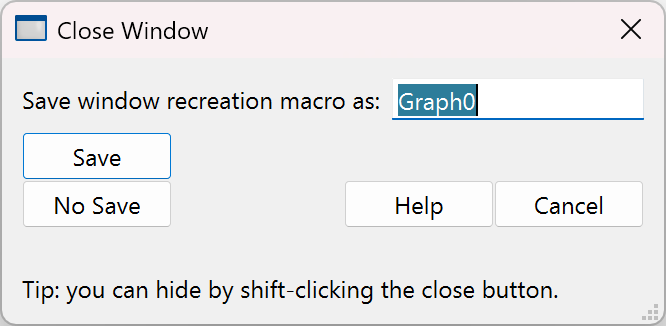
Igor presents the graph's name as the proposed name for the macro. You can replace the proposed name with any valid macro name.
If you want to make a macro so you can recreate the graph later, click Save. Igor then creates a macro which, when invoked, will recreate the graph with its size, position and presentation intact. Igor saves the recreation macro in the procedure window where you can inspect, modify or delete it as you like.
The macro name appears in the Graph Macros submenu of the Windows menu. You can invoke the macro by choosing it from that submenu or by executing the macro from the command line. The window name of the recreated graph will be the same as the name of the macro that recreated it.
If you are sure that you never want to recreate the graph, you can press Alt while you click the close button of the graph window. This closes the graph without presenting the dialog and without saving a recreation macro.
For a general discussion of saving, recreating, closing windows, see Windows.
Graph Style Macros
The purpose of a graph style macro is to allow you to create a number of graphs with the same stylistic properties. Igor can automatically generate a style macro from a prototype graph. You can manually tweak the macro if necessary. Later, you can apply the style macro to a new graph.
For example, you might frequently want to make a graph with a certain sequence of markers and colors and other such properties. You could use preferences to accomplish this. The style macro offers another way and has the advantage that you can have any number of style macros while there is only one set of preferences.
You create a graph style macro by making a prototype graph, setting each of the elements to your taste and then, using the Window Control dialog, instructing Igor to generate a style macro for the window.
You can apply the style macro when you create a graph using the New Graph dialog. You can also apply it to an existing graph by choosing the macro from the Graph Macros submenu of the Windows menu.
Example of Creating a Style Macro
As an example, we will create a style macro that defines the color and line style of five traces.
Since we want our style macro to define a style for five traces, we start by making a graph with five waves:
Make wave0=p, wave1=10+p, wave2=20+p, wave3=30+p, wave4=40+p
Display wave0, wave1, wave2, wave3, wave4
Now, using the Modify Trace Appearance dialog, we set the color and line style for each of the waves to our liking.
Now we're ready to generate the style macro. With the graph the active window, we choose Windows→Control→Window Control to display the Window Control dialog in which we check the Create Style Macro checkbox.
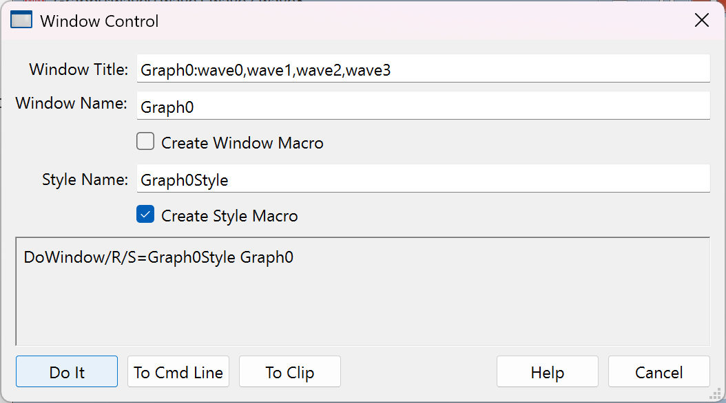
When we click Do It, Igor generates a graph style macro and saves it in the procedure window.
The graph style macro for this example is:
Proc Graph0Style() : GraphStyle
	PauseUpdate; Silent 1	// modifying window...
	ModifyGraph/Z lStyle[1]=1,lStyle[2]=2,lStyle[3]=3,lStyle[4]=4
	ModifyGraph/Z rgb[0]=(0,0,0)
	ModifyGraph/Z rgb[1]=(3,52428,1)
	ModifyGraph/Z rgb[2]=(1,12815,52428)
	ModifyGraph/Z rgb[3]=(52428,1,41942)
	ModifyGraph/Z rgb[4]=(65535,21845,0)
EndMacro
Notice that the graph style macro does not refer to wave0, wave1, wave2, wave3 or wave4. Instead, it refers to traces by index. For example,
ModifyGraph rgb[0]=(0,0,0)
sets the color for the trace whose index is 0 to black. A trace's index is determined by the order in which the traces were displayed or appended to the graph. In the Modify Trace Appearance dialog, the trace whose index is zero appears at the top of the list.
The /Z flag used in the graph style macro tells Igor not to worry if the command tries to modify a trace that is not actually in the graph. For example, if you make a graph with three traces (indices from 0 to 2) and apply this style macro to it, there will be no trace whose index is 3 at the time you run the macro. The command:
ModifyGraph rgb[3]=(52428,1,41942)
would generate an error in this case. Adding the /Z flag tells Igor to continue macro execution and ignore the error.
Style Macros and Preferences
When Igor generates a graph style macro, it generates commands to modify the target graph according to the prototype graph. It assumes that the objects in the target will be in their factory default states at the time the style macro is applied to the target. Therefore, it generates commands only for the objects in the prototype which have been modified. If Igor did not make this assumption, it would have to generate commands for every possible setting for every object in the prototype and style macros would be very large.
Because of this, you should create the new graph with preferences off and then apply the style macro.
Applying the Style Macro
To use a style macro, perform the following steps.
-
Turn preferences off by choosing Preferences Off from the Misc menu.
-
Create a new graph, using the New Graph dialog and optionally the Append Traces to Graph dialog.
-
Choose Graph0Style from the Graph Macros submenu in the Windows menu.
-
Turn preferences back on by choosing Preferences On from the Misc menu.
If you use only the New Graph dialog, you can use the shorter method:
- Open the New Graph dialog, select the waves to be displayed in the graph, and choose Graph0Style from the Style pop-up menu in the dialog. Click Do It.
Igor automatically generates the Preferences Off and Preferences On commands to apply the style to the new graph without being affected by preferences.
Limitations of Style Macros
Igor automatically generates style macro commands to set all of the properties of a graph that you set via the ModifyGraph, Label and SetAxis operations. These are the properties that you set using the Modify Trace Appearance, Modify Graph, and Modify Axis dialogs.
It does not generate commands to recreate annotations or drawing elements. Igor's assumption is that these things will be unique from one graph to the next. If you want to include commands to create annotations and draw elements in a graph, you must add the appropriate commands to the macro.
Where to Store Style Macros
If you want a style macro to be accessible from a single experiment only, you should leave them in the main procedure window of that experiment. If you want a style macro to be accessible from any experiment then you should store it in an auxiliary procedure file. See Procedure Windows for details.
Graph Pop-Up Menus
There are a number of contextual pop-up menus that you can use to quickly set colors and other graph properties. To display a contextual menu, click using the right mouse button.
Different contextual menus are available for clicks on traces, the interior of a graph (but not on a trace) and axes. If you press the Shift key before a contextual click on a trace or axis, the menu will apply to all traces or axes in the graph.
Sometimes it is difficult to contextual click in the plot area of a graph and not hit a trace. In this case, try clicking outside the plot area, but not on an axis.
Graph Expansion
Normally, graphs are shown actual size but sometimes, when working with very small or very large graphs, it is easier to work with an expanded or contracted screen representation. You can set an expansion or contraction factor for a graph using the Expansion submenu in the Graph menu or using the contextual menu for the graph body, away from traces or axes.
The expansion setting affects only the screen representation. It does not affect printing or exporting.
Shortcuts for Graphs
See Graph Shortcuts