Image Plots
You can display image data as an image plot in a graph window. The image data can be a 2D wave, a layer of a 3D or 4D wave, a set of three layers containing RGB values, or a set of four layers containing RGBA values where A is "alpha" which represents opacity.
When discussing image plots, we use the term pixel to refer to an element of the underlying image data and rectangle to refer to the representation of a data element in the image plot.
Each image data value defines the color of a rectangle in the image plot. The size and position of the rectangles are determined by the range of the graph axes, the graph width and height, and the X and Y coordinates of the pixel edges.
If your image data is a floating point type, you can use NaN to represent missing data. This allows the graph background color to show through.
Images are displayed behind all other objects in a graph except the ProgBack and UserBack drawing layers and the background color.
An image plot can be false color, indexed color or direct color.
False Color Images
In false color images, the data values from a 2D wave or layer of a 3D or 4D wave are mapped to colors using a color table. This is a powerful way to view image data and is often more effective than either surface plots or contour plots. You can superimpose a contour plot on top of a false color image of the same data.
Igor has many built-in color tables as described in Color Tables. You can also define your own color tables using waves as described in Color Table Waves. You can also create color index waves that define custom color tables as described in Indexed Color Details.
Indexed Color Images
Indexed color images use the data values stored in a 2D wave or layer of a 3D or 4D wave as indices into an RGB or RGBA wave of color values that you supply. "True color" images, such as those that come from video cameras or scanners, generally use indexed color. Indexed color images are more common than direct color because they consume less memory. See Indexed Color Details.
Direct Color Images
Direct color images use a 3D RGB or RGBA wave. Each layer of the wave represents a color component - red, green, blue, or alpha. A set of component values for a given row and column specifies the color for the corresponding image rectangle. With direct color, you can have a unique color for every rectangle. See Direct Color Details.
Loading an Image
You can load TIFF, JPEG, PNG, BMP, and Sun Raster image files into matrix waves using the ImageLoad operation or the Load Image dialog via the Data menu.
You can also load images from plain text files, HDF5 files, GIS files, and from camera hardware.
For details, see Loading Image Files.
Creating an Image Plot
Image plots are displayed in ordinary graph windows. All the features of graphs apply to image plots: axes, line styles, drawing tools, controls, etc. See Graphs.
You can create an image plot in a new graph window by choosing Windows→New→Image Plot. This displays the New Image Plot dialog. This dialog creates a blank graph to which the plot is appended.
The dialog normally generates two commands - a Display command to make a blank graph window, and an AppendImage command to append a image plot to that graph window. This creates a graph like any other graph but, for most purposes, it is more convenient to use the NewImage operation.
Checking the Use NewImage Command checkbox replaces Display and AppendImage with NewImage. NewImage automatically sizes the graph window to match the number of pixels in the image and reverses the vertical axis so that pictures are displayed right-side-up.
You can show lines of constant image value by appending a contour plot to a graph containing an image. Igor draws contour plots above image plots. See Creating a Contour Plot for an example of combining contour plots and images in a graph.
An image is usually drawn below traces and axes. Usually an image plot fills the plot area, and drawing below the traces allows the traces to be seen. You can choose to have an image plot drawn above axes and traces. This is usually only needed for special effects. It would be useful only if the image range does not cover the plot area completely, or if there are transparent regions in the image.
X, Y, and Z Wave Lists
The Z wave is the wave that contains your image data and defines the color for each rectangle in the image plot.
You can optionally specify an X wave to define rectangle edges in the X dimension and a Y wave to define rectangle edges in the Y dimension. This allows you to create an image plot with rectangles of different widths and heights.
When you select a Z wave, Igor updates the X Wave and Y Wave list to show only those waves, if any, that are suitable for use with the selected Z wave. Only those waves with the proper length appear in the X Wave and Y Wave lists. See Image X and Y Coordinates for details.
Choosing _calculated_ from the X Wave list uses the row scaling (X scaling) of the Z wave to provide the X coordinates of the image rectangle centers.
Choosing _calculated_ from the Y Wave list uses the column scaling (Y scaling) of the Z wave to provide the Y coordinates of the image rectangle centers.
See Also
Operations[AppendImage], ModifyImage, RemoveImage
Modifying an Image Plot
You can change the appearance of the image plot by choosing Image→Modify Image Appearance. This displays the Modify Image Appearance Dialog, which is also available as a subdialog of the New Image Plot dialog.
Use the preferences to change the default image appearance, so you won't be making the same changes over and over. See Image Plot Preferences.
The Modify Image Appearance Dialog
The Modify Image Appearance dialog applies to false color and indexed color images, but not direct color images. See Direct Color Details.
To use indexed color, click the Color Index Wave radio button and choose a color index wave. For color index wave details, see Indexed Color Details.
To use false color, click the Color Table radio button and choose a built-in color table or click the Color Table Wave radio button and choose a color table wave. Autoscaled color mapping assigns the first color in a color table to the minimum value of the image data and the last color to the maximum value. The dialog uses "Z" to refer to the values in the image wave. For more information, see Color Tables.
Indexed and color table colors are distributed between the minimum and maximum Z values either linearly or logarithmically, based on the ModifyImage log parameter, which is set by the Log Colors checkbox.
Use Explicit Mode to select specific colors for specific Z values in the image. If an image element is exactly equal to the number entered in the dialog, it is displayed using the assigned color. This is not very useful for images made with floating-point data; it is intended for integer data. It is almost impossible to enter exact matches for floating-point data.
When you select Explicit Mode for the first time, two entries are made for you assigning white to 0 and black to 255. A third blank line is added for you to enter a new value. If you put something into the blank line, another blank line is added.
To remove an entry, click in the blank areas of a line in the list to select it and press Backspace.
Image X and Y Coordinates
Images display wave data elements as rectangles. They are displayed versus axes just like XY plots.
The intensity or color of each image rectangle is controlled by the corresponding data element of a matrix (2D) wave, or by a layer of a 3D or 4D wave, or by a set of layers of a 3D RGB or RGBA wave.
When discussing image plots, we use the term pixel to refer to an element of the underlying image data and rectangle to refer to the representation of a data element in the image plot.
For each of the spatial dimensions, X and Y, the edges of each image rectangle are defined by one of the following:
-
The dimension scaling of the wave containing the image data or
-
A 1D auxiliary X or Y wave
In the simplest case, all pixels have the same width and height so the pixels are squares of the same size. Another common case consists of rectangular but not square pixels all having the same width and the same height. Both of these are instances of evenly-spaced data. In these cases, you specify the rectangle centers using dimension (X and Y) scaling. This is discussed further under Image X and Y Coordinates - Evenly Spaced.
Less commonly, you may have pixels of unequal widths and/or unequal heights. In this case you must supply auxiliary X and/or Y waves that specify the edges of the image rectangles. This is discussed further under Image X and Y Coordinates - Unevenly Spaced.
It is possible to combine these cases. For example, your pixels may have uniform widths and non-uniform heights. In this case you use one technique for one dimension and the other technique for the other dimension.
Sometimes you may have data that is not really image data, because there is no well-defined pixel width and/or height, but is stored in a matrix (2D) wave. Such data may be more suitable for a scatter plot but can be plotted as an image. This is discussed further under Plotting a 2D Z Wave With 1D X and Y Center Data.
In other cases you may have 1D X, Y and Z waves. These cases are discussed under Plotting 1D X, Y and Z Waves With Gridded XY Data and Plotting 1D X, Y and Z Waves With Non-Gridded XY Data.
The following sections include example commands. If you wish, you can execute the commands by selecting them and pressing Ctrl+Enter.
Image X and Y Coordinates - Evenly Spaced
When your data consists of evenly-spaced pixels, you use the image wave's dimension scaling to specify the image rectangle coordinates. You can set the scaling using the Change Wave Scaling dialog (Data menu) or using the SetScale operation.
The scaled dimension value for a given pixel specifies the center of the corresponding image rectangle.
Here is an example that uses a 2x2 matrix in order to exaggerate the effect.
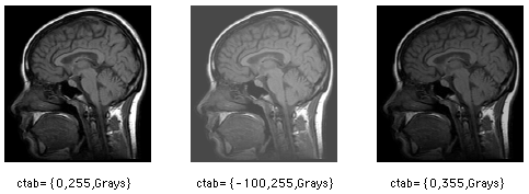
Make/O small={{0,1},{2,3}}
SetScale/P x 0.1,0.02,"", small	// Set X dimension scaling
SetScale/P y 0.0,1.0,"", small	// Set Y dimension scaling
Display;AppendImage small
ModifyImage small ctab= {-0.5,3.5,Grays}
This gives:
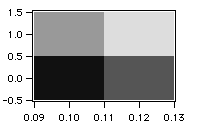
Note that on the X axis the rectangles are centered on 0.10 and 0.12, the matrix wave's X (row) indices as defined by its X scaling. On the Y axis the rectangles are centered on 0.0 and 1.0, the matrix wave's Y (column) indices as defined by its Y scaling. In both cases, the rectangle edges are one half-pixel width from the corresponding index value.
Image X and Y Coordinates - Unevenly Spaced
If your pixel data is unevenly-spaced in the X and/or Y dimension, you must supply X and/or Y waves to define the coordinates of the image rectangle edges.
These waves must contain one more data point than the X (row) or Y (column) dimension of the image wave in order to define the edges of each rectangle.
In this example, the matrix wave is evenly-spaced in the Y dimension but unevenly-spaced in the X dimension:
Make/O small={{0,1},{2,3}}
SetScale/P y 0.0,1.0,"", small		// Set Y dimension scaling
Make/O smallx={1,3,4}					// Define X edges with smallx
Display;AppendImage small vs {smallx,*}
ModifyImage small ctab= {-0.5,3.5,Grays}
This gives:
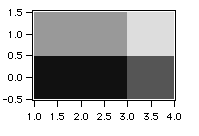
The X coordinate wave (smallx) now controls the vertical edges of each image rectangle. smallx consists of three data points which are necessary to define the vertical edges of the two rectangles in the image plot. The values of smallx are interpreted as follows:
| Point 0: 1.0 | Sets left edge of first rectangle | |
| Point 1: 3.0 | Sets right edge of first rectangle and left edge of second rectangle | |
| Point 2: 4.0 | Sets right edge of last rectangle | |
The 1D edge wave must be either strictly increasing or strictly decreasing.
If you have X and/or Y waves that specify edges but they do not have an extra point, you may be able to proceed by simply adding an extra point. You can do this by editing the waves in a table or using the InsertPoints operation. If this is not appropriate, see the next section for another approach.
Plotting a 2D Z Wave With 1D X and Y Center Data
In an image, each pixel has a well-defined width and height. If your data is sampled at specific X and Y points and there is no well-defined pixel width and height, or if you don't know the width and height of each pixel, you don't really have a proper image.
However, because this kind of data is often stored in a matrix wave with associated X and Y waves, it is sometimes convenient to display it as an image, treating the X and Y waves as containing the center coordinates of the pixels.
To do this, you must create new X and Y waves to specify the image rectangle edges. The new X wave must have one more point than the matrix wave has rows and the new Y wave must have one more point than the matrix wave has columns.
A set of image rectangle centers does not uniquely determine the rectangle edges. To see this, think of a 1x1 image centered at (0,0). Where are the edges? They could be anywhere.
Without additional information, the best you can do is to generate a set of plausible edges, as we do with this function:
Function MakeEdgesWave(centers, edgesWave)
	Wave centers	// Input
	Wave edgesWave	// Receives output

	Variable N=numpnts(centers)
	Redimension/N=(N+1) edgesWave

	edgesWave[0]=centers[0]-0.5*(centers[1]-centers[0])
	edgesWave[N]=centers[N-1]+0.5*(centers[N-1]-centers[N-2])
	edgesWave[1,N-1]=centers[p]-0.5*(centers[p]-centers[p-1])
End
This function demonstrates the use of MakeEdgesWave:
Function DemoPlotXYZAsImage()
	Make/O mat={{0,1,2},{2,3,4},{3,4,5}}            // Matrix containing Z values
	Make/O centersX = {1, 2.5, 5}                   // X centers wave
	Make/O centersY = {300, 400, 600}               // Y centers wave
	Make/O edgesX; MakeEdgesWave(centersX, edgesX)  // Create X edges wave
	Make/O edgesY; MakeEdgesWave(centersY, edgesY)  // Create Y edges wave
	Display; AppendImage mat vs {edgesX,edgesY}
End
If you have additional information that allows you to create edge waves you should do so. Otherwise you can use the MakeEdgesWave function above to create plausible edge waves.
Plotting 1D X, Y and Z Waves With Gridded XY Data
In this case we have 1D X, Y and Z waves of equal length that define a set of points in XYZ space. The X and Y waves constitute an evenly-spaced sampling grid though the spacing in X may be different from the spacing in Y.
A good way to display such data is to create a scatter plot with color set as a function of the Z data. See Setting Trace Properties from an Auxiliary (Z) Wave.
It is also possible to transform your data so it can be plotted as an image, as described under Plotting a 2D Z Wave With 1D X and Y Center Data. To do this you must convert your 1D Z wave into a 2D matrix wave and then convert your X and Y waves to contain the horizontal an vertical centers of your pixels.
For example, we start with this X, Y and Z data:
Make/O centersX = {1,2,3,1,2,3,1,2,3}
Make/O centersY = {5,5,5,7,7,7,9,9,9}
Make/O zData = {1,2,3,4,5,6,7,8,9}
If we display the X and Y data in a graph we can see that the X and Y waves exhibit repeating patterns.
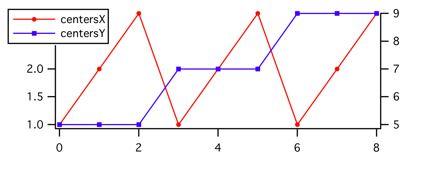
To display this as an image, we transform the data so that the Z wave becomes a 2D matrix representing pixel values and the X and Y waves describe the centers of the rows and columns of pixels:
Redimension/N=(3,3) zData
Make/O/N=3 xCenterLocs = centersX[p]		// 1, 2, 3
Make/O/N=3 yCenterLocs = centersY[p*3]		// 5, 7, 9
We now have data as described under Plotting a 2D Z Wave With 1D X and Y Center Data.
Plotting 1D X, Y and Z Waves With Non-Gridded XY Data
In this case you have 1D X, Y and Z waves of equal length that define a set of points in XYZ space. The X and Y waves do not constitute a grid, so the method of the previous section will not work.
A 2D scatter plot is a good way to graphically represent such data:
Make/O/N=20 xWave=enoise(4),yWave=enoise(5),zWave=enoise(6)  // Random points
Display yWave vs xWave
ModifyGraph mode=3,marker=19
ModifyGraph zColor(yWave)={zWave,*,*,Rainbow,0}
Although the data does not represent a proper image, you may want to display it as an image instead of a scatter plot. You can use the ImageFromXYZ operation to a create matrix wave corresponding to your XYZ data. The matrix wave can then be plotted as a simple image plot.
You can also use Voronoi interpolation to create a matrix wave from the XYZ data:
Concatenate/O {xWave,yWave,zWave}, tripletWave
ImageInterpolate/S={-5,0.1,5,-5,0.1,5} voronoi tripletWave
AppendImage M_InterpolatedImage
Note that the algorithm for Voronoi interpolation is computationally expensive so it may not be practical for very large waves. See also Loess and ImageInterpolate kriging as alternative approaches for generating a smooth surface from unordered scatter data.
Additional options for displaying this type of data as a 3D surface are described under 3D Scatter Plots and in the video tutorial "Creating a Surface Plot from Scatter Data" at https://www.youtube.com/watch?v=kggo0B43n_c.
Image Orientation
By default, Igor draws increasing Y values (matrix column indices) upward, and increasing X (matrix row indices) to the right. Most image formats expect Y to increase downward. As a result, if you create an image plot using
Display; AppendImage <image wave>
your plot appears upside down.
You can flip an image vertically by reversing the Y axis, and horizontally by reversing the X axis, using the axis range tab of the Modify Axis Dialog, which can be reached from the Graph menu.
You can also flip the image vertically by reversing the Y scaling of the image wave.
A simpler alternative is to use NewImage instead of AppendImage. You can do this in the New Image Plot dialog by checking the "Use NewImage command" checkbox. NewImage automatically reverses the left axes.
Image Rectangle Aspect Ratio
By default, Igor does not make the image rectangles square. Use the Modify Graph Dialog (in the Graph menu) to correct this by choosing Plan as the graph's width mode. You can use the Plan height mode to accomplish the same result.
If DimDelta(imageWave,0) does not equal DimDelta(imageWave,1), you will need to enter the ratio (or inverse ratio) of these two values in the Plan width or height:
SetScale/P x 0,3,"", mat2dImage
SetScale/P y 0,1,"", mat2dImage
ModifyGraph width=0, height={Plan,3,left,bottom}
// or
ModifyGraph height=0, width={Plan,1/3,bottom,left}
Do not use the Aspect width or height modes; they make the entire image plot square even if it shouldn't be.
Plan mode ensures the image rectangles are square, but it allows them to be of any size. If you want each image rectangle to be a single point in width and height, use the per Unit width and per Unit height modes. With point X and Y scaling of an image matrix, use one point per unit.
You can also flip an image along its diagonal by setting the Swap XY checkbox.
See also
Image Orientation for a discussion of using Plan and perUnit modes.
Image Polarity
Sometimes the image's pixel values are inverted, too. False color images can be inverted by reversing the color table. Select the Reverse Colors checkbox in the Modify Image Appearance dialog. See Color Tables. To reverse the colors in an index color plot is harder: the rows of the color index wave must be reversed.
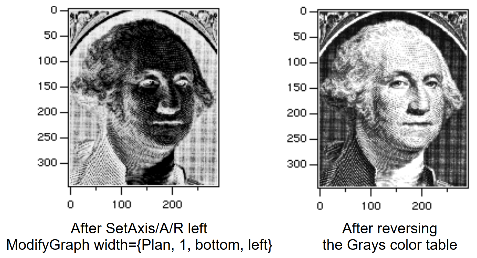
Image Color Tables
In a false color plot, the data values in the 2D image wave are normally linearly mapped into a table of colors containing a set of colors that lets the viewer easily identify the data values. The data values can be logarithmically mapped by using the ModifyImage log=1 option, which is useful when they span multiple orders of magnitude.
There are many built-in color tables for use with false color images. Also, you can create your own color tables using waves - see Color Table Waves.
The CTabList function returns a list of all built-in color table names. You can create a color index wave or a color table wave from any built-in color table using ColorTab2Wave.
The ColorsMarkersLinesPatterns example Igor experiment demonstrates all built-in color tables. These color tables are summarized in the section Color Table Details.
Open ColorsMarkersLinesPatterns Demo
Image Color Table Ranges
The range of data values that maps into the range of colors in the table can be set either manually or automatically using the Modify Image Appearance dialog.
When you choose to autoscale the first or last color, Igor examines the data in your image wave and uses the minimum or maximum data value found.
By changing the "First Color at Z=" and "Last Color at Z=" values you can examine details in your data.
For example, when using the Grays color table, you can lighten the image by assigning the First Color (which is black) to a number lower than the image minimum value. This maps a lighter color to the minimum image value. To darken the maximum image values, assign the Last Color to a number higher than the image maximum value, mapping a darker color to the maximum image value.
You can adjust these settings interactively by choosing Image→Image Range Adjustment.
Data values greater than the range maximum are given the last color in the color table, or they can all be assigned to a single color or made transparent. Similarly, data values less than the range minimum are given the first color in the color table, or they can all be assigned to a single color (possibly different from the max color), or made transparent.
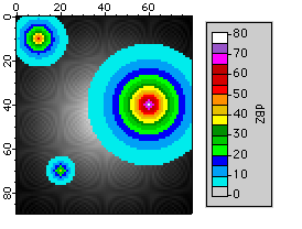
Example: Overlaying Data over a Background Image
By setting the image range to render small values transparent, you can see the underlying image in those locations, which helps visualize where the non-transparent values are located with reference to a background image. Here's a fake weather radar example.
First, we create some "land" to serve as a background image:
Make/O/N=(80,90) landWave = 1-sqrt((x-40)*(x-40)+(y-45)*(y-45))/sqrt(40*40+45*45)
landWave = 7000*landWave*landWave
landWave += 200*sin((x-60)*(y-60)*pi/10)
landWave += 40*(sin((x-60)*pi/5)+sin((y-60)*pi/5))
NewImage landWave
Then we create some "weather" radar data ranging from about 0 to 80 dBZ:
Duplicate/O landWave overlayWeather	// "weather" radar values
overlayWeather=60*exp(-(sqrt((x-10)*(x-10)+(y-10)*(y-10))/5))		// storm 1
overlayWeather+=80*exp(-(sqrt((x-60)*(x-60)+(y-40)*(y-40)))/10)		// storm 2
overlayWeather+=40*exp(-(sqrt((x-20)*(x-20)+(y-70)*(y-70)))/3)		// storm 3
SetScale d, 0, 0, "dBZ", overlayWeather
We append the overlayWeather wave using the same axes as the landWave to overlay the images. With the default color table range, the landWave is totally obscured:
AppendImage/T overlayWeather
ModifyImage overlayWeather ctab= {*,*,dBZ14,0}
// Show the image's data range with a ColorScale
ModifyGraph width={Plan,1,top,left}, margin(right)=100
ColorScale/N=text0/X=107.50/Y=0.00 image=overlayWeather
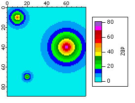
We calibrate the image plot colors to National Weather Service values for precipitation mode by selecting the dBZ14color table for data values ranging from 5 to 75, where values below 5 are transparent and values above 75 are white.
ModifyImage overlayWeather ctab= {5,75,dBZ14,0};DelayUpdate
ModifyImage overlayWeather minRGB=NaN,maxRGB=(65535,65535,65535)
We modify the ColorScale to show a range larger than the color table values (0-80):
ColorScale/C/N=text0 colorBoxesFrame=1,heightPct=90,nticks=10
ColorScale/C/N=text0/B=(52428,52428,52428) axisRange={0,80},tickLen=3.00
Color Table Ranges - Lookup Table (Gamma)
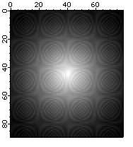
Normally the range of data values and the range of colors are linearly related or logarithmically related if the ModifyImage log parameter is set to 1. You can also cause the mapping to be nonlinear by specifying a lookup (or "gamma") wave, as described in the next example.
Example: Using a Lookup for Advanced Color/Contrast Effects
The ModifyImage operation with the lookup parameter specifies a 1D wave that modifies the mapping of scaled Z values into the current color table. Values in the lookup wave should range from 0.0 to 1.0. A linear ramp from 0 to 1 would have no effect while a ramp from 1 to 0 would reverse the colormap. Used to apply gamma correction to grayscale images or for special effects.
Make luWave=0.5*(1+sin(x/30))
Make /n=(50,50) simpleImage=x*y
NewImage simpleImage
ModifyImage simpleImage ctab= {*,*,Rainbow,0}

// After inspecting the simple image, apply the lookup:
ModifyImage simpleImage lookup=luWave
Specialized Color Tables
Some of the color tables are designed for specific uses and specific numeric ranges.
The BlackBody color table is designed to show the color of a heated "black body", though not the brightness of that body, over the temperature range of 1,000 to 10,000 K.
The Spectrum color table is designed to show the color corresponding to the wavelength of visible light as measured in nanometers over the range of 380 to 780 nm.
The SpectrumBlack color table does the same thing, but over the range of 355 to 830 nm. The fading to black is an attempt to indicate that the human eye loses the ability to perceive colors at the range extremities.
The GreenMagenta16, EOSOrangeBlue11, EOSSpectral11, dBZ14, and dBZ21 tables are designed to represent discrete levels in weather-related images, such as radar reflectivity measures of precipitation and wind velocity and discrete levels for geophysics applications.
The LandAndSea, Relief, PastelsMap, and SeaLandAndFire color tables all have a sharp color transition which is intended to denote sea level. The LandAndSea and Relief tables have this transition at 50% of the range. You can put this transition at a value of 0 by setting the minimum value to the negative of the maximum value:
ModifyImage imageName, ctab={-1000,1000,LandAndSea,0}		// image plot
ColorScale/C/N=scale0  ctab={-1000,1000,LandAndSea,0}		// colorscale
The PastelsMap table has this transition at 2/3 of the range. You can put this transition at a value of 0 by setting the minimum value to twice the negative of the maximum value:
ModifyImage imageName, ctab={-2000,1000,PastelsMap,0}		// image plot
ColorScale/C/N=scale0  ctab={-2000,1000,PastelsMap,0}		// colorscale
This principle can be extended to the other color tables to position a specific color to a desired value. Some trial-and-error is to be expected.
The BlackBody, Spectrum, and SpectrumBlack color tables are based on algorithms from the Color Science web site: http://www.physics.sfasu.edu/astro/color.html (no longer active). Also see Color Science by Wyszecki and Stiles.
References
Light, Adam, and Patrick J. Bartlein, The End of the Rainbow? Color Schemes for Improved Data Graphics, Eos, 85, 385-391, 2004.
Wyszecki, Gunter, and W. S. Stiles, Color Science : Concepts and Methods, Quantitative Data and Formula, 628 pp., John Wiley & Sons, 1982.
See Also: The Color of Contour Traces
Color Table Details
The built-in color tables can be grouped into several categories.
Igor Pro 4-Compatible Color Tables
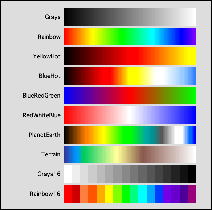
Igor Pro 4 supported 10 built-in color tables: Grays, Rainbow, YellowHot, BlueHot, BlueRedGreen, RedWhiteBlue, PlanetEarth, Terrain, Grays16, and Rainbow16. These color tables have 100 color levels except for Grays16 and Rainbow16, which only have 16 levels.
Igor Pro 4 Color Tables
Igor Pro 5-Compatible Color Tables
Igor Pro 5 added 256-color versions of the eight 100-level color tables in Igor Pro 4 (Grays256, Rainbow256, etc.), new gradient color tables, and new special-purpose color tables.
Igor Pro 5 Gradient Color Tables
These are 256-color transitions between two or three colors.
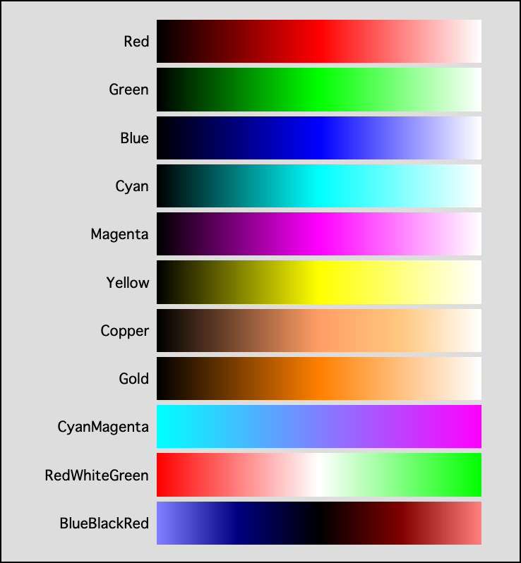
Igor Pro 5 Additional Gradient Color Tables
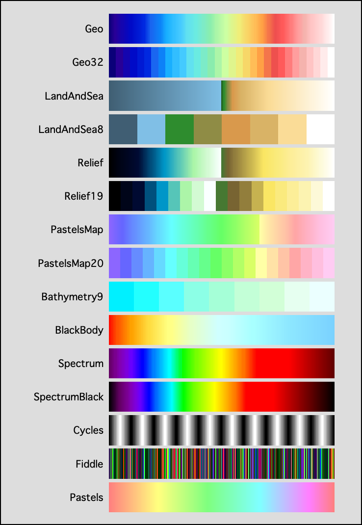
Igor Pro 5 Special-Purpose Color Tables
The special purpose color tables are ones that will find use for particular needs, such as coloring a digital elevation model (DEM) of topography or for spectroscopy. These color tables can have any number of color entries.
The following table summarizes the various special-purpose color tables:
| Color Table Name | Colors | Notes |
|---|---|---|
| Geo | 256 | Popular geographic color table with water and land colors, sea level is around 50%. |
| Geo32 | 32 | Quantized to classify altitudes. Sea level is around 50%. |
| LandAndSea | 255 | Rapid color changes above sea level, which is at exactly 50%. Ocean depths are blue-gray. |
| LandAndSea8 | 8 | Quantized, sea level is at about 22%. |
| Relief | 255 | Slower color changes above sea level, which is at exactly 50%. Ocean depths are black. |
| Relief19 | 19 | Quantized, sea level is at about 47.5%. |
| PastelsMap | 301 | Desaturated rainbow-like colors, with sharp green→yellow color change at sea level, which is at approximately 2/3 (66.67%). Ocean depths are faded purple. |
| PastelsMap20 | 20 | Quantized. Sea level is at about 66.67%. |
| Bathymetry9 | 9 | Colors for ocean depths. Sea level is at 100%. |
| BlackBody | 181 | Red → Yellow → Blue colors that are calibrated to black body radiation colors (neglecting intensity) when the color table range is set from 1,000 °K to 10,000 °K. Each color table entry represents 50 °K. |
| Spectrum | 201 | Rainbow-like colors that are calibrated to the visible spectrum when the color table range is set from 380 to 780 nm (wavelength). Each color table entry represents 2nm. The colors do not completely fade to black at the ends of the color table. |
| SpectrumBlack | 476 | Rainbow-like colors that are calibrated to the visible spectrum when the color table range is set from 355 to 830 nm (wavelength). Each color table entry represents 1nm. The colors fade to black at the ends of the color table. |
| Cycles | 201 | Ten grayscale cycles from 0 to 100% to 0%. |
| Fiddle | 254 | Some randomized colors for "fiddling" with an image to detect faint details in the image. |
| Pastels | 256 | Desaturated Rainbow. |
Igor Pro 5 Additional Special-Purpose Color Tables
Igor Pro 6-Compatible Color Tables
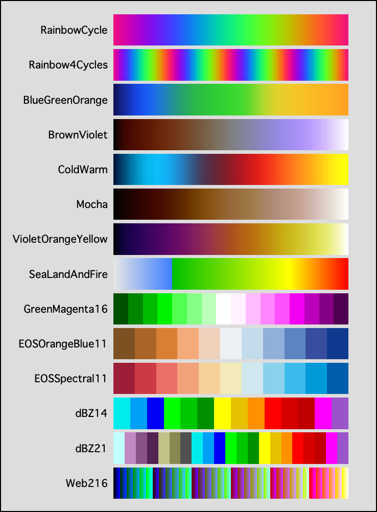
Igor Pro 6 added 14 new color tables:
| Color Table Name | Colors | Notes |
|---|---|---|
| RainbowCycle | 360 | Red, green, blue vary sinusoidally, each 120 degrees (120 values) out of phase. The first and last colors are identical. |
| Rainbow4Cycles | 360 | 4 cycles with one quarter of the angular resolution. |
| BlueGreenOrange | 300 | Three-color gradient. |
| BrownViolet | 300 | Two-color gradient. |
| ColdWarm | 300 | Multicolor gradient for temperature. |
| Mocha | 300 | Two-color gradient. |
| VioletOrangeYellow | 300 | Multicolor gradient for temperature. |
| SeaLandAndFire | 256 | Another topographic table. Sea level is at 25%. |
| GreenMagenta16 | 16 | Similar to the 14-color National Weather Service Motion color tables (base velocity or storm relative values), but friendly to red-green colorblind people. |
| EOSOrangeBlue11 | 11 | Colors for diverging data (friendly to red-green colorblind people). |
| EOSSpectral11 | 11 | Modified spectral colors (friendly to red-green colorblind people). |
| dBZ14 | 14 | National Weather Service Reflectivity (radar) colors for Clear Air (-28 to +24 dBZ) or Precipitation (5 to 70 dBZ) mode. |
| dBZ21 | 21 | National Weather Service Reflectivity (radar) colors for combined Clear Air and Precipitation mode (-30 to 70 dBZ). |
| Web216 | 216 | The 216 "web-safe" colors, provides a wide selection of standard colors in a single color table. Intended for trace f(z) coloring using the ModifyGraph zColor(traceName )=... feature. |
Igor Pro 6 Additional Color Tables
Igor Pro 6.2-Compatible Color Tables
Igor Pro 6.2 added 2 new color tables:
| Color Table Name | Colors | Notes |
|---|---|---|
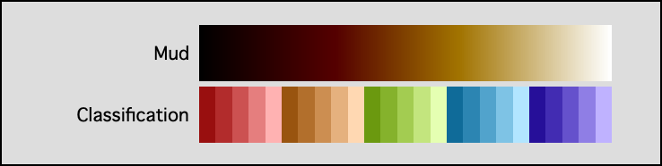
| Mud | 256 | Dark brown to white, without the pink cast of the Mocha color table. For Veeco atomic force microscopes. |
| Classification | 25 | 5 hues for classification, 5 saturations for variations within each class. |
Igor Pro 6.2 Additional Color Tables
Igor Pro 9-Compatible Color Tables
Igor Pro 9 added one new color table:
| Color Table Name | Colors | Notes |
|---|---|---|
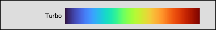
| Turbo | 256 | A reversed Rainbow-like color table with smoother transitions to avoid overly emphasizing features only because they map to a certain color. |
| Designed by Anton Mikhailov, Senior Software Engineer, Daydream. See https://ai.googleblog.com/2019/08/turbo-improved-rainbow-colormap-for.html |
Igor Pro 9 Additional Color Tables
Igor Pro 10-Compatible Color Tables
Igor Pro 10 added two color tables:
| Color Table Name | Colors | Notes |
|---|---|---|
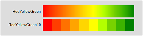
| RedYellowGreen | 256 | Three-color gradient. |
| RedYellowGreen10 | 10 | Quantized gradient. |
Igor Pro 10 Additional Color Tables
Color Table Waves
You can use color index waves (see Indexed Color Details) as if they were color tables.
With a color index wave, the image wave data value is used as an X index into the color index wave to select the color for a given point. The resultant color depends on the data value and the X scaling of the color index wave.
With a color table wave, the image wave's full range of data values, or a range that you explicitly specify, is mapped to the entire color table wave. The resultant color depends on the data value and the operative range only, not on the color table wave's X scaling.
A trivial way to generate a color table wave is to call the ColorTab2Wave operation which creates a 3 column RGB wave named M_Colors, where column 0 is the red component, column 1 is green, and column 2 is blue, and each value is between 0 (dark), and 65535 (bright).
With at 3-column RGB color table wave, all colors are opaque. You can add a fourth column to control transparency, making it an RGBA wave. The fourth column of an RGBA wave represents "alpha", where 0 is fully transparent and 65535 is fully opaque.
Many color table waves are included in the Igor Pro Folder's "Color Tables" folder, along with a help file that describes them. See Color Table Waves in the Igor Pro Folder.
The syntaxes for using color table waves for image plots, contour plots, graph traces, and colorscales vary and are detailed in their respective commands. See ModifyImage (ctab keyword), ModifyContour (ctabFill and ctabLines keywords), ModifyGraph (zColor keyword) and ColorScale (ctab keyword).
See Color Table Waves in the Igor Pro Folder to preview and load color table waves that ship with Igor Pro.
Indexed Color Details
An indexed color plot uses a 2D image wave, or a layer from a 3D or 4D wave, and a color index wave. The image wave data value is used as an X index into the color index wave to select the color for a given image rectangle. The resulting color depends on the data value and the X scaling of the color index wave.
A color index wave is a 2D RGB or RGBA wave. An RGB wave has three columns and each row contains a set of red, green, and blue values that range from 0 (zero intensity) to 65535 (full intensity). An RGBA wave has three color columns plus an alpha column whose values range from 0 (fully transparent) to 65535 (fully opaque).
Linear Indexed Color
For the normal linear indexed color, Igor finds the color for a particular image data value by choosing the row in the color index wave whose X index corresponds to the image data value. Igor converts the image data value zImageValue into a row number colorIndexWaveRow using the following computation:
colorIndexWaveRow = floor(nRows*(zImageValue-xMin)/xRangeInclusive)
where,
nRows = DimSize(colorIndexWave,0)
xMin = DimOffset(colorIndexWave,0)
xRangeInclusive = (nRows-1) * DimDelta(colorIndexWave,0)
If colorIndexWaveRow exceeds the row range, then the Before First Color and After Last Color settings are applied.
By setting the X scaling of the color index wave, you can control how Igor maps the image data value to a color. This is similar to setting the First Color at Z= and Last Color at Z= values for a color table.
Logarithmic Indexed Color
For logarithmic indexed color (the ModifyImage log parameter is set to 1), colors are mapped using the log(x scaling) and log(image z) values this way:
colorIndexWaveRow = floor(nRows*(log(zImageValue)-log(xMin))/(log(xmax)-log(xMin)))
where,
nRows = DimSize(colorIndexWave,0)
xMin = DimOffset(colorIndexWave,0)
xMax = xMin + (nRows-1) * DimDelta(colorIndexWave,0)
Displaying image data in log mode is slower than in linear mode.
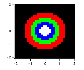
Example: Point-scaled Color Index Wave
// Create a point-scaled, unsigned 16-bit integer color index wave
Make/O/W/U/N=(1,3) shortindex				// initially 1 row; more will be added
shortindex[0][]= {{0},{0},{0}}			// black in first row
shortindex[1][]= {{65535},{0},{0}}		// red in new row
shortindex[2][]= {{0},{65535},{0}}		// green in new row
shortindex[3][]= {{0},{0},{65535}}		// blue in new row
shortindex[4][]= {{65535},{65535},{65535}}	// white in new row
// Generate sample data and display it using the color index wave
Make/O/N=(30,30)/B/U expmat				// /B/U makes unsigned byte image
SetScale/I x,-2,2,"" expmat
SetScale/I y,-2,2,"" expmat
expmat= 4*exp(-(x^2+y^2))					// test image ranges from 0 to 4
Display;AppendImage expmat
ModifyImage expmat cindex=shortindex
Direct Color Details
Direct color images use a 3D RGB wave with three color planes containing absolute values for red, green and blue or a 3D RGBA wave that adds an alpha plane. Generally, direct color waves are either unsigned 8 bit integers or unsigned 16 bit integers.
For 8-bit integer waves, 0 represents zero intensity and 255 represents full intensity. For alpha, 0 represents fully transparent and 255 represents fully opaque.
For all other number types, 0 represents zero intensity but 65535 represents full intensity. For alpha, 0 represents fully transparent and 65535 represents fully opaque. Out-of-range values are clipped to the limits.
Try the following example, executing each line one at a time:
Make/O/B/U/N=(40,40,3) matrgb
NewImage matrgb
matrgb[][][0]= 127*(1+sin(x/8)*sin(y/8))	// Specify red,   0-255
matrgb[][][1]= 127*(1+sin(x/7)*sin(y/6))	// Specify green, 0-255
matrgb[][][2]= 127*(1+sin(x/6)*sin(y/4))	// Specify blue,  0-255

// Switch to floating point, image turns black
Redimension/S matrgb

// Scale floating point to 0..65535 range
matrgb *= 256
Because the appearance of a direct color image is completely determined by the image data, the Modify Image Appearance dialog has no effect on direct color images, and the dialog appears blank.
Direct Color Packing Modes
Prior to Igor Pro 10, direct color images required 3D numeric waves where the standard RGB(A) color components are stored in consecutive color planes. Many cameras and image file formats store data as a stream of pixels of various orders. To help display such images efficiently, Igor Pro 10 adds support for the following new packing modes:
| packSTD: | The default mode where color images are stored as RGB or RGBA layers of a 3D wave. | |
| packFastU8U16: | Monochrome images stored in 2D waves of 8 or 16 bit unsigned integers (one integer per pixel). Here the dimensions of the wave equal to the number of pixels in the image. | |
| packU32RGBFF: | Color images stored in 2D 32-bit unsigned integer waves. Colors are packed as one byte per color component (RGB order) followed by a constant alpha component set to 0xFF. The number of wave columns is 4 times image height in pixels. | |
| packU32RGBA: | Color images stored in 2D 32-bit unsigned integer waves. Colors are packed with one byte per color component (RGBA order). The number of wave columns is 4 times image height in pixels. | |
| packU32FFRGB: | Color images stored in 2D 32-bit unsigned integer waves. Colors are packed with one byte per color component (ARGB order with alpha constant 0xFF). The number of wave columns is 4 times image height in pixels. | |
| packU32ARGB: | Color images stored in 2D 32-bit unsigned integer waves. Colors are packed with one byte per color component (ARGB order). The number of wave columns is 4 times image height in pixels. | |
| pack4U8RGBA: | Color images stored in 2D unsigned byte waves. Colors are packed with one byte per color component (RGBA order). The number of wave columns is 4 times image height in pixels. | |
| pack4U8ARGB: | Color images stored in 2D unsigned byte waves. Colors are packed with one byte per color component (ARGB order). The number of wave columns is 4 times image height in pixels. | |
| pack4U8BGRA: | Color images stored in 2D unsigned byte waves. Colors are packed with one byte per color component (BGRA order). The number of wave columns is 4 times image height in pixels. | |
| pack3U8RGB: | Color images stored in 2D unsigned byte waves. Colors are packed with one byte per color component (RGB order). The number of wave columns is 3 times image height in pixels. | |
| pack3U8BGR: | Color images stored in 2D unsigned byte waves. Colors are packed with one byte per color component (BGR order). The number of wave columns is 3 times image height in pixels. | |
Creating Color Legends
You can create a color legend using a color scale annotation. For background information, see Legends and Color Scales.
We will demonstrate with a simple image plot:
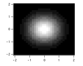
Make/O/N=(30,30) expmat
SetScale/I x,-2,2,"" expmat; SetScale/I y,-2,2,"" expmat
expmat= exp(-(x^2+y^2))		// data ranges from 0 to 1
Display;AppendImage expmat		// by default, left and bottom axes
ModifyGraph width={Plan,1,bottom,left},mirror=0
This creates the following image, using the autoscaled Grays color table:
Choose Graph→Add Annotation to display the Add Annotation dialog.
Choose "ColorScale" from the Annotation pop-up menu.
Switch to the Frame tab and set the Color Bar Frame Thickness to 0 and the Annotation Frame to None.
Switch to the Position tab, check the Exterior checkbox, and set the Anchor to Right Center.
Click Do It. Igor executes:
ColorScale/C/N=text0/F=0/A=RC/E image=expmat,frame=0.00
This generates the following image plot:
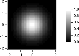
Image Instance Names
Igor identifies an image plot by the name of the wave providing Z values (the wave selected in the Z Wave list of the Image Plot dialogs). This "image instance name" is used in commands that modify the image plot.
In this example the image instance name is "zw":
Display; AppendImage zw		// new image plot
ModifyImage zw ctab={*,*,BlueHot}			// change color table
In the unusual case that a graph contains two image plots of the same wave, to show different subranges of the data side-by-side for example, an instance number must be appended to the name to modify the second plot:
Display; AppendImage zw; AppendImage/R/T zw	// two image plots
ModifyImage zw ctab={*,*,RedWhiteBlue} 	// change first plot
ModifyImage zw#1 ctab={*,*,BlueHot} 		// change second plot
The Modify Image Appearance dialog generates the correct image instance name automatically. Image instance names work much the same way wave instance names for traces in a graph do. See Instance Notation.
The ImageNameList function returns a string list of image instance names. Each name corresponds to one image plot in the graph. The ImageInfo function returns information about a particular named image plot.
ImageNameList returns strings, but ModifyImage uses names. The $ operator turns a string into a name. For example:
Function SetFirstImageToRainbow(graphName)
	String graphName
	String imageInstNames = ImageNameList(graphName, ";") 		// List of names in string
	String firstImageName = StringFromList(0,imageInstNames) 	// Name in a string
	if (strlen(firstImageName) > 0)
		ModifyImage/W=$graphName $firstImageName ctab={,,Rainbow} // $ converts string to name
	endif
End
See also
ImageInfo[ImageInfo], ImageNameList
Image Plot Preferences
You can change the default appearance of image plots by capturing preferences from a prototype graph containing image plots. Create a graph containing an image plot with the settings you use most often. Then choose Capture Graph Prefs from the Graph menu. Select the Image Plots category, and click Capture Prefs.
Preferences are normally in effect only for manual operations, not for automatic operations from Igor procedures. See Procedures and Preferences.
The Image Plots category includes both Image Appearance settings and axis settings.
See also
Preferences, Graph Preferences, Operations[Preferences]
Image Appearance Preferences
The captured Image Appearance settings are automatically applied to an image plot when it is first created, provided preferences are turned on. They are also used to preset the Modify Image Appearance dialog when it is invoked as a subdialog of the New Image Plot dialog.
If you capture the Image Plot preferences from a graph with more than one image plot, the first image plot appended to a graph gets the settings from the image first appended to the prototype graph. The second image plot appended to a graph gets the settings from the second image plot appended to the prototype graph, etc. This is similar to the way XY plot wave styles work.
See also
Image Axis Preferences
Only axes used by the image plot have their settings captured. Axes used solely for an XY, category, or contour plot are ignored.
The image axis preferences are applied only when axes having the same name as the captured axis are created by an AppendImage command. If the axes existed before AppendImage is executed, they are not affected by the image axis preferences.
The names of captured image axes are listed in the X Axis and Y Axis pop-up menus of the New Image Plot Dialog and Append Image Plot Dialog. This is similar to the way XY plot axis preferences work.
For example, suppose you capture preferences for an image plot using axes named "myRightAxis" and "myTopAxis". These names will appear in the X Axis and Y Axis pop-up menus in image plot dialogs.
If you choose them in the New Image Plot Dialog and click Do It, a graph will be created containing newly-created axes named "myRightAxis" and "myTopAxis" and having the axis settings you captured.
If you have a graph which already uses axes named "myRightAxis" and "myTopAxis" and choose these axes in the Append Image Plot Dialog, the image will be appended to those axes, as usual, but no captured axis settings will be applied to these already-existing axes.
You can capture image axis settings for the standard left and bottom axes, and Igor will save these separately from left and bottom axis preferences captured for XY, category, and contour plots. Igor will use the image axis settings for AppendImage commands only.
See also
Graph Preferences, Waves and Axes, Operations[AppendImage]
How to Use Image Preferences
Here is our recommended strategy for using image preferences:
-
Create a new graph containing a single image plot. Use the axes you will normally use, even if they are left and bottom. You can use other axes, too (select New Axis in the New Image Plot and Append Image Plot dialogs).
-
Use the Modify Image Appearance, Modify Graph, and Modify Axis dialogs to make the image plot appear as you prefer.
-
Choose Capture Graph Prefs from the Graph menu. Select the Image Plots category, and click Capture Prefs.