Category Plots
Category plots are two-dimensional plots with a continuous numeric variable on one axis and a non-numeric (text) category on the other. Most often they are presented as bar charts with one or more bars occupying a category slot either side-by-side or stacked or some combination of the two. You can also combine them with error bars:

Category plots are created in ordinary graphs when you use a text wave or dimension labels as the X data. See Graphs for general information on graphs.
Creating a Category Plot
To create a category plot, first create your numeric wave or waves and your text category wave.
The numeric waves used to create a category plot should have "point scaling" (X scaling with Offset = 0 and Delta = 1). See Category Plot Pitfalls for an explanation.
Then invoke the New Category Plot Dialog by choosing Windows→New→Category Plot. You can append to an existing graph by choosing Graph→Append to Graph→Category Plot.
Select the numeric waves from the Y Waves list and the category (text) wave from the X Wave list.
You can use also the Display command directly to create a category plot:
Make/O control={100,300,50,500},test={50,200,70,300}
Make/O/T sample={"15 min","1 hr","6 hrs","24 hrs"}
Display control,test vs sample	// vs text wave creates category plot
ModifyGraph hbFill(control)=5,hbFill(test )=7
SetAxis/A/E=1 left
Legend

Category Plot Commands
The Display operation that creates a category plot is the same Display operation that creates an XY plot. When you use a text wave for the X wave, Igor creates a category plot. When you use a numeric wave for the X wave, Igor creates an XY plot. The same applies to the AppendToGraph operation.
You can control the gap between categories and the gap between bars within a single category using the ModifyGraph operation with the barGap and catGap keywords. You can create a stacked category plot using the ModifyGraph toMode keyword. See Bar and Category Gaps.
Category Plot Using Dimension Labels
An alternative to using a text wave to create a category plot is to use the dimension labels from the Y wave. This feature was added in Igor Pro 8.00.
The easiest way to create the dimension labels is to edit the dimension labels in a table (see Showing Dimension Labels). This example shows how to programmatically make a category plot using dimension labels:
Function DemoCategoryPlotUsingDimensionLabels()
	Make/O control={100,300,50,500}, test={50,200,70,300}
	SetDimLabel 0, 0, '15 min', control
	SetDimLabel 0, 1, '1 hour', control
	SetDimLabel 0, 2, '6 hrs', control
	SetDimLabel 0, 3, '24 hrs', control
	Display /W=(35,45,430,253) control, test vs '\_labels\_'
	ModifyGraph hbFill(control)=5,hbFill(test)=7
	SetAxis/A/E=1 left
	Legend
End
The _labels_ keyword must be enclosed in single quotes because it has the form of a liberal name and it is used in a place where a wave name is expected.
Using the Y wave's dimension labels is convenient for category plots having just one Y wave because it keeps the category labels and the numeric Y data in one place. If you are making the graph manually, you can enter the labels in a table, instead of executing a separate command for each label.
When you have more than one Y wave, the first trace added to a category axis controls the category labels. If you remove the first trace or change the order of traces, the labels may change or become blank. You can prevent this by setting the dimension labels for all the Y waves.
Combining Category Plots and XY Plots
You can have ordinary XY plots and category plots in the same graph window. However, once an axis has been used as either numeric or category, it is not usable as the other type.
For example, if you tried to append an ordinary XY plot to the graph shown above, you would find that the bottom (category) axis was not available in the Axis pop-up menu. If you try to append data to an existing category plot using a different text wave as the category wave, the new category wave is ignored.
The solution to these problems is to create a new axis using the Append Traces to Graph dialog or the Append Category Plot dialog.
Modifying a Category Plot
Because category plots are created in ordinary graph windows, you can change the appearance of the category plot using the same methods you use for XY plots. For example, you can modify the bar colors and line widths using the Modify Trace Appearance dialog. For information on traces, XY plots and graphs, see Modifying Traces.
The settings unique to category plots are described in the following sections.
Bar and Category Gaps
You can control the gap size between bars and between categories.

Generally, the category gap should be larger than the bar gap so that it is clear which bars are in the same category. However, a category gap of 100% leaves no space for bars.
The gap sizes are set in the Modify Axis Dialog which you can display by choosing Graph→Modify Axis or by double-clicking the category axis.
See also
Tick Mark Positioning
You can cause the tick marks to appear in the center of each category slot rather than at the edges. Double-click the category axis to display the Modify Axis dialog and check the "Tick in center" checkbox. This looks best when there is only one bar per category.

Fancy Tick Mark Labels
Tick mark labels on the category axis are drawn using the contents of your category text wave. In addition to simple text, you can insert special escape codes in your category text wave to create multiline labels and to include font changes and other special effects. The escape codes are exactly the same as those used for axis labels and for annotation text boxes (see Annotation Text Content).
There is no point-and-click way to insert the codes in this version of Igor Pro. You will have to either remember the codes or use the Add Annotation Dialog to create a string you can paste into a cell in a table.
To enter multi-line text in a table cell, click the text editor widget at the right end of the table entry line.
You can also make a multi-line label from the command line, like this:
Make/T/N=5 CatWave         // Mostly you won't need this line
CatWave[0]="Line 1\rLine2" // "\r" Makes first label with two lines
Multiline labels are displayed center-aligned on a horizontal category axis and right-aligned on a left axis but left-aligned on a right axis. You can override the default alignment using the alignment escape codes as used in the Add Annotation dialog. See Annotation Text Escape Codes for a description of the formatting codes.
Horizontal Bars
To create a category plot in which the category axis runs vertically and the bars run horizontally, create a normal vertical bar plot and then select the Swap XY checkbox in the Modify Graph dialog.

Reversed Category Axis
Although the ordering of the categories is determined by the ordering of the value (numeric) and category (text) waves, you can reverse a category axis just like you can reverse a numeric axis. Double-click one of the category axis tick labels or choose the Set Axis Range item from the Graph menu. When the axis is in autoscale mode, select the Reverse Axis checkbox to reverse the axis range.

Category Axis Range
You can also enter numeric values in the min and max value items of the Modify Axis Dialog (Axis Range tab). The X scaling of the numeric waves determine the range of the category axis. We used "point" X scaling for the numeric waves, so the numeric range of the category axis for the 15 min, 1 hr, 6 hrs, 24 hrs example is 0 to 4. To display only the second and third categories, set the min to 1 and the max to 3:

Bar Drawing Order
When you plot multiple numeric waves against a single category axis, you have multiple bars within each category group. In the examples so far, there are two bars per category group.
The order in which the bars are initially drawn is the same as the order of the numeric waves in the Display or AppendToGraph command:
Display control,test vs elapsed // control on left, test on right
You can change the drawing order in an existing graph using the Reorder Traces Dialog and the Trace pop-up menu (see Graph Pop-Up Menus).
The ordering of the traces is particularly important for stacked bar charts.
Stacked Bar Charts
You can stack one bar on top of the next by choosing one of several grouping modes in the Modify Trace Appearance dialog which you can invoke by double-clicking a bar. The Grouping pop-up menu in the dialog shows the available modes. The choices are:
| Mode | Mode Name | Purpose |
|---|---|---|
| -1 | Keep with next | For special effects |
| 0 | None | Side-by-side bars (default) |
| 1 | Draw to next | Overlapping bars |
| 2 | Add to next | Arithmetically combined bars |
| 3 | Stack on next | Stacked bars |
For most uses, you will use the None and "Stack on next" modes which produce the familiar bar and stacked bar charts:


In all of the Stacked Bar Chart examples that follow, the stacking mode is applied to the Gain Test #1 bar and Gain Test #2 is the "next" bar. We have offset Gain Test #1 horizontally by 0.1 so that you can see what is being drawn behind Gain Test #2.
Choosing "Draw to next" causes the current bar to be in the same horizontal position as the next bar and to be drawn from the y value of this trace to the y value of the next trace.

If the next bar is taller than the current bar then this bar will not usually be visible because it will be hidden by the next bar. The result is as if the current bar is drawn behind the next bar, as is done when bars are displayed using a common numeric X axis.
"Add to next" is similar to "Draw to next" except the y values of the current bar are added to the y values of the next bar (and so on) before plotting.

If the current Y value is negative and the next is positive then the final position will be shorter than the next bar, as it is here for the 24 hrs bar.
"Stack on next" is similar to "Add to next" except bars are allowed only to grow.
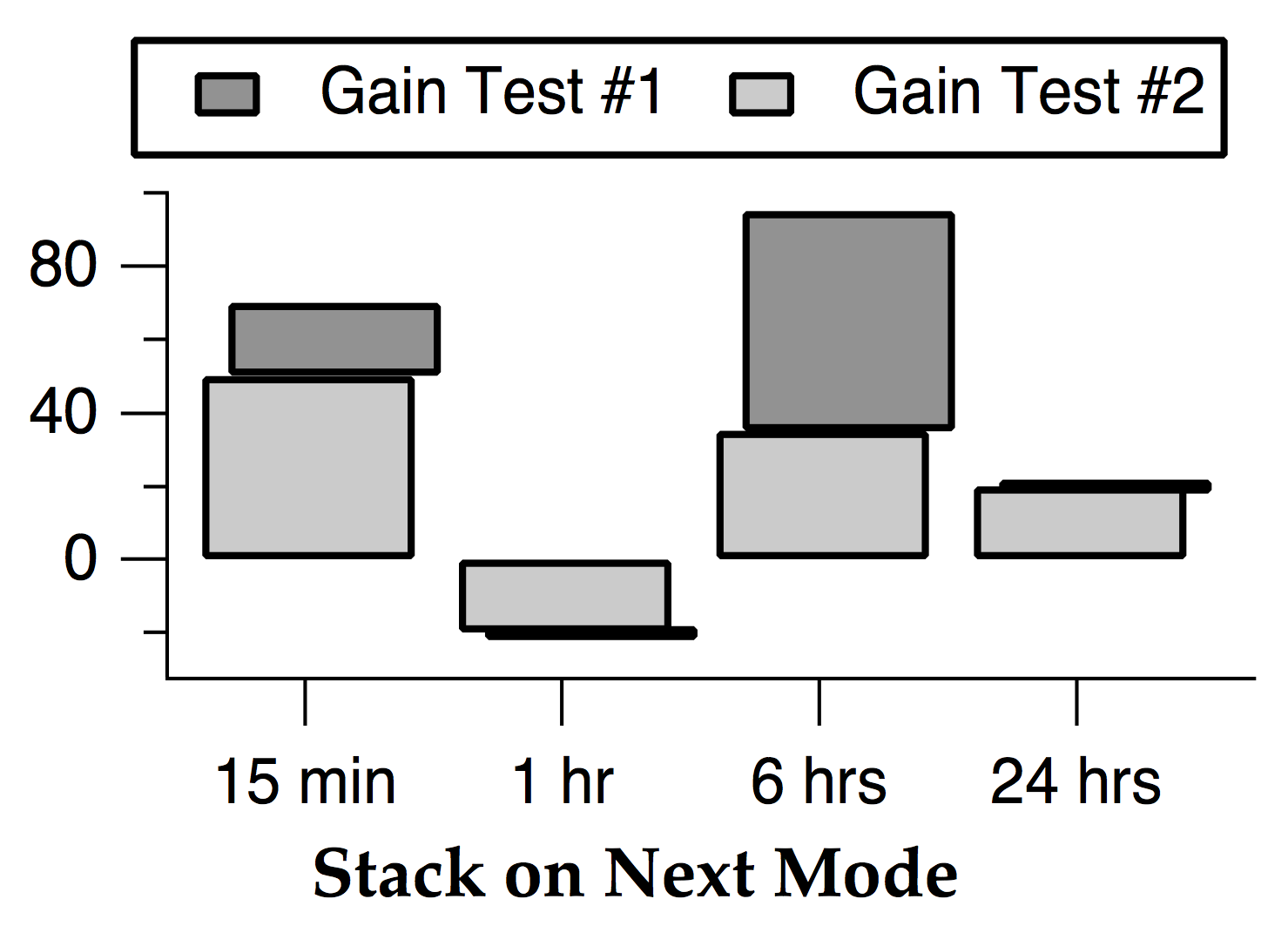
Negative values act like zero when added to a positive next trace (see the 24 hrs bar) and positive values act like zero when added to a negative next trace (see the 1 hr bar). Zero height bars are drawn as a horizontal line. Normally the values are all positive, and the bars stack additively, like the 15 min and 6 hrs bars.
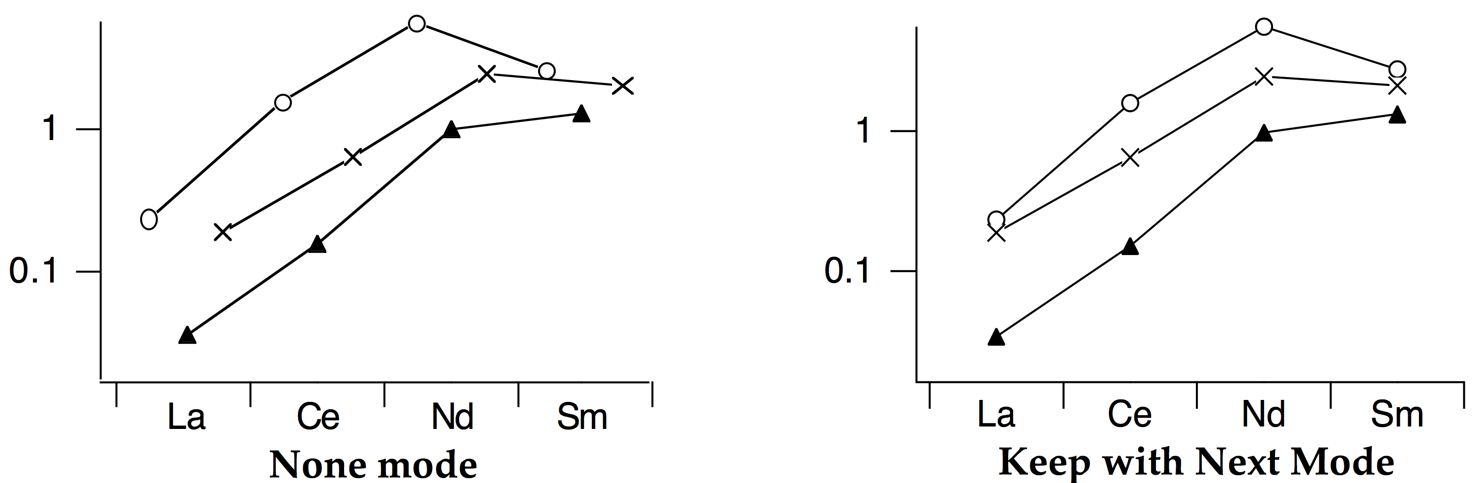
"Keep with next" is provided for special effects in category plots. It is used when you want the current trace to be plotted in the same horizontal slot as the next but you don't want to affect the length of the current bar. For example, if the current trace is a bar and the next is a marker then the marker will be plotted on top of the bar. Here we set the Gain Test #2 wave to Sticks to zero mode, using a line width of 10 points.
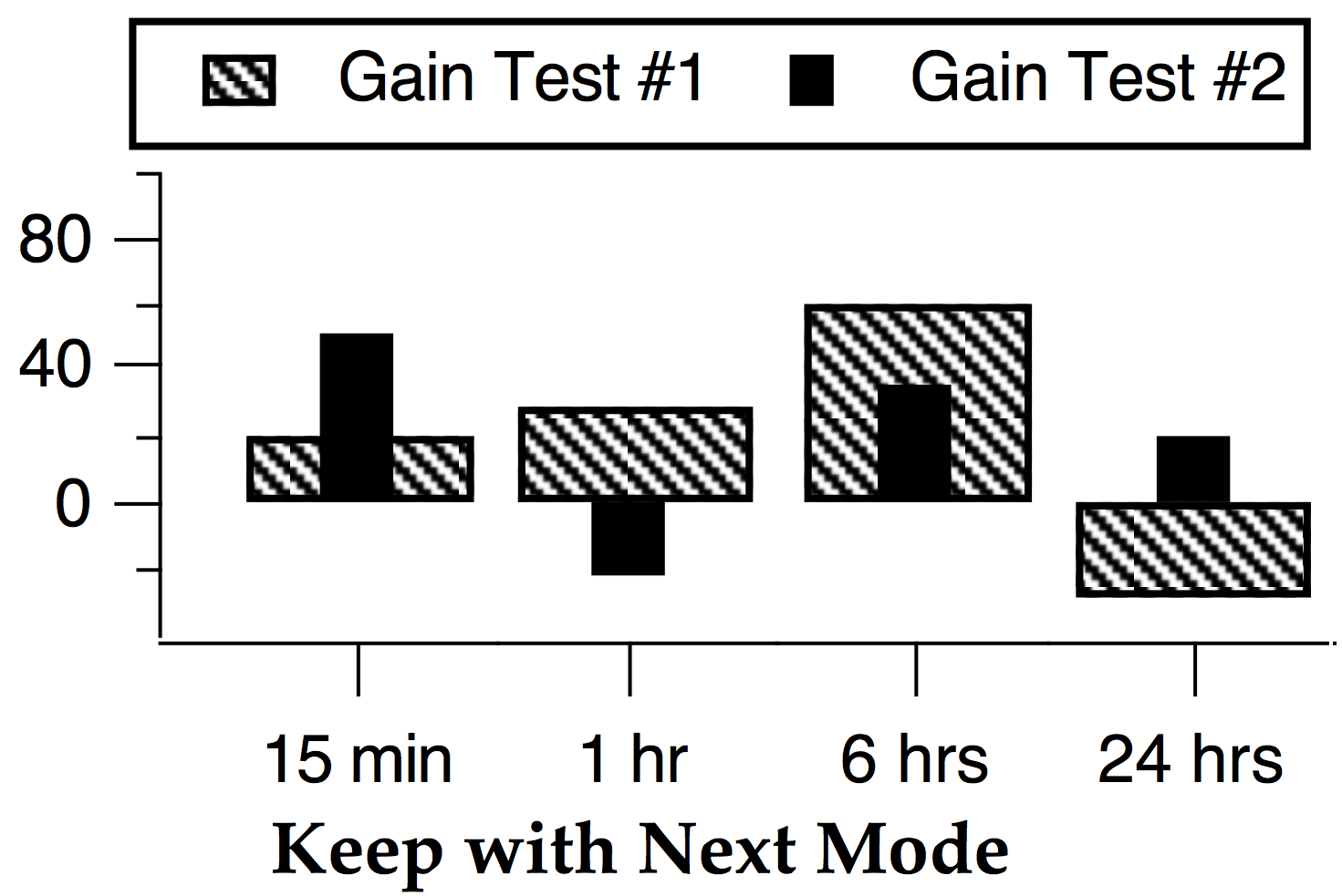
"Keep with next" mode is also useful for category plots that don't use bars; you can keep markers from different traces vertically aligned within the same category:
See also
Numeric Categories
You can create category plots with numeric categories by creating a text wave from your numeric category data. Create a text wave containing a "print-out" of the numeric values by using the num2str function. For example, if we have years in a numeric wave:
Make years={1993,1995,1996,1997}
we can create an equivalent text wave like so:
Make/T/N=4 textYears= num2str(years)
Then create your category plot using textYears:
Display years vs textYears // vs 1993, 1995, 1996, 1997 (as text)
Combining Numeric and Category Traces
Normally when you create a category plot, you can append only another category trace (a numeric wave plotted versus a text wave) to that plot. In rare cases, you may want to add a numeric trace to a category plot. You can do this using the /NCAT flag. Here is an example:
Make/O/T catx = {"cat0", "cat1", "cat2"}
Make/O caty = { 1, 3, 2}
Display caty vs catx
SetAxis/A/E=1 left

// Plot simulated original data for a category
Make/N=10/O cat1over = gnoise(1) + 1.5
SetScale/P x, 1.5, 1e-5, cat1over	// Delta x cannot be zero
AppendToGraph/NCAT cat1over
ModifyGraph mode(cat1over)=3, marker(cat1over)=19, rgb(cat1over)=(0,0,65535)
The /NCAT flag, used with AppendToGraph, tells Igor to allow adding a numeric trace to a category plot. This flag was added in Igor Pro 6.20.
In Igor Pro 6.37 or later, the Display operation also supports the /NCAT flag. This allows you to create a numeric plot and then append a category trace.
Category Plot Pitfalls
You may encounter situations in which the category plot doesn't look like you expect it to.
X Scaling Causes Bars to Move
Category plots position the bars using the X scaling of the value (numeric) waves. The X scaling of the category (text) wave is completely ignored. It is usually best if you leave the X scaling of the category plot waves at the default "point scaling." In any event, the X scaling of the value (numeric) waves should be identical. Differing X scaling causes the bars to become separated in category plots containing multiple bars per category. In the graph on the right the numeric waves have different X scaling:

See also
Stacked Bar Charts, The Waveform Model of Data, Change Wave Scaling Dialog
Drawing Order Breaks Stacked Bars
Stacked bar charts are heavily dependent on the concept of the "current bar" and the "next bar". The modes describe how the current bar is connected to the next bar, such as "Stack on next".
If you change the drawing order of the traces, using the Reorder Traces Dialog or the Trace pop-up menu, one or more bars will have a new "next bar" (a different trace than before). Usually this means that a bar will be stacking on a different bar. This is usually a problem only when the stacking modes of the traces differ, or when smaller bars become hidden by larger bars.
After you change the drawing order, you may have to change the stacking modes. Bars hidden by larger bars may have to be moved forward in the drawing order with the Reorder Traces Dialog or the Trace pop-up menu.
See also
Stacked Bar Charts, Reorder Traces Dialog
Bars Disappear with "Draw to next" Mode
In "Draw to next" mode, if the next bar is taller than the current bar then the current bar will not be visible because it will be hidden by the next bar.
You can change the drawing order with the Reorder Traces Dialog or the Trace pop-up menu to move the shorter bars forward in the drawing order, so they will be drawn in front of the larger bars.
See also
Stacked Bar Charts, Reorder Traces Dialog
Category Plot Preferences
You can change the default appearance of category plots by capturing preferences from a prototype graph containing category plots. Create a graph containing a category plot (or plots) having the settings you use most often. Then choose Graph→Capture Graph Prefs. Select the Category Plots categories, and click Capture Prefs.
Preferences are normally in effect only for manual operations, not for automatic operations from Igor procedures. See Procedures and Preferences.
Category Plot Axes and Axis Labels
When creating category plots with preferences turned on, Igor uses the Category Plot axis settings for the text wave axis and XY Plot axis settings for the numeric wave axis.
Only axes used by category plot text waves have their settings captured. Axes used solely for an XY plot, image plot, or contour plot are ignored. Usually this means that only the bottom axis settings are captured.
The category plot axis preferences are applied only when axes having the same name as the captured axis are created by a Display or AppendToGraph operation when creating a category plot. If the axes existed before the operation is executed, they are not affected by the category plot axis preferences.
The names of captured category plot axes are listed in the X Axis pop-up menu of the New Category Plot and Append Category Plot dialogs.
For example, suppose you capture preferences for a category plot that was created with the command:
AppendToGraph/R=myRightAxis/T=myTopAxis ywave vs textwave
Since only the X axis is a category axis, "myTopAxis" appears in the X Axis pop-up menu in the category plot dialogs. The Y Axis pop-up menu is unaffected.
- If you select "myTopAxis" in the X Axis pop-up menu of the New Category Plot dialog and click Do It, a graph is created containing a newly-created X axis named "myTopAxis" and having the axis settings you captured.
- If you have a graph which already uses an axis named "myTopAxis" as a category axis and you choose it from the X Axis pop-up menu in the Append Category Plot dialog, the category plot uses the axis, but no captured axis settings are applied to it.
You can capture category plot axis settings for the standard left or bottom axis, and Igor will save the settings separately from left and bottom axis preferences captured for XY, image, and contour plots.
Category Plot Wave Styles
The captured category plot wave styles are automatically applied to a category plot when it is first created, provided preferences are turned on - see Procedures and Preferences. "Wave styles" refers to the various trace-specific settings for category plot numeric waves in the graph. The settings include trace mode, line style, stacking mode, fill pattern, colors, etc., as set by the Modify Trace Appearance dialog.
If you capture the category plot preferences from a graph with more than one category plot, the first category plot appended to a graph gets the wave style settings from the category first appended to the prototype graph. The second category plot appended to a graph gets the settings from the second category plot appended to the prototype graph, etc. This is similar to the way XY plot wave styles work.
How to Use Category Plot Preferences
Here is our recommended strategy for using category preferences:
-
Create a new graph containing a single category plot.
-
Use the Modify Trace Appearance dialog and the Modify Axes dialogs to make the category plot appear as you prefer.
-
Choose Capture Graph Prefs from the Graph menu. Select the Category Plot checkboxes, and click Capture Prefs.