Controls and Control Panels
We use the term controls for a number of user-programmable objects that can be employed by Igor programmers to create a graphical user interface for Igor users. We call them controls even though some of the objects only display values. The term widgets is sometimes used by other application programs.
Here is a summary of the types of controls available:
| Button | Calls a procedure that the programmer has written. | |
| Chart | Emulates a mechanical chart recorder. Charts can be used to monitor data acquisition processes or to examine a long data record. Programming a chart is quite involved. See FIFOs and Charts. | |
| CheckBox | Sets an off/on value for use by the programmer's procedures. | |
| CustomControl | Custom control type. Completely specified and modified by the programmer. | |
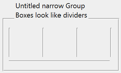
| GroupBox | An organizational element. Groups controls with a box or line. | |
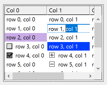
| ListBox | Lists items for viewing or selecting. | |
| PopupMenu | Used by the user to choose a value for use by the programmer's procedures. | |
| SetVariable | Sets and displays a numeric or string global variable. The user can set the variable by clicking or typing. For numeric variables, the control can include up/down buttons for incrementing/decrementing the value stored in the variable. | |
| Slider | Duplicates the behavior of a mechanical slider. Selects either discrete or continuous values. | |
| TabControl | Selects between groups of controls in complex panels. | |
| TitleBox | An organizational element. Provides explanatory text or message. | |
| ValDisplay | Presents a readout of a numeric expression which usually references a global variable. The readout can be in the form of numeric text or a thermometer bar or both. | |
The programmer can specify a procedure to be called when the user clicks on or types into a control. This is called the control's action procedure. For example, the action procedure for a button may interrogate values in PopupMenu, CheckBox, and SetVariable controls and then perform some action.
Control panels are simple windows that contain these controls. These windows have no other purpose. You can also place controls in graph windows and in panel panes embedded into graphs. Controls are not available in any other window type such as tables, notebooks, or layouts.
When used in graphs, controls are not considered part of the presentation and thus are not included when a graph is printed or exported. Allowing controls in graphs is maintained for backward compatibility; we do not recommend it. Instead, use a graph subwindow in a control panel, or a control panel subwindow in a graph. See Embedding and Subwindows.
Nonprogrammers will want to skim only the Modes of Operation and Using Controls sections, and skip the remaining topics. Igor programmers should study all of the topics.
Modes of Operation
Controls have three modes of operation: one mode to use the control, another to enable guides for automatic layout control, and a third mode to modify it. To see this, create a control panel (Windows→New→Panel), then choose Show Tools from the Panel menu to display the tool palette. Three icons will appear in the top of the resulting tools palette. When the top icon is selected, you are able to use the controls. When the next icon is selected, layout guides are displayed in the window and you can edit the layout of controls. When you select the third icon, draw mode is entered and drawing tool buttons appear below the third icon. Draw mode allows you to modify size and position of controls, and to add drawing objects to the window.
When the top icon is selected or when the tool palette is hidden, you are in operate mode. You can momentarily switch to the draw mode to modify the control by pressing Ctrl+Alt. Use this to drag or resize a control as well as to double-click it. Double-clicking with Ctrl+Alt pressed brings up a dialog that modifies the control.
You can also switch to draw mode by choosing an item from the Select Control submenu of the Graph or Panel menu.
To enable the Add Controls submenu in the Graph and Panel menus, you must be in draw mode; either by clicking the third icon or by pressing Ctrl+Alt while selecting the Add Controls submenu.
If the panel is in no-edit mode, you cannot show the tool palette or use the Ctrl+Alt shortcut (see ModifyPanel), or use the Select Control menu.
Using Controls
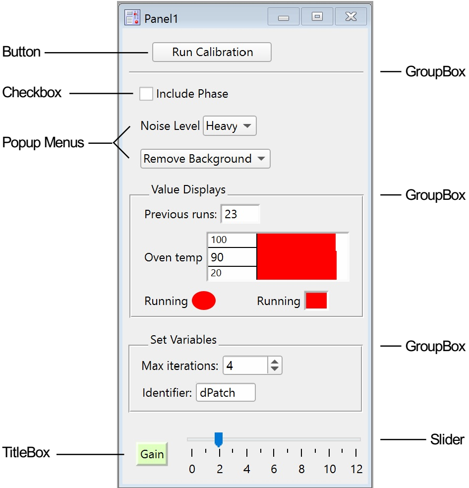
The following panel window illustrates most of the control types.
Buttons
When you click a button, it runs whatever procedure the programmer may have specified.
If nothing happens when you click a button, then there is no procedure assigned to the button. If the procedure window(s) haven't been compiled, clicking a button that has an assigned procedure will produce an error dialog.
You should choose Compile from the Macros menu to correct this situation. If no error occurs, then the button will now be functional.
Buttons usually have a rounded appearance, but a programmer can assign a custom picture so that the button can have nearly any appearance:
Charts
Chart controls can be used to emulate a mechanical chart recorder that writes on paper with moving pens as the paper scrolls by under the pens. Charts can be used to monitor data acquisition processes or to examine a long data record.
For further discussion of using chart controls, see Using Chart Recorder Controls.
Although programming a chart is quite involved, using a chart is actually very easy. See FIFOs and Charts for details.
Checkboxes
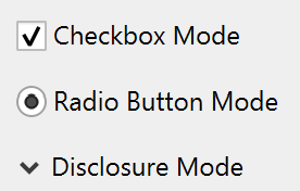
Clicking a checkbox changes its selected state and may run a procedure if the programmer specified one. A checkbox may be connected to a global variable or wave element. Checkboxes can be configured to look and behave like radio buttons or disclosure controls.
CustomControl
CustomControls are used to create completely new types of controls that are custom-made by the programmer. You can define and control the appearance and all aspects of a custom control's behavior. See Creating Custom Controls for examples.
GroupBox
GroupBox controls are organizational or decorative elements. They are used to graphically group sets of controls. They may either draw a box or a separator line and can have optional titles.
ListBox
ListBox controls can present a single or multiple column list of items for viewing or selection. ListBoxes can be configured for a variety of selection modes. Items in the list can be made editable and can be configured as checkboxes.
Pop-Up Menus
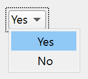
These controls come in two forms: one where the current item is shown in the pop-up menu box:
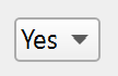
and another where there is no current item and a title is shown in the box:
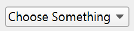
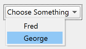
The first form is usually used to choose one of many items while the second is used to run one of many commands.
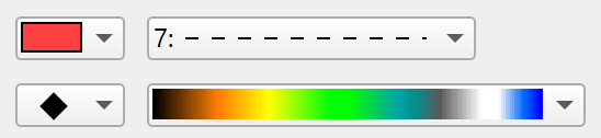
Pop-up menus can also be configured to act like Igor's color, line style, pattern, or marker pop-up menus. These always show the current item.
SetVariable
SetVariable controls also can take on a number of forms and can display numeric values. Unlike Value Display controls that display the value of an expression, SetVariable controls are connected to individual global variables or wave elements, and can be used to set or change those variables in addition to reading out their current value. SetVariable controls can also be used with global string variables or text wave elements to display or set short one line strings. SetVariable controls are automatically updated whenever their associated variables are changed. The value may also be stored internally.
When connected to a numeric variable, these controls can optionally have up or down arrows that increment or decrement the current value of the variable by an amount specified by the programmer. Also, the programmer can set upper and lower limits for the numeric readouts.
New values for both numeric and string variables can be entered by directly typing into the control. Clicking inside the edit area puts the control into edit mode.
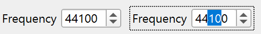
You can then edit the readout text using the standard techniques including Cut, Copy, and Paste. If you want to discard changes you have made, press Escape. To accept changes, press Return, Enter, or Tab or click anywhere outside of the control. Tab enters the current value and also takes you to the next control if any. Shift-Tab is similar but takes you to the previous control if any.
If the control is displaying a numeric value and the text you have entered cannot be converted to a number, then a beep will be emitted when you try to enter the value and no change will be made to the value. If the value you are trying to enter exceeds the limits set by the programmer, then your value will be replaced by the nearest limit.
When a numeric control is selected for editing, Up Arrow and Down Arrow keys act like the up and down buttons on the control.
Changing a value in a SetVariable control may run a procedure if the programmer has specified one.
SetVariable Controls and Data Folders
When connected to a global variable or wave element, SetVariable controls remember the data folder in which the variable exists, and continue to function properly when the current data folder is different than the controlled variable. See SetVariable.
The system variables (K0 through K19) belong to no particular data folder (they are available from any data folder), and there is only one copy of these variables. If you create a SetVariable controlling K0 while the current data folder is "aFolder", and another SetVariable controlling K0 while the current data folder is "bFolder", they are actually controlling the same K0.
Sliders
Slider controls can be used to graphically select either discrete or continuous values. When used to select discrete values, a slider is similar to a pop-up menu or a set of radio buttons. Sliders can be live, updating a variable or running a procedure as the user drags the slider, or they can be configured to wait until the user finishes before performing any action.
Repeating Sliders
Sliders can be configured to call your action procedure repeatedly while the user is interacting with the slider. They can be configured to operate at a constant rate or at a rate proportional to the value, and optionally to spring back to a resting value when released. This feature was added in Igor Pro 8.00.
To implement a repeating slider, use the repeat keyword with the Slider operation. For a demonstration, see this demo experiment: File→Example Experiments→Feature Demos 2→Slider Repeat Demo Slider Repeat Demo.
TabControl
TabControls are used to create complex panels containing many more controls than would otherwise fit. When the user clicks on a tab, the programmers procedure runs and hides the previous set of controls while showing the new set.
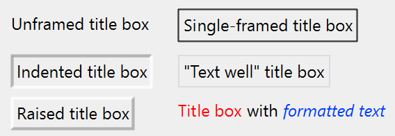
TitleBox
TitleBox controls are mainly decorative elements. They are used to provide explanatory text or labels in a control panel. They may also be used to display textual results. The text can be unchanging, or can be the contents of a global string variable. In either case, the user can't inadvertently change the text.
ValDisplays
ValDisplay controls display numeric or string values in a variety of forms ranging from a simple numeric readout to a thermometer bar. Regardless of the form, ValDisplays are just readouts. There is no interaction with the user. They display the current value of whatever expression the programmer specified. Often this will be just the value of a numeric variable, but it can be any numeric expression including calls to user-defined functions and external functions.
Here is a sampling of the forms that ValDisplay controls can assume.
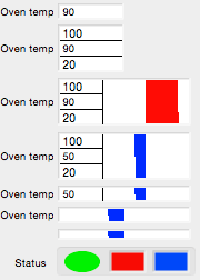
When a thermometer bar is shown, the left edge of the thermometer region represents a low limit set by the programmer while the right edge represents a high limit. The low and high limits appear in some of the above examples. The bar is drawn from a nominal value set by the programmer and will be red if the current value exceeds the nominal value and will be blue if it is less than the nominal value. In the above examples the nominal value is 60. There is no numeric indication of the nominal value. If the nominal value is less than the low limit then the bar will grow from the left to the right. If the nominal value is greater than the high limit then the bar will grow from the right to the left.
If you carefully observe a thermometer bar that is connected to an expression whose value is slowly changing with time you will see that the bar is drawn in a zig-zag fashion. This provides a much finer resolution than if the bar were to be extended or contracted by an entire column of screen pixels at once.
Creating Controls
The ease of creating the various controls varies widely. Anyone capable of writing a simple procedure can create buttons and checkboxes, but creating charts and custom controls requires more expertise. Most controls can be created and modified using dialogs that you invoke via the Add Controls submenu in the Graph or Panel menu, or the Add Control submenu of the panel contextual menu that is available in a panel in Draw mode or Guides mode.
The Add Controls menu or the Add Control submenu are enabled only when the guides mode or draw mode is enabled (for more information on these modes, see Modes of Operation). To do this, choose Show Tools from the Graph or Panel menu and then click the second icon from the top in the graph or panel tool palette.
You can temporarily use the arrow tool in draw mode without the tool palette showing by pressing Ctrl+Alt. While you press these keys, the normally-disabled Add Controls submenu is enabled.
Draw Mode
Enter Draw Mode by selecting Panel→Show Tools, or by right-clicking in a panel window and selecting Show Tools. Click the third button to activate Draw Mode. That displays a palette of tools for creating drawing objects; at the bottom are buttons that display menus to manipulate drawing objects and controls. The top tool button is the arrow or selection tool.
When you click a control with the arrow tool, small handles are drawn that allow you to resize the control. Note that some controls cannot be resized this way, and some can only be resized in one dimension. You will know this when you try to resize a control and it doesn't budge. You can also use the arrow tool to reposition a control. You can select a control by name with the Select Control submenu in the Graph or Panel menu.
With the arrow tool, you can double-click most controls to get a dialog that modifies or duplicates the control. Charts and CustomControls do not have dialog support.
When you right-click a control, you get a contextual menu that varies depending on the type of control.
In Draw mode (third button in the tool palette), you can select multiple controls, mix selections with drawing objects, and perform operations such as move, cut, copy, paste, delete, and align. These operations are undoable. You can't group controls as you can with drawing objects. When you choose Select All, all drawing objects and controls are selected.
If you want to copy controls from one window to another, simply use the Edit menu to copy and paste. You can also duplicate controls using copy and paste.
When you copy controls to the clipboard, the command and control names are also copied as text. This is handy for programming. Right-click on a control and select Copy Commands to put the commands that will create that control onto the clipboard. Select one or more controls, right-click and select Copy Names to copy a semicolon-separated list of the control names.
Press Alt while choosing Edit→Copy to copy the complete commands for creating the copied controls.
If you copy a control from the extreme side or bottom of a window, it may not be visible when you paste it into a smaller window. Use the smaller window's Retrieve submenu in the Mover tool palette icon to make it visible.
Guides Mode
Select the second icon in the tool palette to enter Guides mode. In Guides mode, controls can be anchored to guide lines that help to align and size controls, and to maintain appropriate layout within the owning window. See Laying Out Controls in Guides Mode below. Guides mode for controls is similar to subwindow layout using guides; see Guides Mode for Laying Out Subwindows.
In guides mode, you can select multiple controls for layout using guides. Draw objects do not interact with the guides, and in Guides mode you cannot select them.
General Command Syntax
All of the control commands use the following general syntax:
ControlOperation Name [,keyword[=value] [,keyword[=value]]...]
Name is the control's name. It must be unique among controls in the window containing the control. If Name is not already in use then a new control is created. If a control with the same name already exists then that control is modified, so that multiple commands using the same name result in only one control. This is useful for creating controls that require many keywords.
All keywords are optional. Not all controls accept all keywords, and some controls accept a keyword but do not actually use the value. The value for a keyword with one type of control can have a different form from the value for the same keyword used with a different type of controls. See the specific control operation documentation in the Igor Pro Reference for details.
Some controls utilize a format keyword to set a format string. The format string can be any printf-style format that expects a single numeric value. Think of the output as being the result of the following command:
Printf formatString, value_being_displayed
See the printf operation for a discussion of printf format strings. The maximum length of the format string is 63 bytes. The format is used only for controls that display numeric values.
Most controls can interact with the mouse or keyboard. Such controls can optionally call a user-defined function in response to user actions. We use the term action procedure for such a function. The action procedure for a control takes a single parameter that is a special structure that encapsulates information about the action that triggered a call to the action procedure. Each control has its own structure. See the documentation for a given control type for information on the control's structure.
A long time ago, the action procedures for controls took several input parameters, and each parameter carried one bit of information. Such action procedures are still documented, and they still work, but their use is deprecated. For all new code, please use the structure-based action procedures. They are far more capable, and easier for WaveMetrics to add new features. The old-style action procedures are maintained only to keep old code working.
The creation dialogs for each control can create a blank user function with the correct parameters.
Creating Button Controls
The Button operation creates or modifies a standard or custom button with the title text centered in the button. The default font depends on the operating system, but you can change the font, font size, text color and use annotation-like escape codes (see Annotation Escape Codes). The amount of text does not change the button size, which you can set to whatever you want.
Here we create a simple button that will just emit a beep when pressed. Start by choosing the Add Button menu item in the Graph or Panel menu to invoke the Button Control dialog:
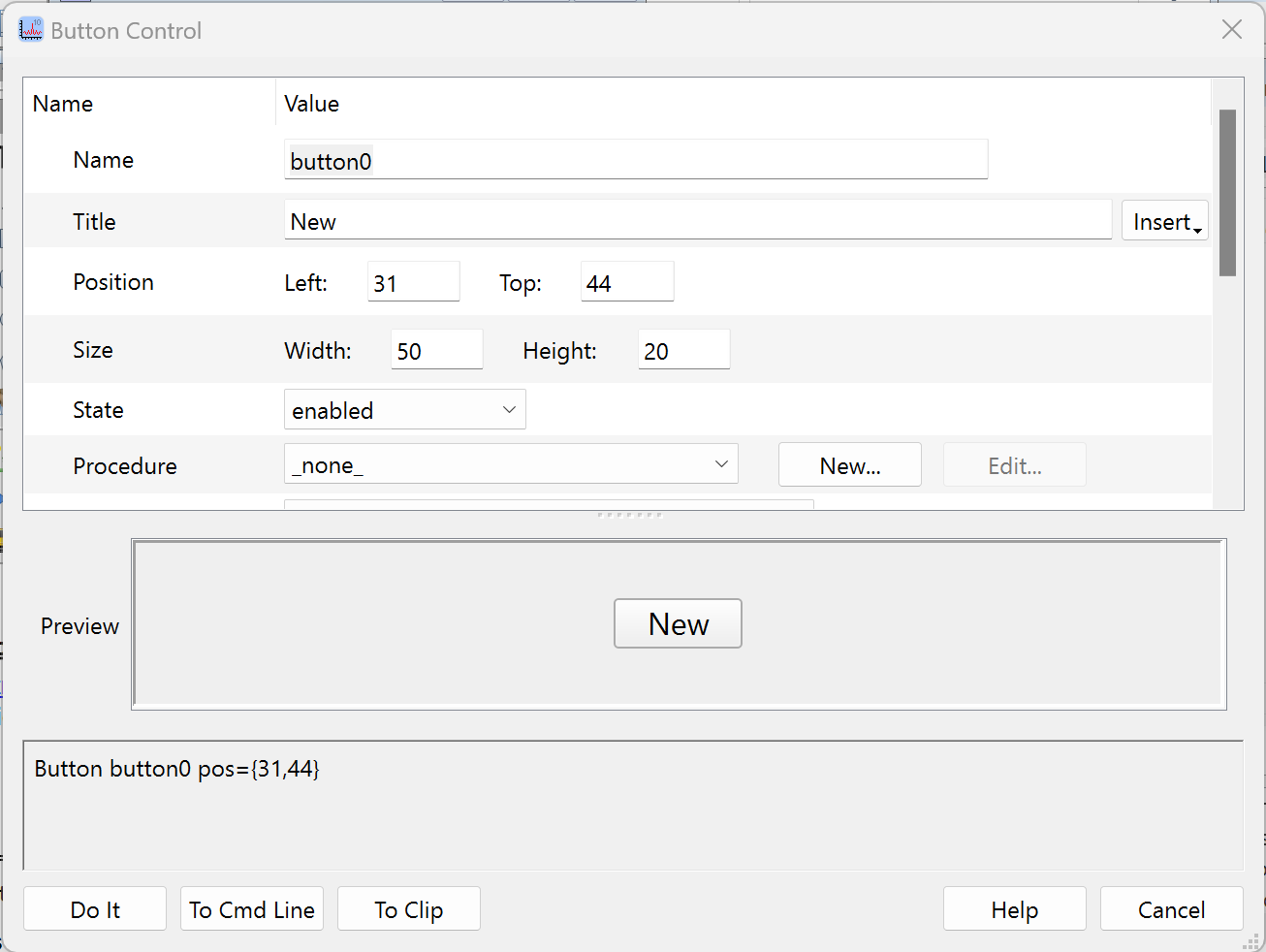
Clicking the procedure's New button brings up a dialog containing a procedure template that you can edit, rename, and save. Here we started with the standard ButtonControl template, replaced the default name with MyBeepProc, and added the Beep command:
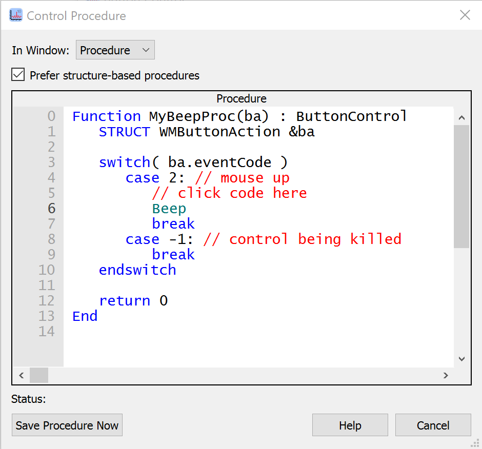
The controls can work with procedures using two formats: the old procedure format used in Igor 3 and 4, and the "structure-based" format introduced in Igor 5.
The "Prefer structure-based procedures" checkbox is checked by default because structure-based procedures are recommended for all new code. If you uncheck this checkbox before editing the template, Igor switches the template to the old procedure format. Use of the old format is discouraged.
Click Help to get help about the Button operation. In the Details section of the help, you can find information about the members of the WMButtonAction structure.
The fact that you can create the action procedure for a control in a dialog may lead you to believe that the procedure is stored with the button. This is not true. The procedure is actually stored in a procedure window. This way you can use the same action procedure for several controls. The control's structure contains the name of the control and the name of the control's owning window, allowing you to differentiate the individual controls using the same procedure.
For more information on using action procedures, see Control Structures, the Button operation, and Using Structures with Windows and Controls.
Button Control Example
Here is how to make a button whose title alternates between Start and Stop.
Enter the following in the procedure window:
Function MyStartProc()
	Print "Starting"
End

Function MyStopProc()
	Print "Stopping"
End

Function StartStopButton(ba) : ButtonControl
	STRUCT WMButtonAction &ba

	switch (ba.eventCode)
		case 2: 						// Mouse up
			if (CmpStr(ba.ctrlName,"bStart") == 0)
				Button $ba.ctrlName,title="Stop",rename=bStop
				MyStartProc()
			else
				Button $ba.ctrlName,title="Start",rename=bStart
				MyStopProc()
			endif
			break
	endswitch

	return 0
End
Now execute:
NewPanel
Button bStart,size={50,20},proc=StartStopButton,title="Start"
Custom Button Control Example
You can create custom buttons by following these steps:
-
Using a graphics-editing program, create a picture that shows the button in its normal ("relaxed") state, then in the pressed-in state, and then in the disabled state. Each portion of the picture should be the same size:
If the button blends into the background, it will look better if the buttons are created on the background you will use in the panel. Better yet, create your picture with a transparent background, like the picture above.
-
Copy the picture to the clipboard.
-
Switch to Igor, choose Misc→Pictures, click Load→From Clipboard.
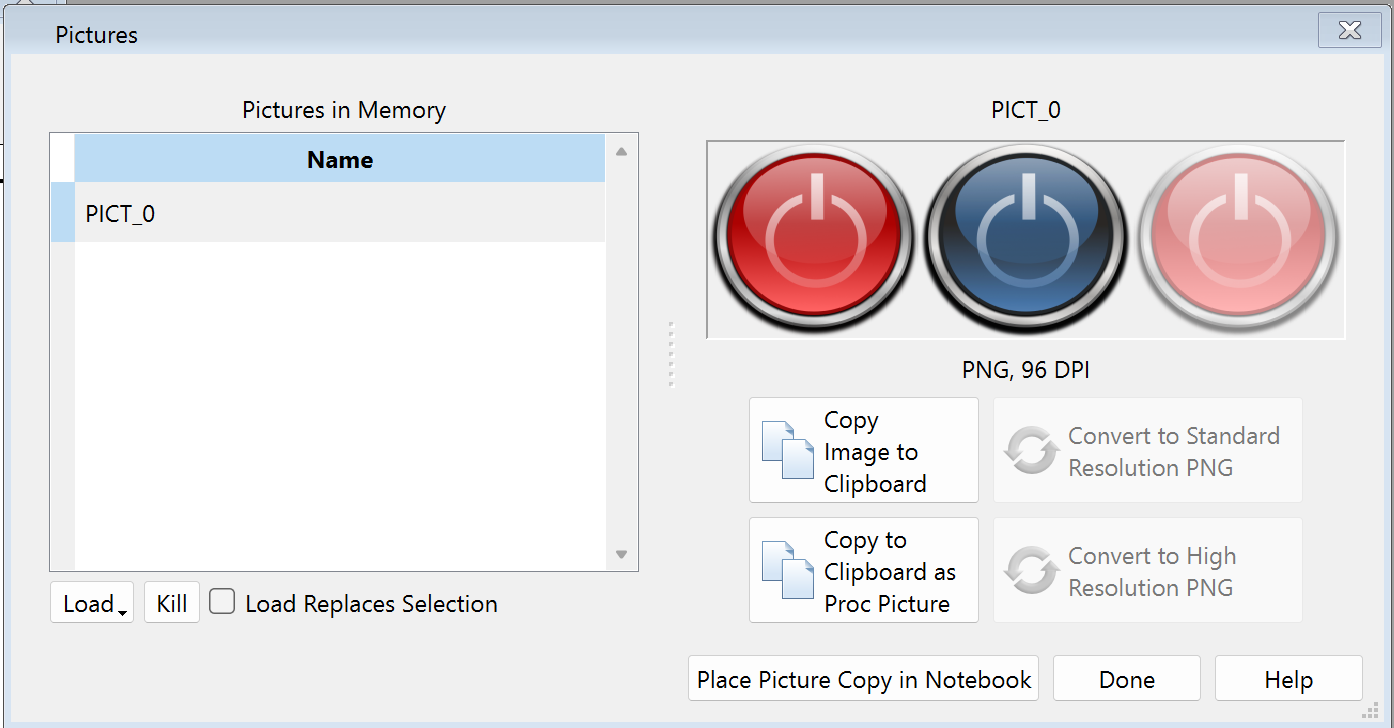
-
Click Copy to Clipboard as Proc Picture to create Proc Picture text on the Clipboard.
-
Click Done.
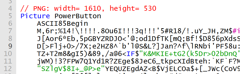
-
Open a procedure window, paste the text, and give a suitable name to the picture:
-
Activate an existing control panel or create a new one.
-
If the tool palette is not showing, choose Panel→Show Tools.
-
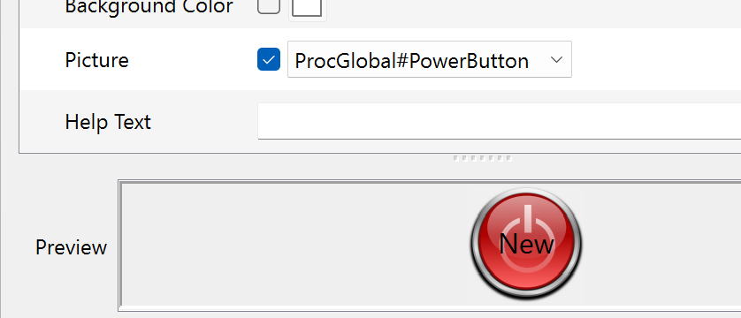
Choose Panel→Add Control→Add Button or right-click in the panel and select Add Control→Button to display the Button Control dialog.
-
Locate the Picture setting in the dialog, check the checkbox, and select the proc picture from the pop-up menu:
-
Locate the Size setting in the dialog and set the appropriate size for the button:
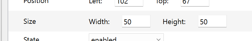
Note that the button's size is the same vertically and horizontally; the picture will be distorted to fit into whatever size you set.
Creating Chart Controls
The Chart operation creates or modifies a chart control. There is no dialog support for chart controls. You need at least intermediate-level Igor programming skills to create a functional chart control.
For further information, see FIFOs and Charts.
Creating Checkbox Controls
The CheckBox operation creates or modifies a checkbox, radio button or disclosure control.
CheckBox controls automatically size themselves in both height and width. They can optionally be connected to a global variable or an element in a wave.
For an example of using checkbox controls as a radio buttons, see the reference documentation for CheckBox.
Checkbox control action procedures have this form:
Function CheckProc(cba) : CheckBoxControl
	STRUCT WMCheckboxAction &cba

	switch (cba.eventCode)
		case 2: 			// Mouse up
			Variable checked = cba.checked
			break
		case -1: 			// Control being killed
			break
	endswitch

	return 0
End
The checked structure member is set to the new checkbox value: 0 or 1.
You often do not need an action procedure for a checkbox because you can read the state of the checkbox with the ControlInfo operation.
You can create custom checkboxes by following steps similar to those for custom buttons (see Custom Button Control Example), except that the picture has six states side-by-side instead of three. The checkbox states are:
| Image Order | Control State |
|---|---|
| Left | Deselected enabled. |
| Deselected enabled and clicked down (about to be selected). | |
| Deselected disabled. | |
| Selected enabled. | |
| Selected enabled and clicked down (about to be deselected). | |
| Right | Selected disabled. |
Creating Custom Controls
The CustomControl operation creates or modifies a custom control, all aspects of which are completely defined by the programmer. See the CustomControl operation for a complete description.
The examples in this section are also available in the Custom Controls demo experiment.
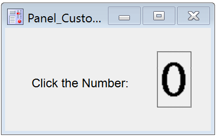
What you can create with a CustomControl can be fairly simple, such as this counter that increments when you click on it.
Four clicks later:
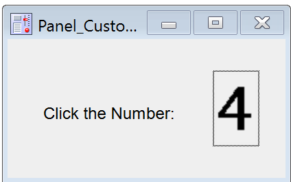
The following code implements the counter custom control using the kCCE_frame event. In the panel, click on the number to increment the counter; also try clicking and then dragging outside the control.
static constant kCCE_mouseup= 2
static constant kCCE_frame= 12

// PNG: width= 280, height= 49
Picture Numbers0to9
	ASCII85Begin
	M,6r;%14!\!!!!.8Ou6I!!!$:!!!!R#Qau+!00#^OT5@]&TgHDFAm*iFE_/6AH5;7DfQssEc39jTBQ
	=U"5QO:5u`*!m@2jnj"La,mA^'a?hQ[Z.[.,Kgd(1o5*(PSO8oS[GX%3u'11dTl)fII/"f-?Jq*no#
	Qb>Y+UBKXKHQpQ&qYW88I,Ctm(`:C^]$4<ePf>Y(L\U!R2N7CEAn![N1I+[hTtr.VepqSG4R-;/+$3
	IJE.V(>s0B@E@"n"ET+@5J9n_E:qeR_8:Fl?m1=DM;mu.AEj!)]K4CUuCa4T=W)#(SE>uH[A4\;IG/
	e]FqJ4u,2`*p=N5sc@qLD5bH89>gIBdF-1i6SF28oH@"3c2m)bDr&,UB$]i]/0bA.=qbR2#\-D9E?O
	2>3D>`($p(Kn)F8aF@)LYiXn[h2K):5@^kF?94)j*1Xtq1U2oFZmY.te?0G)EQ%5,RVT-c)DVa+%mP
	%+bS*_hN$hC*8uCJuIWqTHJR.U?32`_B)(g_8e#*YXa>=faEdJsF]6iJlrQ@QAX7huJUmXj8:PBTb2
	Y:DYf*Sci'Q"3_;@RDQA:A/([2sO8r$hW)\B$XBGASJ:6OpC+GL<FjVfeNm20U<l<9J%cndX3'HP+k
	R.IV?U>ns*\_;Zt[]6G6"Rb-*'Nm-E8]LXXXo7Ub>A**7Bm5cS*">HbQ&_RhmUe]$iu@T?Cci:e-\_`k
	sE+H.GRSMT(9to;IZuH`T4%Yt<jF$+W?Yh6Q*_`C4sGig=L@DKoT%.H=#e_H"QEeeBVNTWBSMYr3dj
	O=T%d&4kT9#cWPHS>kAG;3=or2(IK*IBF$^qK,+m0NSDK_!+e0#3fAI>HfKa<sk0641u\W@r+Y:$.i
	i$grCPR#&6,;+>nTs_IKS6XcYR)A$fJiC6Z_d2S!$R>_ZH+[<p:JI0ub]\BhE(0RP@((KTRTGo;#SY
	LT^9;D7X#km%UV20?$RS"FZoIF!(`FY-iL?n$%#o;-Wj(\PaBS6ZRQe@:kC>%ULrhTWLNM=n@fUbRp
	SKkLe\kJ)Sd]u7!?pRJk-!XL[/MZX'"n4?a?JIKO0k'KUm1IZ+roB=:Bq'$&E<#$Krp%p,E"4sI>[-
	0F#^ff5SN':2fO)LNC?L4(2ga=!aLm8)tVbGAM?L`l^=$D_YP7Z(sOFs)BL5er5G95p3?m%hM^lSr'
	*E^O@8=u6hL`L$mPcq!Bl-iHuGA6hiip%`cFjl9>W?'E-&5T%Y.]i2A@1i%p8XJ5[khb:&"JXYSC\r
	10Ss8<Ye;S^"Nc0%-DFouAiPQ9OemnR!"sHH$JKt@!"d0E"'M(P%:`p'15_10`!<nVt"TALQ>PF8WL
	Z:#f!!!!j78?7R6=>B
	ASCII85End
End

Structure CC_CounterInfo
	Int32 theCount						// current frame of 10 frame sequence of numbers in
EndStructure

Function MyCC_CounterFunc(s)
	STRUCT WMCustomControlAction &s

	STRUCT CC_CounterInfo info

	if( s.eventCode==kCCE_frame )
		StructGet/S info,s.userdata
		s.curFrame= mod(info.theCount+(s.curFrame!=0),10)
	elseif( s.eventCode==kCCE_mouseup )
		StructGet/S info,s.userdata
		info.theCount= mod(info.theCount+1,10)
		StructPut/S info,s.userdata		// will be written out to control
	endif

	return 0
End

Window Panel_CustomControl() : Panel
	PauseUpdate; Silent 1		// building window...
	NewPanel /W=(69,93,271,194)
	SetDrawLayer UserBack
	DrawText 26,62,"Click the Number:"
	CustomControl cc2,pos={152,26},proc=MyCC_CounterFunc,picture={ProcGlobal#Numbers0to9,10}
EndMacro
You can create even more sophisticated controls, such as this voltage meter control.
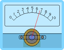
Open the Custom Controls demo experiment to try this control and see the code that implements it.
Creating GroupBox Controls
The GroupBox operation creates or modifies a group box control. It makes a visual container for a group of related controls. See the GroupBox operation for a complete description and examples.
Creating ListBox Controls
The ListBox operation creates or modifies a listbox control.
We illustrate listbox creation by example.
- Create a panel with a listbox control:
NewPanel
ListBox list0 size={200,60},mode=1
The simplest functional listbox needs at least one text wave to contain the list items. Without the text wave, a listbox control has no list items. In this state, the listbox is drawn with a red X over the control.
- Create a text wave to contain the list items:
Make/O/T textWave0 = {"first item in list", "second item in list", "etc..."}
-
Choose Panel→Show Tools. Make sure the bottom of the three tool buttons is selected.
This puts the panel in draw mode so you can modify controls.
-
Double-click the listbox control to invoke the ListBox Control dialog.
-
For the List Text Wave property, select the wave you created to assign it as the list's text wave.
-
Click Do It.
You now have a basic listbox control.
-
Click the operate (top) icon, or choose Panel→Hide Tools, so you can use, rather than edit, the list.
In this example, we created a single-selection list. You can query its selection by calling ControlInfo and checking the V_Value output variable.
A ListBox control has many different options and variations; see the ListBox operation for a complete description and further examples. There is also a demo experiment for ListBox controls:
Right-clicking a listbox shows a contextual menu with commands for editing the list waves and action procedure, and for creating a numeric selection wave, if the control is a multi-selection listbox.
Creating PopupMenu Controls
The PopupMenu operation creates or modifies a pop-up menu control. Pop-up menus are usually used to provide a choice of text items but can also present colors, color tables, line styles, patterns, and markers.
The control automatically sizes itself as a function of the title or the currently selected menu item. You can specify the bodyWidth keyword to force the body (non-title portion) of the pop-up menu to be a fixed size. You might do this to get a set of pop-up menus that are nicely aligned with equal width, or to constrain the width of menu control that has some very long menu items. The bodywidth keyword also affects the non-text pop-up menus.
The font and fsize keywords affect only the title of a pop-up menu. The pop-up menu itself uses standard system fonts.
Unlike color, color table, line style, pattern, or marker pop-up menus, text pop-up menu controls can operate in two distinct modes as set by the mode keyword's value.
If the argument to the mode keyword is nonzero then it is considered to be the number of the menu item number that is the initial current item and displays the current item in the pop-up menu box. This is the selector mode. There is often no need for an action procedure since the value of the current item can be read at any time using the ControlInfo operation.
If mode is zero then the title appears inside the pop-up menu box, hence the name title-in-box mode. This mode is generally used to select a command for the action procedure to execute. The current item has no meaning except when the pop-up menu is activated and the selected item is passed to the action procedure.
The menu that pops up when the control is clicked is determined by a string expression that you pass as the argument to the value keyword. For example:
PopupMenu name value="Item 1;Item 2;Item 3;"
To create the color, color table, line style, pattern or marker pop-up menus, set the string expression to one of these fixed values:
"*COLORPOP*"
"*COLORTABLEPOP*"
"*COLORTABLEPOPNONAMES*"
"*LINESTYLEPOP*"
"*MARKERPOP*"
"*PATTERNPOP*"
For text pop-up menus, the string expression must evaluate to a list of items separated by semicolons. This can be a fixed literal string or a dynamically-calculated string. For example:
PopupMenu name value="Item 1;Item 2;Item 3;"
PopupMenu name value="\_none\_;" + WaveList("*",";","")
It is possible to apply certain special effects to the menu items, such as disabling an item or marking an item with a check. See Special Characters in Menu Item Strings for details.
The literal text of the string expression is stored with the control rather than the results of the evaluation of the expression. Igor evaluates the expression when the PopupMenu value=<value> command runs and reevaluates it every time the user clicks on the pop-up menu box. This reevaluation ensures that dynamic menus, such as created by the WaveList example above, reflect conditions at click time rather than the conditions that were in effect when the PopupMenu control was created.
When the user clicks and Igor reevaluates the string expression, the procedure that created the pop-up menu is no longer running. Consequently, its local variables no longer exist, so the string expression cannot reference them. To incorporate the value of local variables in the value expression use the Execute operation:
String str = <code that generates item list>	// str is a local variable
Execute "PopupMenu name value=" + str
Igor evaluates the string expression as if it were typed on the command line. You cannot know what the current data folder will be when the user clicks the pop-up menu. Consequently, if you want to refer to objects in specific data folders, you must use full paths. For example:
PopupMenu name value=#"func(root:DF234:wave0, root:gVar)"
Because of click-time reevaluation, the pop-up menu does not automatically update if the value of the string expression changes. Normally this is not a problem, but you can use the ControlUpdate operation to force the pop-up menu to update. Here is an example:
NewPanel/N=PanelX
String/G gPopupList="First;Second;Third"
PopupMenu oneOfThree value=gPopupList		// pop up shows "First"
gPopupList="1;2;3"							// pop up is unchanged
ControlUpdate/W=PanelX oneOfThree		// pop up shows "1"
In some cases, the string expression cannot be compiled at the time the PopupMenu command is compiled because it references a global object that does not yet exist. In this case, you can prevent a compile-time error by using this special syntax:
PopupMenu name value= #"pathToNonExistentGlobalString"
If a deferred expression has quotes in it, they need to be escaped with backslashes:
PopupMenu name value= #"\"\_none\_;\"+UserFunc(\"foo\")"
The optional user defined action procedure is called after the user makes a selection from the pop-up menu. Pop-up menu procedures have the following form:
Function PopMenuProc(pa) : PopupMenuControl
	STRUCT WMPopupAction &pa

	switch (pa.eventCode)
		case 2: 							// Mouse up
			Variable popNum = pa.popNum	// 1-based item number
			String popStr = pa.popStr	// Text of selected item
			break
		case -1: 							// Control being killed
			break
	endswitch

	return 0
End
pa.popNum is the item number, starting from one, and pa.popStr is the text of the selected item.
For the color pop-up menus, the easiest way to determine the selected color is to use the ControlInfo operation.
See the PopupMenu documentation for examples of the many ways in which the menu items can be specified.
Creating SetVariable Controls
The SetVariable operation creates or modifies a SetVariable control. SetVariable controls are useful for both viewing and setting these values.
SetVariable controls are tied to numeric or string global variables, to a single element of a wave, or to an internal value stored in the control itself. To minimize clutter, you should use internal values in most cases.
When used with numeric variables, Igor draws up and down arrows that the user can use to increment or decrement the value.
You can set the width of the control but the height is determined from the font and font size. The width of the readout area is the width of the control less the width of the title and up/down arrows. However, you can use the bodyWidth keyword to specify a fixed width for the body (nontitle) portion of the control.
For example, executing the commands:
Variable/G globalVar=99
SetVariable setvar0 size={120,20},frame=1,font="Helvetica", value=globalVar
creates the following SetVariable control: 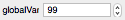
To associate a SetVariable control with a variable that is not in the current data folder at the time SetVariable runs, you must use a data folder path:
Variable/G root:Packages:ImagePack:globalVar=99
SetVariable setvar0 value=root:Packages:ImagePack:globalVar
Unlike PopupMenu controls, SetVariable controls remember the current data folder when the SetVariable command executes. Thus an equivalent set of commands is:
SetDataFolder root:Packages:ImagePack
Variable/G globalVar=99
SetVariable setvar0 value=globalVar
Also see SetVariable Controls and Data Folders.
You can control the style of the numeric readout via the format keyword. For example, the string "%.2d" will display the value with 2 digits past the decimal point. You should not use the format string to include text in the readout because Igor has to read back the numeric value. You may be able to add suffixes to the readout, but prefixes will not work. When used with string variables the format string is not used.
Often it is sufficient to query the value using ControlInfo and there is no need for an action procedure. If you want to do something every time the value is changed, then you need to create an action procedure with following form:
Function SetVarProc(sva) : SetVariableControl
	STRUCT WMSetVariableAction &sva

	switch (sva.eventCode)
		case 1: 							// Mouse up
		case 2:							// Enter key
		case 3: 							// Live update
			Variable dval = sva.dval
			String sval = sva.sval
			break
		case -1: 							// Control being killed
			break
	endswitch

	return 0
End
If the value is a string, then sva.sval contains its contents. If it is numeric, then sva.dval contains the value. sva.isStr is 0 for numeric values and non-zero for string values.
When the user clicks and holds in the up or down arrows then the value of the variable will be steadily changed by the increment value. By default, your action procedure will not be called until the user releases the mouse button. Using the SetVariable keyword "live=1" causes the action procedure to be called for every increment. If you use this feature, it is important that your action procedure execute quickly.
Using information in the WMSetVariableAction structure, it is possible to learn where in the control a mouse click occurred, allowing you to create special effects such as nonlinear increments or to display a contextual menu.
Creating Slider Controls
The Slider operation creates or modifies a slider control.
A slider control is tied to a numeric global variable or to an internal numeric value stored in the control itself. To minimize clutter, you should use internal values in most cases. The value is changed by dragging the "thumb" part of the control or by clicking in the track at the value you want.
There are many options for labelling the numeric range such as setting the number of ticks.
You can also provide custom labels in two waves, one numeric and another providing the corresponding text label. For example:
NewPanel
Make/O tickNumbers= {0,25,60,100}
Make/O/T tickLabels= {"Off","Slow","Medium","Fast"}
Slider speed,pos={86,28},size={74,73}
Slider speed,limits={0,100,0},value= 40
Slider speed,userTicks={tickNumbers,tickLabels}
Often it is sufficient to query the value using ControlInfo and there is no need for an action procedure. If you want to do something every time the value is changed, or to implement a repeating slider then you need to create an action procedure.
Igor calls the action procedure when the user drags the thumb, when the user clicks the thumb, when the user clicks on either side of the thumb, and when a procedure modifies the slider's global variable, if any. For a repeating slider, it calls the action procedure periodically while the user clicks the thumb.
See the Slider operation and Repeating Sliders for further information.
Handling Slider Events
A slider can call your action procedure only when the mouse is released (live mode off) or it can call it each time the slider position changes while the mouse is pressed (live mode on). This section demonstrates how to create both kinds of sliders.
Enter this code in the procedure window of a new experiment. Then execute
SliderDemoPanel()
in the command line and play with both sliders.
Window SliderDemoPanel() : Panel
	PauseUpdate; Silent 1		// building window...
	NewPanel /W=(262,115,665,287)

	TitleBox Title0,pos={46,21},size={139,15},fSize=12,frame=0,fStyle=1
	TitleBox Title0,title="Live Mode Off"
	Slider slider0,pos={197,23},size={150,44},proc=Slider0Proc
	Slider slider0,limits={0,2,0},value=0,live=0,vert=0

	TitleBox Title1,pos={52,114},size={135,15},fSize=12,frame=0,fStyle=1
	TitleBox Title1,title="Live Mode On"
	Slider slider1,pos={197,113},size={150,44},proc=Slider1Proc
	Slider slider1,limits={0,2,0},value=0,live=0,vert=0
EndMacro

Function Slider0Proc(sa) : SliderControl	// Action procedure for slider0
	STRUCT WMSliderAction &sa

	switch(sa.eventCode)
		case -3:		// Control received keyboard focus
		case -2:		// Control lost keyboard focus
		case -1:		// Control being killed
			break
		default:
			if (sa.eventCode & 1) 	// Value set
				Printf "Slider value = %g, event code = %d\r", sa.curval, sa.eventCode
			endif
			break
	endswitch

	return 0
End

Function Slider1Proc(sa) : SliderControl	// Action procedure for slider1
	STRUCT WMSliderAction &sa

	switch(sa.eventCode)
		case -3:		// Control received keyboard focus
		case -2:		// Control lost keyboard focus
		case -1:		// Control being killed
			break
		default:
			if (sa.eventCode & 1)	// Value set
				Printf "Slider value = %g, event code = %d\r", sa.curval, sa.eventCode
			endif
			if (sa.eventCode & 8)	// Mouse moved or arrow key moved the slider
				Printf "Mouse moved or arrow key, value = %g, event code = %d\r", sa.curval, sa.eventCode
			endif
			break
	endswitch

	return 0
End
Creating TabControl Controls
The TabControl operation creates or modifies a TabControl control. Tabs are used to group controls into visible and hidden groups, allowing groups of controls for different purposes to occupy the same space in a control panel.
The tabs are numbered. The first tab is tab 0, the second is tab 1, etc.
A default tab control has one tab:
NewPanel /W=(150,50,650,400)
TabControl tb, tabLabel(0)="Settings", size={400,250}
You add tabs to the control by providing additional tab labels:
TabControl tb, tabLabel(1)="More Settings"
When you click on a tab, the control's action procedure receives the number of the clicked-on tab.
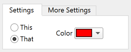
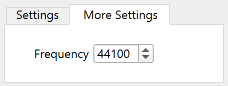
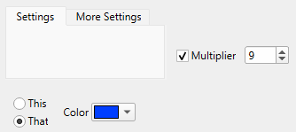
The showing and hiding of the controls are accomplished by your action procedure. In this example, the This, That, and Color controls are shown when the Settings tab is clicked, and the Multiplier checkbox is hidden. When the More Settings tab is clicked, the action procedure makes the opposite occur.
The simplest way to create a tabbed user interface is to create an over-sized panel with all the controls visible and outside of the tab control. Place controls in their approximate positions relative to one another. By positioning the controls this way you can more easily modify each control until you are satisfied with them.
Before you put the controls into the tab control, get a list of the non-tab control names:
Print ControlNameList("" ,"\r", "!tb") // all but "tb"
thisCheck
thatCheck
colorPop
multCheck
multVar
Determine which controls are to be visible in which tabs:
| Tab 0: Settings | Tab 1: More Settings | |
|---|---|---|
| thisCheck | multCheck | |
| thatCheck | multVar | |
| colorPop | ||
Write the action procedure for the tab control to show and hide the controls:
Function TabProc(tca) : TabControl
	STRUCT WMTabControlAction &tca

	switch (tca.eventCode)
		case 2: 								// Mouse up
			Variable tabNum = tca.tab		// Active tab number
			Variable isTab0 = tabNum==0
			Variable isTab1 = tabNum==1

			ModifyControl thisCheck disable=!isTab0		// Hide if not Tab 0

			ModifyControl thatCheck disable=!isTab0		// Hide if not Tab 0
			ModifyControl colorPop disable=!isTab0		// Hide if not Tab 0

			ModifyControl multCheck disable=!isTab1		// Hide if not Tab 1
			ModifyControl multVar disable=!isTab1		// Hide if not Tab 1
			break
	endswitch

	return 0
End
A more elegant method is to systematically name the controls inside each tab using a prefix or suffix that is unique to that tab, such as tab0_thisCheck, tab0_thatCheck, tab1_multVar. Then use the ModifyControlList operation to show and hide the controls. See the ModifyControlList operation for an example.
Assign the action procedure to the tab control:
TabControl tb, proc=TabProc
Verify that the action procedure correctly shows and hides controls as you click the tabs. When this works correctly, move the controls into their final positions, inside the tab control.
During this process, the "temporary selection" shortcut comes in handy. While you are in operate mode, pressing Ctrl+Alt temporarily switches to select mode, allowing you to select and drag controls.
Save the panel as a recreation macro (Windows→Control→Window Control) to record the final control positions. Rewrite the macro as a function that initially creates the panel:
Function CreatePanel()
	KillWindow/Z TabPanel
	NewPanel/N=TabPanel/W=(596,59,874,175) as "Tab Demo Panel"
	TabControl tb,pos={15,19},size={250,80},proc=TabProc
	TabControl tb,tabLabel(0)="Settings"
	TabControl tb,tabLabel(1)="More Settings",value= 0
	CheckBox thisCheck,pos={53,52},size={39,14},title="This"
	CheckBox thisCheck,value= 1,mode=1
	CheckBox thatCheck,pos={53,72},size={39,14},title="That"
	CheckBox thatCheck,value= 0,mode=1
	PopupMenu colorPop,pos={126,60},size={82,20},title="Color"
	PopupMenu colorPop,mode=1,popColor= (65535,0,0)
	PopupMenu colorPop,value= #"\"*COLORPOP*\""
	CheckBox multCheck,pos={50,60},size={16,14},disable=1
	CheckBox multCheck,title="",value= 1
	SetVariable multVar,pos={69,60},size={120,15},disable=1
	SetVariable multVar,title="Multiplier",value=multiplier
End
Yet another method for managing the controls within a tab control is to create a panel subwindow for each tab. Your action procedure then uses the hide keyword with the SetWindow operation to make the subwindow for the chosen tab visible, and to hide the other subwindows. You can show and hide the subwindows as you lay out the controls. An example of this is shown later in the section Laying Out Controls in Guides Mode.
See the TabControl operation for a complete description and examples.
Creating TitleBox Controls
The TitleBox operation creates or modifies a TitleBox control. The control's text can be static or can be tied to a global string variable. Using a global string variable makes possible longer strings, as static text must fit within a single command line. See Operations[TitleBox] for a complete description and examples.
By default, a TitleBox control adjusts its width to the control's text. Use the fixedSize keyword to set the width to a constant value. That can be useful if the contents are dynamic and possibly long, to avoid situations where it runs into other controls.
Creating ValDisplay Controls
The ValDisplay operation creates or modifies a value display control.
ValDisplays are very flexible and multifaceted controls. They can range from simple numeric readouts to thermometer bars or a hybrid of both. A ValDisplay control is tied to a numeric expression that you provide as an argument to the value keyword. Igor automatically updates the control whenever anything that the numeric expression depends on changes.
ValDisplay controls evaluate their value expression in the context of the root data folder. To reference a data object that is not in the root, you must use a data folder path, such as "root:Folder1:var1".
Here are a few selected keywords extracted from the ValDisplay operation:
size={width,height}
barmisc={lts, valwidth}
limits={low,high,base}
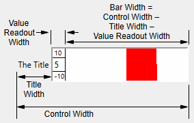
The size and appearance of the ValDisplay control depends primarily on the valwidth and size parameters and the width of the title. However, you can use the bodyWidth keyword to specify a fixed width for the body (non-title) portion of the control. Essentially, space for each element is allocated from left to right, with the title receiving first priority. If the control width hasn't all been used by the title, then the value readout width is the smaller of valwidth points or what is left. If the control width hasn't been used up, the bar is displayed in the remaining control width:
ValDisplay controls have many possible forms; here are examples of some of them. Some of these examples modify previous examples. For instance, the second bar-only example is a modification of the valdisp1 control created by the first bar-only example. If you want to try out the examples, you need a panel for them:
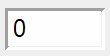
Numeric Readout Only
// Default readout width (1000) is >= default control width (50)
ValDisplay valdisp0 value=K0
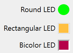
LED Display
// Create the three LED types
ValDisplay led1,pos={67,17},size={75,20},title="Round LED"
ValDisplay led1,limits={-50,100,0},barmisc={0,0},mode=1
ValDisplay led1,bodyWidth= 20,value= #"K1",zeroColor=(0,65535,0)

ValDisplay led2,pos={38,48},size={104,20},title="Rectangular LED"
ValDisplay led2,frame=5,limits={0,100,0},barmisc={0,0},mode=2
ValDisplay led2,bodyWidth= 20,value= #"K2"
ValDisplay led2,zeroColor= (65535,49157,16385)

ValDisplay led3,pos={60,76},size={82,20},title="Bicolor LED"
ValDisplay led3,limits={-40,100,-100},barmisc={0,0},mode= 2
ValDisplay led3,bodyWidth= 20,value= #"K3"
Bar Only
// Readout width = 0
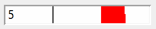
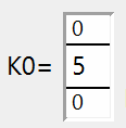
ValDisplay valdisp1,frame=1,barmisc={12,0},limits={-10,10,0},value=K0
K0= 5 // halfway from base of 0 to high limit of 10.
The nice thing about a bar-only ValDisplay is that you can make it 5 to 200 points tall whereas with a numeric readout, the height is set by the font sizes of the readout and printed limits.
// Set control height= 80
ValDisplay valdisp1, size={50,80}
Numeric Readout and Bar
// 0 < readout width (50) <  control width (150)
ValDisplay valdisp2 size={150,20},frame=1,limits={-10,10,0}
ValDisplay valdisp2 barmisc={0,50},value=K0		// no limits shown
Optional Limits
Whenever the numeric readout is visible, the optional limit values may be displayed too.
// Set limits font size to 10 points. Readout widths unchanged.
ValDisplay valdisp2 barmisc={10,50}
ValDisplay valdisp0 barmisc={10,1000}
Optional Title
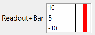
The control title steals horizontal space from the numeric readout and the bar, pushing them to the right. You may need to increase the control width to prevent them from disappearing.
// Add titles. Readout widths, control widths unchanged.
ValDisplay valdisp2 title="Readout+Bar"
ValDisplay valdisp0 title="K0="
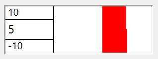
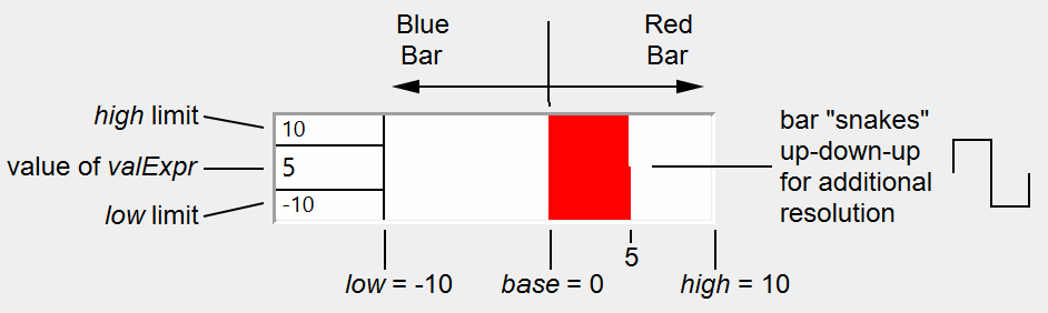
The limits values low, high, and base and the value of valExpr control how the bar, if any, is drawn. The bar is drawn from a starting position corresponding to the base value to an ending position determined by the value of valExpr, low and high. low corresponds to the left side of the bar, and high corresponds to the right. The position that corresponds to the base value is linearly interpolated between low and high.
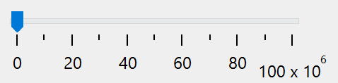
For example, with low = -10, high=10, and base= 0, a valExpr value of 5 will draw from the center of the bar area (0 is centered between -10 and 10) to the right, halfway from the center to the right of the bar area (5 is halfway from 0 to 10):
You can force the control to not draw bars with fractional parts by specifying mode=3.
Laying Out Controls in Guides Mode
Subwindows and guides for subwindow layout have been available in Igor for many years. In Igor Pro version 10, guides have been extended to laying out controls. This has motivated some changes in the way guides work. To learn about the changes, and to learn about subwindow layout in guides mode, see Guides Mode for Laying Out Subwindows. You may want to follow that link now to learn the basics of the layout guides.
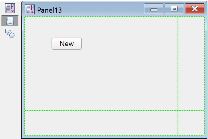
Select Windows→New→Panel to make a new panel. By default, a new panel has the tool palette showing so that you can get right to work. If the tool palette isn't displayed, select Panel→Show Tools.
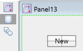
Right-click in the panel and select Add Control→Button. Click Do It. Note that a button titled "New" is created at the point where you right-clicked.
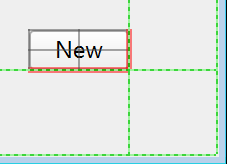
In the Tool Palette, click the second button to enter Guides mode. Click the button to select it. When selected in Guides mode, Igor adds gray lines around the edges, and across the middle of the control:
These lines are anchors for attaching the control to the layout guides in the window that owns the control. Perhaps we want that button to stay near the lower-right corner of the control panel when the control panel window is resized.
Keeping a Control Near a Window Edge
While holding down the Alt key, move the mouse over the hard-to-see green dotted line at the right edge of the window until the mouse cursor changes to left/right arrows with double bars:
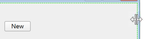
Now, while still holding down the Alt key, drag to the left about 1 cm. A new user-defined guide is created and dragged with the mouse. Do the same thing to drag a new guide up from the bottom edge of the window. When you are done, the window will look something like this:
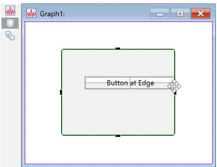
Now click on the button to select it. Because the window is in Guides mode, it will display the anchor lines in the button. Move the mouse over the right edge anchor line, making sure you get the left/right arrow cursor. There isn't much space, so you have to be careful! With the correct mouse cursor showing, click on the anchor line at the right edge of the button and drag it to the vertical guide. Note that when it gets close, it will snap to the guide. Now move the mouse to the bottom edge of the button, looking for the cursor with up/down arrows. Click and drag the button to the horizontal guide.
When you select a control in Guides mode, if the control has attachments to guides, the attached anchor lines will be displayed in red:
Resize the window by dragging the lower-right corner of the window frame. See how the button follows the guides it is attached to, keeping it at a fixed distance from the edge of the window.
To detach a control from attached guides, click and drag anywhere within the body of the control that is not on an anchor line. You can tell what will happen by the mouse cursor- if it is a two-headed arrow cursor, you will drag the attachment line. If you drag an attached guide, you will detach it.
In our example, the button is so small there is no room to find a place that isn't close to the anchor line. Select Panel→Expansion→200% to make everything big enough to find the space to drag the button's body.
Help! I Can't Change a Control Anchor at the Edge of a Subwindow!
Here is a picture of a control panel subwindow with a button that has its right edge anchor attached to the Frame Right guide in the subwindow:
The mouse is hovering over the button's right edge anchor because we want to move that anchor. But instead, the mouse cursor shows that the subwindow will be resized instead of selecting and moving the button's anchor.
If you hold the Alt key while hovering in that spot, you will instead see the double-bar with left and right arrows cursor, showing that now you can move the button's right edge anchor:
Make a Listbox Resize with Owning Panel
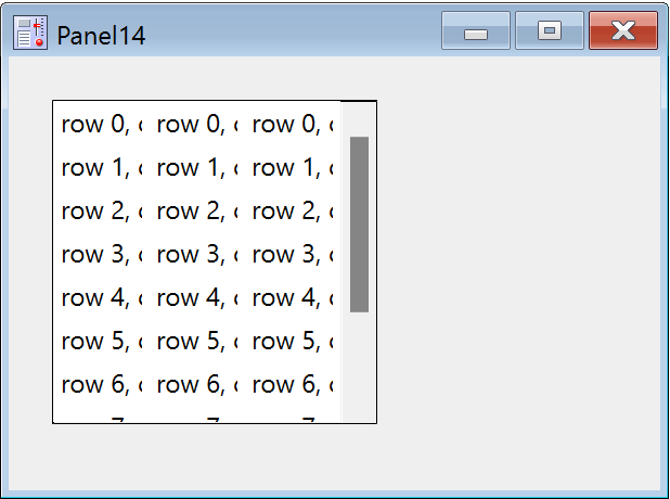
Execute these commands to make a panel with a listbox control:
NewPanel
Make/T/N=(10,3)/O listwave="row "+num2str(p)+", col "+num2str(q)
Make/N=(10,3)/O selwave=0
ListBox list0 pos={20,20},size={150,150},ListWave=listwave,SelWave=selwave,mode=8
Here is what it looks like:
It would be useful if this listbox would expand to fill the panel as you resize the panel window. To do that, we will make four user-defined guides that will accomplish exactly that.
Use the same technique as previously to create guides near all four edges of the window:
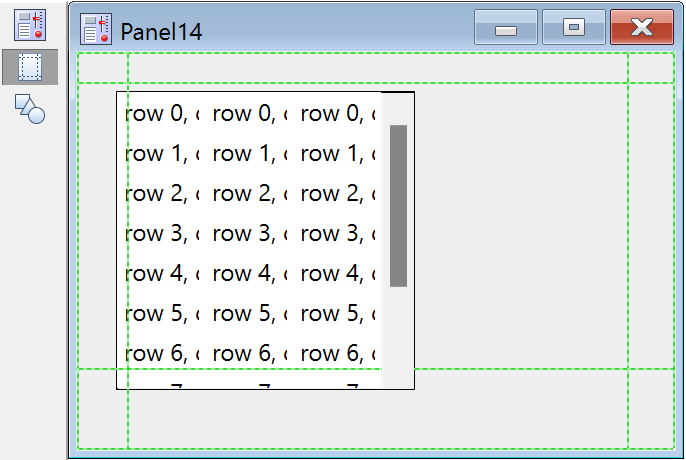
Click on the ListBox control to select it and display the anchor lines. Drag the top anchor line until it snaps to the top guide. Note that if there are no anchors already attached to guides in a given direction, then dragging an anchor moves the control without changing its size.
Drag the left anchor to the left guide, etc. until all four edges are attached to the appropriate guides.
Once one anchor is attached in a given direction, then dragging another anchor in that direction resizes the control: the first attached anchor constrains the control's position, so the only way to accommodate the anchor drag is by resizing.
The final result:
Now the ListBox control will expand and shrink with the window as you resize the panel.
This technique is also useful for making a Tab control resize with its owning window.
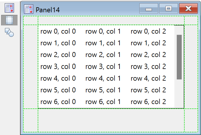
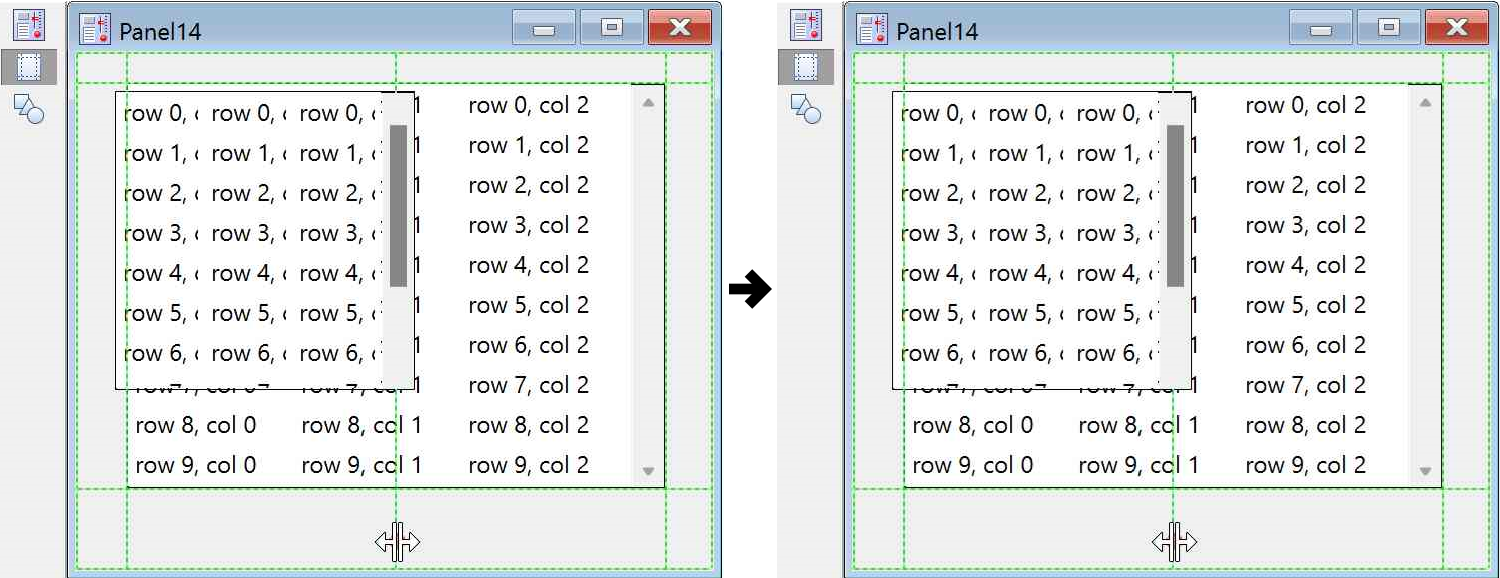
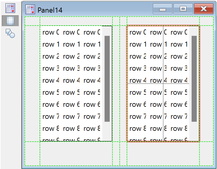
Make Two ListBox Controls Share a Window Equally
With the same panel window as the target, execute this command to make a second ListBox control:
ListBox list1 pos={20,20},size={150,150},listWave=listwave,selwave=selwave,mode=8
Naturally, in a real application it would be very unusual to re-use the same waves for the two ListBoxes!
It's a mess:
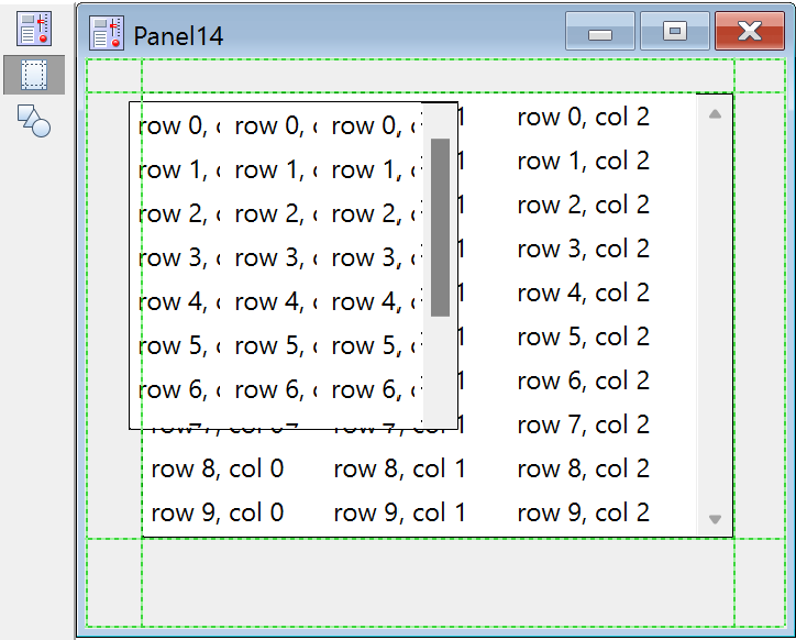
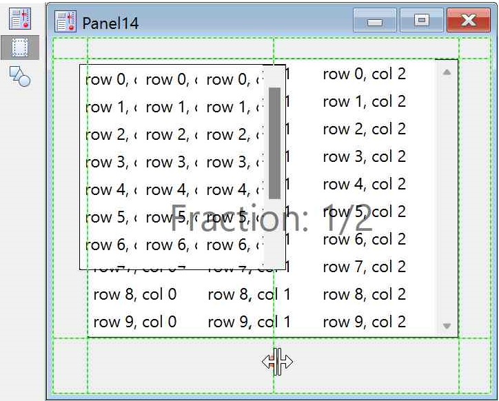
We would like to have the two ListBox controls side-by-side, taking up equal space, and to have them resize to maintain equal space when the window is resized. To do that, we will create a relative guide that references two other guides.
Start by holding the Alt key and click and drag a new user-defined guide from the left-hand guide. Holding the Alt key while dragging from an existing guide, you create a new guide.
Now right-click on the new guide and select Make relative to→UGV1 (if you hover the mouse pointer over a guide, a tooltip will appear that tells you the name of the guide, the name of its owning window, and some information about the guide). Depending on the order in which you created the guides previously, that guide could be UGV0. A relative guide maintains the fractional distance between the two guides it is relative to. When the middle guide was created, we dragged it from "UGV0" (or possibly UGV1). Then we made it relative to UGV1 (UGV0?).
We would like that guide to be exactly half way between UGV0 and UGV1. This time, do NOT hold the Alt key while dragging; instead hold the Shift key- that would constrain the position of a guide to certain fractions:
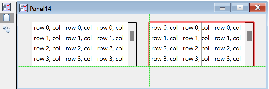
Now we can stick the left edge of the right-hand Listbox and the right edge of the new Listbox to that guide. The new Listbox needs to be attached to the other guides as well. Now the Listboxes maintain their relationship when the window is resized.
But really, that's not what we want; there should be some space between the Listboxes. So drag a new guide from the middle guide just a bit to the left and another new guide just a bit to the right. The final appearance is like this:
And when the window is stretched sideways and shrunk vertically:
A Column of Centered Controls
In previous examples, we haven't used the middle guide anchors, the ones that make a cross over the control. Those anchors attach to the center of the control, either vertically or horizontally. Using those anchors, you can keep a control centered with respect to other controls or features in your window.
Make a panel with a narrow button, a wide button and a checkbox:
NewPanel
Button button0,pos={124.50,38},size={150,20},title="A Wide Button"
Button button1,pos={172.50,74.50},size={50,20},title="Narrow"
CheckBox s,pos={163.75,109},size={67.50,16.50},title="Checkbox",value=0
Now make a new guide from the right side of the panel. Drag-select all three controls. The panel now looks like this:
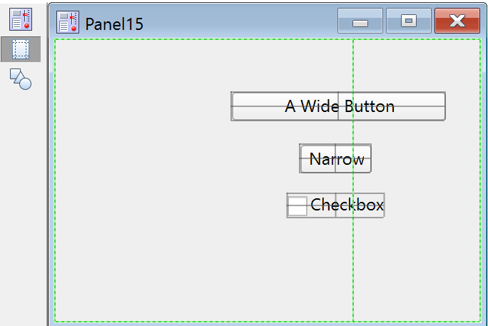
The commands that made the controls were manipulated by us such that the controls are pretty nearly aligned by their horizontal centers. Now drag the vertical anchor of any one of the controls until it snaps to the guide. If you have several controls selected and you drag an anchor of one control, all the controls will move. If the anchor you drag is nearly aligned with the same anchor on the other controls, all will snap to the guide together. The final result:
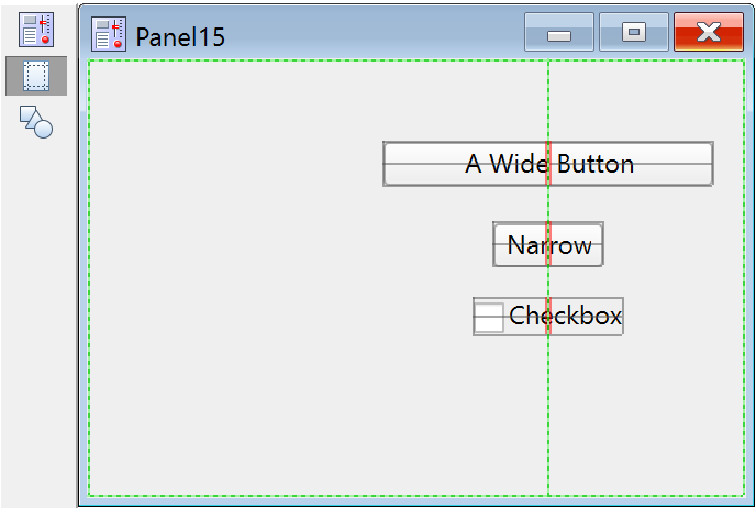
Now if you resize the window, those controls will remain close to the right edge of the window, and they will remain in a centered column.
A Couple of Rules
Cannot over-constrain a control
There are only two ways to accommodate the constraint a guide attachment applies to a control: by moving the control, which happens if one guide anchor is attached, or by resizing a control, which happens if two anchors are attached. But there are three anchors in each direction- what happens if all three are attached? Igor doesn't allow you to do that!
The size of some controls is set by factors like font size or title length. For such controls, two guide attachments would try to change the size, which would fight with the control's preferred size. For such controls, one attachment is allowed. Some controls have settings that change the control's ability to resize, so the number of attachments depends on the control's settings. This table shows what is allowed:
| Control | Resizes horizontally | Resizes vertically |
|---|---|---|
| Button | Yes | Yes |
| Chart | Yes | Yes |
| Checkbox | No: controlled by title length | No: controlled by title font |
| CustomControl | Yes* | Yes* |
| GroupBox | Yes | Yes |
| ListBox | Yes | Yes |
| PopupMenu | No: set by content or by bodyWidth | No: controlled by font size |
| SetVariable | Yes, unless bodyWidth is used | No: controlled by font size |
| Horizontal Slider | Yes | No: set by axis settings |
| Vertical Slider | No: set by axis settings | Yes |
| TabControl | Yes | Yes |
| TitleBox | Only if fixedSize is non-zero | Only if fixedSize is non-zero |
| ValDisplay | Only if bodyWidth is not used | No: controlled by feature sizes |
* But it might be a mistake, if it's not written to gracefully handle changes in size
Note that SetVariable, TitleBox and ValDisplay may be resizeable or may be not resizeable, depending on either the bodyWidth setting, or for a TitleBox, the fixedSize setting. So it is possible for one of those control types to change from allowing two attached vertical guides to allowing one. If such a control has two guides attached, and that becomes incorrect, one of the guides will be detached.
Guides mode does not apply to drawing objects
At present, drawing objects (lines, rectangles, etc. created by the drawing tools) cannot be laid out with guides. Consequently, when you are in Guides Mode, it is impossible to select drawing objects. Only controls and subwindows can be selected.
In Draw Mode, you can select both drawing objects and controls. Selected controls can be moved and resized by click-and-drag. If a control is attached to layout guides, they may not be able to respond to an arbitrary move or resize. To show you why, if a control is selected in Draw Mode and it has attachments to layout guides, those guides are displayed, even though you can't interact with the guides while in Draw Mode.
Copy and paste with guides
There is some limited support for copying and pasting guides from one window to another. This is described in Copy and Paste Guides.
Deleting Controls
You can delete a control from within a procedure using the KillControl operation. This might be useful in creating control panels that change their appearance depending on other settings.
You can interactively delete a control while in Draw mode by selecting it with the arrow tool or the Select Control submenu and pressing Delete.
Getting Information About Controls
You can use the ControlInfo operation to obtain information about a given control. This is useful to obtain information such as the current state of a checkbox or the current setting of a pop-up menu.
ControlInfo is usually used for control panels that have a Do It button or equivalent. When the user clicks the button, its action procedure calls ControlInfo to query the state of each relevant control and acts accordingly.
ControlInfo is generally not used for the other style of panel in which the action procedure for each control acts as soon as that control is clicked.
Updating Controls
You can use the ControlUpdate operation to cause a given control to redraw with its current value. You would use this in a procedure after changing the value or appearance of a control to display the changes before the normal update occurs.
Help Text for User-Defined Controls
Each control type has a help text property, set using the help keyword, through which you can add a help tip. In Igor Pro 9.00 and later, tips are limited to 1970 bytes. Previously they were limited to 255 bytes.
Here is an example:
Button button0 title="Beep", help={"This button beeps."}
The tip appears when the user moves the mouse over the control. There is no built-in way for users to turn off help tips from user-defined controls. It is recommended that any user interface that uses control help tips has an easy way for the user to turn off the tooltips. Users on small screens often wish to turn tooltips off.
You can use a limited set of HTML tags for formatting. See HTML Tags in Tooltips.
Modifying Controls
The control operations create a new control if the name parameter doesn't match a control already in the window. The operations modify an existing control if the name does match a control in the window, but generate an error if the control kind doesn't match the operation.
For example, if a panel already has a button control named "button0", you can modify the button with another Button button0 command:
Button button0 disable=1 // hide
However, if you use Checkbox instead of Button, you get a "button0 is not a Checkbox" error.
You can use the ModifyControl operation and ModifyControlList operation to modify a control without needing to know what kind of control it is:
ModifyControl button0 disable=1 // hide
This is especially handy when used in conjunction with tab controls.
Disabling and Hiding Controls
All controls support the keyword "disable=d" where d can be:
| 0: | Normal operation | |
| 1: | Hidden | |
| 2: | User input disabled | |
| 3: | Hidden and user input disabled | |
Charts and ValDisplays do not change appearance when disable=2 because they are read-only.
SetVariables also have the noedit keyword. This is different from disable=2 mode in that noedit allows user input via the up or down arrows but disable=2 does not.
Control Background Color
The background color of control panel windows and the area at the edges of a graph as reserved by the ControlBar operation is a shade of gray chosen to match the operating system look. This gray is used when the control bar background color, as set by ModifyGraph cbRGB or ModifyPanel cbRGB, is the default pure white, where the red, green and blue components are all 65535. Any other cbRGB setting, including not quite pure white, is honored. However, some controls or portions of controls are drawn by the operating system and may look out of place if you choose a different background color.
For special purposes, you can specify a background color for an individual control using the labelBack keyword. See the reference help for the individual control types for details.
Control Structures
Control action procedures can take one of two formats: structure-based or an old format that is not recommended. This section assumes that you are using the structure-based format.
The action procedure for a control uses a predefined, built-in structure as a parameter to the function. The procedure has this format:
Function ActionProcName(s)
	STRUCT <WMControlTypeAction>& s	// <WMControlTypeAction> is one of the structures listed below
	...
End
The names of the various control structures are:
Action functions should respond only to documented eventCode values. Other event codes may be added along with more fields in the future. Although the return value is not currently used, action functions should always return zero.
The constants used to specify the size of structure char arrays are internal to Igor Pro and may change.
You can use the same action procedure for different controls of the same type, for all the buttons in one window, for example. Use the ctrlName field of the structure to identify the control and the win field to identify the window containing the control.
Control Structure Example
This example illustrates the extended event codes available for a button control. The function prints various text messages to the history area or the command window, depending what actions you take while in the button area.
Function ControlStructureTest()
	NewPanel
	Button b0,proc= NewButtonProc
End

Structure MyButtonInfo
	Int32 mousedown
	Int32 isLeft
EndStructure

Function NewButtonProc(s)
	STRUCT WMButtonAction &s
	STRUCT MyButtonInfo bi
	Variable biChanged= 0
	StructGet/S bi,s.userdata
	if( s.eventCode==1 )
		bi.mousedown= 1
		bi.isLeft= s.mouseLoc.h < (s.ctrlRect.left+s.ctrlRect.right)/2
		biChanged= 1
	elseif( s.eventCode==2 || s.eventCode==3 )
		bi.mousedown= 0
		biChanged= 1
	elseif( s.eventCode==5 )
		print "Enter button"
	elseif( s.eventCode==6 )
		print "Leave button"
	endif
	if( s.eventCode==4 )						//  mousemoved
		if( bi.mousedown )
			if( bi.isLeft )
				printf "L"
			else
				printf "R"
			endif
		else
			printf "*"
		endif
	endif
	if( biChanged )
		StructPut/S bi,s.userdata			// written out to control
	endif
	return 0
End
Control Structure eventMod Field
The eventMod field appears in the built-in structure for each type of control. It is a bitfield defined as follows:
| Int32 eventMod | Bit 0: | A mouse button is down. | ||
| Bit 1: | Shift key is down. | |||
| Bit 2: | Alt is down. | |||
| Bit 3: | Ctrl is down. | |||
| Bit 4: | Contextual menu click occurred. | |||
See Setting Bit Parameters for details about bit settings.
Control Structure blockReentry Field
Long ago, on Macintosh version 6 and before, if a control action procedure took a long time to run, it was possible to repeat the action and start the action procedure again before the previous invocation was finished (that's called reentrancy). That is, if a button starts a long computation, like a lengthy curve fit, it was possible to start a new fit before the first was done, if you clicked the button again too soon. To control that, the blockReentry member was added.
In Igor 7 and later, code was added that prevents reentry, so the blockReentry field is obsolete. It is retained for backward compatibility and has no effect.
If you find a case in which reentry is a problem, please contact support@wavemetrics.com with a report. We will need an example that we can use to reproduce the problem.
User Data for Controls
You can store arbitrary data in a control using the userdata keyword.
Each control has a primary, unnamed user data string that is used by default. You can also store an unlimited number of additional user data strings by specifying a name for each one. The name can be any legal standard Igor name.
You can retrieve information from the default user data using the ControlInfo operation, which returns such information in the S_UserData string variable. To retrieve named user data, you must use the GetUserData operation, specifying the control's name in the objID input. The user data strings are considered simply as a bunch of bytes; as long as you don't apply string operations to the contents, it can store arbitrary binary data. For small data, it's probably best to use readable text as that simplifies handling and makes the data less fragile.
Although there is no size limit to how much user data you can store, it does have to be generated as part of the recreation macro for the window when experiments are saved. Consequently, huge user data strings can slow down experiment saving and loading.
User data is intended to replace or reduce the usage of global variables for maintaining state information related to controls.
Control User Data Examples
Here is a simple example of a button with user data:
NewPanel
Button b0, userdata="user data for button b0"
Print GetUserData("","b0","")
Here is a more complex example.
Copy the following code into the procedure window of a new experiment and run the Panel0 macro. Then click the buttons.
Structure mystruct
	Int32 nclicks
	double lastTime
EndStructure

Function ButtonProc(ctrlName) : ButtonControl
	String ctrlName
	STRUCT mystruct s1
	String s= GetUserData("", ctrlName,"")
	if( strlen(s) == 0 )
		print "first click"
	else
		StructGet/S s1,s
		printf "button %s clicked %d time(s), last click = %s\r",ctrlName, s1.nclicks, Secs2Date(s1.lastTime, 1 )+" "+Secs2Time(s1.lastTime,1)
	endif
	s1.nclicks += 1
	s1.lastTime= datetime
	StructPut/S s1,s
	Button $ctrlName,userdata= s
End

Window Panel0() : Panel
	PauseUpdate; Silent 1				// building window...
	NewPanel /W=(150,50,493,133)
	SetDrawLayer UserBack
	Button b0,pos={12,8},size={50,20},proc=ButtonProc,title="Click"
	Button b1,pos={65,8},size={50,20},proc=ButtonProc,title="Click"
	Button b2,pos={119,8},size={50,20},proc=ButtonProc,title="Click"
	Button b3,pos={172,8},size={50,20},proc=ButtonProc,title="Click"
	Button b4,pos={226,8},size={50,20},proc=ButtonProc,title="Click"
End
Controls in Graphs
The combination of controls and graphs provides a nice user interface for tinkering with data. You can create such a user interface by embedding controls in a graph or by embedding a graph in a control panel. This section explains the former technique, but the latter technique is usually recommended. See Embedding and Subwindows for details.
Although controls can be placed anywhere in a graph, you can and should reserve an area just for controls at the edge of a graph window. Controls in graphs operate much more smoothly if they reside in these reserved areas. The ControlBar operation can be used to set the height of a non-embedded control area along any edge of the graph; the Control Bar dialog provides a user interface for creating one at the top of a graph.
The simplest way to add a panel is to show the draw tools palette and select draw mode, then click near the edge of the graph and drag out a control area.
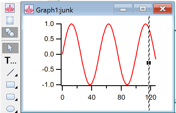
Click at the top, right, bottom, or left edge of the graph, being careful not to grab the window frame:
Drag the dashed line to define the inside edge of the embedded panel:
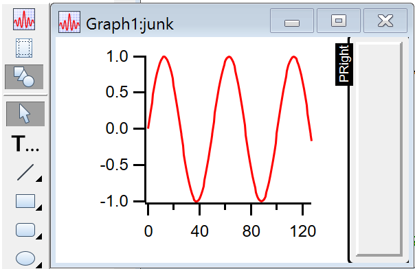
PRIGHT is the name of the resulting embedded panel subwindow. The label disappears in "operate" mode:
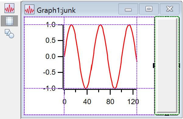
In Guides mode (see Guides Mode for Laying Out Subwindows) adjust the position of the embedded window by clicking the subwindow frame and dragging its handles. The dashed lines represent the edges of the plot and graph areas, and the subwindow frame snaps and attaches to them:
The background color of a control area or embedded panel can be set by right-clicking in the background, and then selecting a color from the contextual menu's pop-up color palette. See Control Background Color for details.
The contextual menu adjusts the style of the frame around the panel.
You can use the same contextual menu to remove an embedded panel, leaving only the bare control area underneath. Remove the control area by dragging the inside edge back to the outside edge of the graph.
Drawing Limitations
Drawing tools cannot be used in the control bar region of a graph. You can use the drawing tools in the panel subwindow that results from dragging from the edge of a graph (see Controls in Graphs), in a panel with a graph subwindow, or in a regular panel subwindow with a graph as its parent.
Control Panels
Control panels are windows designed to contain controls. The NewPanel operation creates a control panel.
Drawing tools can be used in panel windows to decorate control panels. Control panels have two drawing layers, UserBack and ProgBack, behind the controls, and one layer, Overlay, in front of the controls. See Drawing Layers for details.
A panel's background color can be set by right-clicking in the background and then selecting a color from the pop-up color palette. See Control Background Color for details.
Embedding into Control Panels
You can embed a graph, table, notebook, or another panel into a control panel window. See Embedding and Subwindows for details. This technique is cleaner than adding control areas to a graph. It also allows you to embed multiple graphs in one window with controls.
Use the contextual menu while in drawing mode to add an embedded window. To adjust the size and position of the subwindow, enter Guides Mode and click on the frame of the subwindow:
You can use a notebook subwindow in a control panel to display status information or to accept lengthy user input. See Notebooks as Subwindows in Control Panels for details.
For more information on laying out subwindows, see Subwindow User-Interface Concepts. "Guides Mode", shown above, can make complex subwindow arrangement somewhat easier. Guides Mode can also be used to help lay out controls in a panel (see Laying Out Controls in Guides Mode).
Exterior Control Panels
Exterior subwindows are panels that act like subwindows but live in their own windows attached to a host window. The host window can be a graph, table, panel or Gizmo plot. The host window and its exterior subwindows move together and, in general, act as a single window. Exterior subwindows have the advantage of not disturbing the host window and, unlike normal subwindows, are not limited in size by the host window.
To create an exterior subwindow panel, use NewPanel with the /EXT flag in combination with /HOST.
Floating Control Panels
Floating panels float above all other windows, except dialogs. To create a floating panel, use NewPanel with the /FLT flag.
Control Panel Expansion
In Igor Pro 9.00 and later, you can set an expansion factor for a control panel using the Expansion submenu in the Panel menu or the panel's contextual menu which you summon by right-clicking. You can set it for all panels using the Panel section of the Miscellaneous Settings dialog. As explained below, setting it for all panels is recommended in most cases.
The factory default control panel expansion factor is 1.0 which means that control panels and their controls are displayed at "normal" size. The normal size depends on the pixel size of your screen and on various complex software factors. It may be too small or too large for your taste. If so, you can use the control panel expansion factor to adjust.
When you change the expansion factor, the size of the panel window and any controls and subwindows in the panel changes accordingly. Additionally, elements drawn in the panel using drawing tools are also expanded.
If normal size is not ideal for you, you will usually want to change the expansion for all control panels, not for just one specific control panel. You can do this by changing the default control panel expansion factor using the Panel section of the Miscellaneous Settings dialog. For most uses, changing the default is recommended over changing the expansion for a specific control panel.
When creating a control panel programmatically, you can set the expansion factor using the NewPanel /EXP=<factor> flag which was added in Igor Pro 9.00. However, for most uses, you should omit /EXP and allow the user's default control panel expansion factor to take effect.
When a control panel is recreated, such as when you open an experiment with a control panel, if the /EXP=<factor> flag is present in the recreation macro, Igor applies the specified expansion factor to the panel. If the /EXP flag is omitted, Igor applies the user's default control panel expansion factor.
When Igor generates a control panel recreation macro, if the control panel uses other than the default expansion as set in the Panel section of the Miscellaneous Settings dialog, Igor uses the NewPanel /EXP flag to specify the desired expansion. If the experiment is opened on a different machine, the specific expansion factor is applied. This overrides the user's default control panel expansion factor. You can avoid overriding the user's preference by using the default control panel expansion rather than setting it for a specific panel.
It is rarely necessary, but you can programmatically set the expansion factor of a control panel window or subwindow using a ModifyPanel command with the expand keyword which was added in Igor Pro 9.00. For main control panel windows, this works the same as setting the expansion using the Expansion submenu. For control panel subwindows, it affects the size of the controls but not the size of the subwindow itself. For the reasons explained above, it is usually best to refrain from programmatically setting the expansion so that the user's default takes effect.
You can add controls to a graph by creating a control bar using the ControlBar operation. The default control panel expansion factor affects the size of the control bar in a graph and the sizes of the controls in the control bar.
Control Panel Units
The size and position of a control panel window on screen is set by the NewPanel /W=(left,top,right,bottom) flag. The size and position of controls within a control panel are set by the pos={left,top} and size={width,height} keywords of control operations like Button and TitleBox.
For historical reasons, the interpretation of these parameters depends on the operating system; see Control Panel Resolution on Windows for details.
The parameters are interpreted as points except if the screen resolution is 96 DPI in which case, for compatibility with existing experiments and procedures, they are interpreted as pixels.
To allow users to control the size of control panels and their contents, Igor Pro 9.00 introduced Control Panel Expansion. The rest of this section discusses how control panel expansion affects the interpretation of the NewPanel /W and control operation keyword parameters.
A parameter that is expressed in normal control panel units (points or pixels as described above) to which Igor applies the control panel expansion factor is said to be expressed in control panel units.
Interpretation of NewPanel Coordinates
First we consider the NewPanel /W=(left,top,right,bottom) flag.
When control panel expansion is other than the factory default 1.0, Igor scales the width (computed as right-left) and height (computed as bottom-top) of the panel by the expansion factor but does not change the interpretation of left and top.
Consider these examples assuming that the default control panel expansion is 1.0:
NewPanel/N=Panel1/W=(100,100,300,200)
NewPanel/N=Panel2/EXP=2/W=(100,100,300,200)
The first NewPanel command creates a panel at the specified coordinates which are interpreted as points or pixels as described in the preceding section.
In the second command, the expansion is 2.0 because of the /EXP flag. This does not affect the position of the window as specified by the left and top parameters. It does affect the width and height of the panel as computed by Igor from width=right-left and height=bottom-top. After computing the width and height, Igor applies the expansion factor. The result is that the top/left corner of Panel2 is the same as Panel1 but Panel2 is twice as wide and twice as tall. We wind up with width=200 and height=100 in both cases but, because of panel expansion, Panel2 is twice as large as Panel1.
The left, top, right, and bottom parameters are in normal panel units but NewPanel interprets the internally computed width and height as control panel units (i.e., normal units to which control panel expansion is to be applied).
If you use /I (inches) or /M (centimeters) before /W then the interpretation of the parameters is different. They are converted from inches or centimeters to points and the result is treated as points, as with the Display operation.
Interpretation of Control Operation Coordinates
Now we consider the pos={left,top} and size={width,height} keywords of control operations like Button and TitleBox.
All of these parameters are treated as control panel units. This means that they are first treated as points or pixels as described above and then the expansion factor of the targeted panel, if other than 1.0, is applied.
Consider these examples which use Panel1 and Panel2 from the preceding section:
AutopositionWindow /R=Panel1 Panel2		// Make panels side-by-side
Button button0 win=Panel1, pos={100,50}, size={100,20}, title="Button"
Button button0 win=Panel2, pos={100,50}, size={100,20}, title="Button"
We created buttons that are one-half the width of the panel and with the top/left corner of the button one-half of the way from the top to the bottom and one-half of the way from the left to the right. We did this using the same parameters in both cases. This gives different results because the Button operation interprets the parameters as being expressed in control panel units.
Interpretation of Drawing Coordinates
When you use drawing tools and drawing operations in control panels, coordinates are interpreted as control panel units the same as for control operations such as Button.
See Also
Control Panel Resolution on Windows, ScreenResolution, PanelResolution
Control Panel Preferences
Control panel preferences allow you to control what happens when you create a new control panel. To set preferences, create a panel and set it up to your taste. We call this your prototype panel. Then choose Capture Panel Prefs from the Panel menu.
Preferences are normally in effect only for manual operations, not for automatic operations from Igor procedures. This is discussed in more detail in Preferences.
When you initially install Igor, all preferences are set to the factory defaults. The dialog indicates which preferences you have changed.
The preferences affect the creation of new panels only.
Selecting the Show Tools category checkbox captures whether or not the drawing tools palette is initially shown or hidden when a new panel is created.
See also Control Panel Expansion.